| 说到响应式网页设计(Responsive
web design),最近在谷歌加上碰到个奇葩贴子,通过一个原始到无法再简单的网页Motherfucking
Website及满屏幕的fuck道出了网页设计的真谛,这孩子不是个激进分子就是个报复社会型的货没错,虽然整篇文章就像是泼妇骂街,但我特么是笑着读完的。。
统计了下全文共用Fuck (包括fucking) 33次,shit (包括shitty)16次,Motherfucker
8次,创下我所阅读的技术类文章里面脏话之最。
文章表达的中心思想就是最后的那句引用"最好的设计是尽量少的设计"。最重要的是我意识到平时我们都忽略了一个常识:一张未经加工的原始HTML文档就已经是响应式的了,根本不用什么CSS
media属性或者指定任何样式。
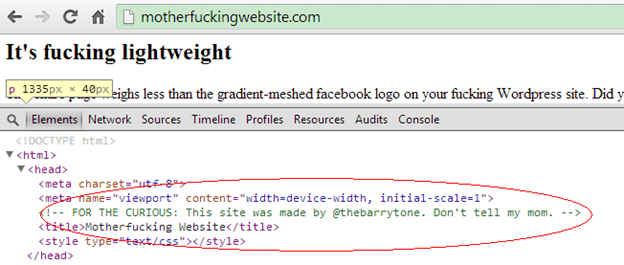
通过查看HTML代码发现作者果然留下了一些信息,于是在twitter上找到他表达了我对他的膜拜之情以及想把如此精华的文章翻译成中文的意愿。作者很爽快地答应了23333~~(X___X)~~。
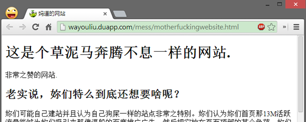
于是就有了同样奇葩的中文版本:妈逼的网站,原文的精髓可能由于我自身对这类表达的驾驭的不够而丢失了一些,但多少还是能够方便嫌英文阅读麻烦的同学们围观的了。
当然以上全是扯淡,一如作者所指出的,相当讽刺。
回到正题,各种屏幕尺寸满天飞的时代如何让网站自适应的究极解决方案:响应式设计(Responsive Design)。
构造基本的HTML页面
一个简单的博客页面
始终觉得再多口水都没有一个生动鲜明的例子来得实在,下面通过对一个普通HTML页面的改造来体验什么是响应式设计及如何达到。
下面构造一个基本的HTML页面,它包含网站导航菜单,正文,图片,侧边栏,表格式的布局以及页脚信息。是个非常完整而中庸的布局,几乎是常见的博客版面。
<html>
<head>
<title>
Responsive Design Example
</title>
<meta http-equiv="content-type" content="text/html;charset=utf-8" />
<link rel="stylesheet" type="text/css" href="style.css">
</head>
<body>
<div id="main">
<nav>
<ul>
<li>
<a href="#">Home</a>
</li>
<li>
<a href="#">Articles</a>
</li>
<li>
<a href="#">Gallery</a>
</li>
<li>
<a href="#">Forum</a>
</li>
<li>
<a href="#">About</a>
</li>
</ul>
</nav>
<aside>
<ul>
<li><a href="#subtitle1">item1</a> </li>
<li><a href="#subtitle2">item2</a></li>
<li><a href="#subtitle3">item3</a></li>
<li><a href="#subtitle4">item4</a></li>
<li><a href="#subtitle5">item5</a></li>
</ul>
</aside>
<section class="post">
<article>
<h1>
Sample Title
</h1>
<p></p>
<section class="grid">
<div class="item">
#1
</div>
<div class="item">
#2
</div>
<div class="item">
#3
</div>
</section>
<p></p>
</article>
</section>
<footer>
<hr>
<ul>
<li><small>Wayou © 2013|</small></li>
<li><small><a href="mailto:sample@somesite.com">Contact</a></small> </li>
</ul>
</footer>
</div>
</body>
</html> |
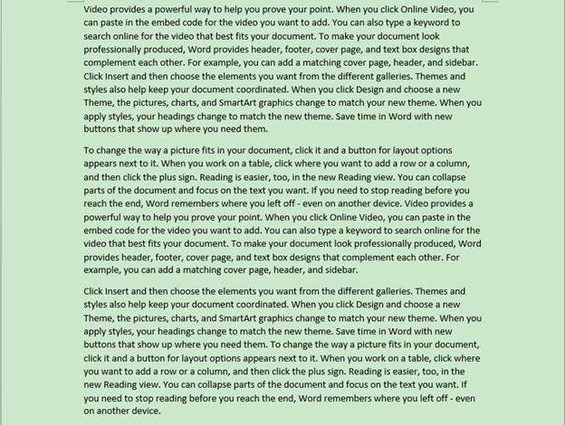
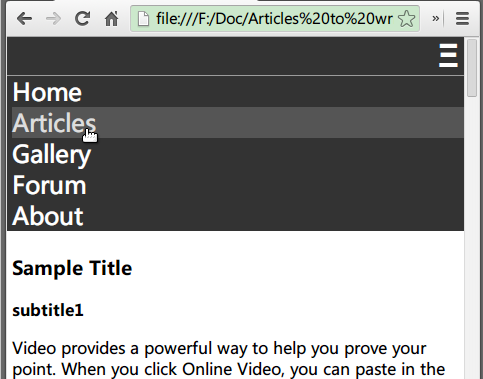
文章内容填充
剩下文章部分需要填充点内容,正好MS Word有这样一个产生随机文章的彩蛋。使用方法是新建一个word文件然后打开输入"
=rand(3,10) " 再回车。其中rand 函数接收两个参数,第一个表示要产生多少个自然段,第二个表示每段多少行。所以上面回车后我们会得到一篇由3个自然段组成的文章且每段有10行。
然后再另存为网页文件:
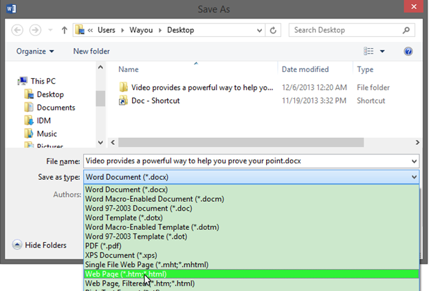
最后可以在浏览器中通过查看源码把包含内容的<p>标签复制到我们的代码中即可。
同时这里有一个专门产生填充内容的网站Fillerati。可以定义篇幅,作者信息,标题等。
当然以上两种作法多少有点装逼与做作的感觉,你完全可以随便复制点什么东西来作为内容填充的 一_一|||。
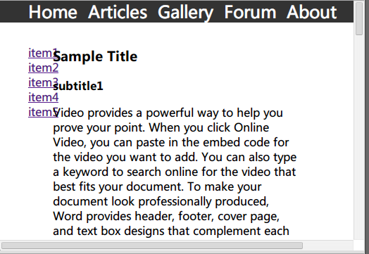
填充内容后HTML变成这样
<section class="post">
<article>
<h1>
Sample Title
</h1>
<p>
Video provides a powerful way to help you prove your point. When you click Online
Video, you can paste in the embed code for the video you want to add. You can also
type a keyword to search online for the video that best fits your document. To make
your document look professionally produced, Word provides header, footer, cover page,
and text box designs that complement each other. For example, you can add a matching
cover page, header, and sidebar. Click Insert and then choose the elements you want
from the different galleries. Themes and styles also help keep your document coordinated.
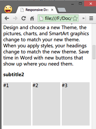
When you click Design and choose a new Theme, the pictures, charts, and SmartArt
graphics change to match your new theme. When you apply styles, your headings change
to match the new theme. Save time in Word with new buttons that show up where you
need them.
</p>
<section class="grid">
<div class="item">
#1
</div>
<div class="item">
#2
</div>
<div class="item">
#3
</div>
</section>
<p>
To change the way a picture fits in your document, click it and a button for layout
options appears next to it. When you work on a table, click where you want to add
a row or a column, and then click the plus sign. Reading is easier, too, in the new
Reading view. You can collapse parts of the document and focus on the text you want.
If you need to stop reading before you reach the end, Word remembers where you left
off - even on another device. Video provides a powerful way to help you prove your
point. When you click Online Video, you can paste in the embed code for the video
you want to add. You can also type a keyword to search online for the video that
best fits your document. To make your document look professionally produced, Word
provides header, footer, cover page, and text box designs that complement each other.
For example, you can add a matching cover page, header, and sidebar.
</p>
<img class="illustration" src="beauty.png" title="sample pic" alt="beauty" />
<p>
Click Insert and then choose the elements you want from the different galleries.
Themes and styles also help keep your document coordinated. When you click Design
and choose a new Theme, the pictures, charts, and SmartArt graphics change to match
your new theme. When you apply styles, your headings change to match the new theme.
Save time in Word with new buttons that show up where you need them. To change the
way a picture fits in your document, click it and a button for layout options appears
next to it. When you work on a table, click where you want to add a row or a column,
and then click the plus sign. Reading is easier, too, in the new Reading view. You
can collapse parts of the document and focus on the text you want. If you need to
stop reading before you reach the end, Word remembers where you left off - even on
another device.
</p>
</article>
</section> |
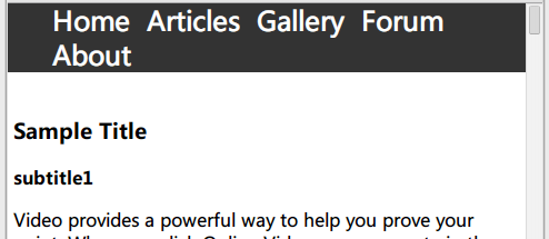
最后出来的效果看起来是这样的:
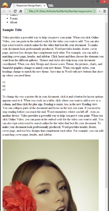
最后为了让侧边栏更有意义一点,给文章正文加上一些子标题同时给侧边栏里的元素加上锚点连接可以在文章的子标题间进行导航。
<aside>
    <ul>
        <li>
            <a href="#subtitle1">item1</a>
        </li>
        <li>
            <a href="#subtitle2">item2</a>
        </li>
        <li>
            <a href="#subtitle3">item3</a>
        </li>
        <li>
            <a href="#subtitle4">item4</a>
        </li>
        <li>
            <a href="#subtitle5">item5</a>
        </li>
    </ul>
</aside>
<section class="post">
    <article>
        <h1>
            Sample Title
        </h1>
        <p id="subtitle1">
            <strong>
                subtitle1
            </strong>
        </p>
        <p>
            //正文被省略
        </p>
        <p id="subtitle2">
            <strong>
                subtitle2
            </strong>
        </p>
        <section class="grid">
            <div class="item">
                #1
            </div>
            <div class="item">
                #2
            </div>
            <div class="item">
                #3
            </div>
        </section>
        <p>
            <p id="subtitle3">
                <strong>
                    subtitle3
                </strong>
            </p>
            //正文被省略
        </p>
        <p id="subtitle4">
            <strong>
                subtitle4
            </strong>
        </p>
        <img class="illustration" src="beauty.png" title="sample pic" alt="beauty" />
        <p id="subtitle5">
            <strong>
                subtitle5
            </strong>
        </p>
        <p>
            //正文被省略
        </p>
    </article>
</section> |
基本的样式
最后加上一些样式让整个页面看起来更正常些。
我们首先去掉body元素的默认外边距,去掉列表元素前面默认的加点,把菜单里的超连接的下划线也去掉。
body {
    margin: 0;
}

li {
    list-style: none;
}

/*navigation bar*/

nav {
    background-color: #333;
}

nav li {
    display: inline-block;
    padding-right: 10px;
}

nav li a {
    text-decoration: none;
    color: white;
    font-size: 1.5em;
}

nav li a:hover {
    color: #DDD;
} |
再修饰下字体及正文中的三个方块div以及其他,最后的样式代码差不多是这样的:
html {
    font-family: "microsoft yahei",arial
}

body {
    margin: 0;
}

li {
    list-style: none;
}

/*navigation bar*/
nav {
    background-color: #333;
}

nav li {
    display: inline-block;
    padding-right: 10px;
}

nav li a {
    text-decoration: none;
    color: white;
    font-size: 1.5em;
}

nav li a:hover {
    color: #DDD;
}


/*sidebar*/
aside {
    width: 15%;
    float: left;
}

/*post*/
.post {
    width: 70%;
    margin: 0 auto;
    float: left;
}

 /*grid layout*/
.grid {
}

.grid .item {
    width: 25%;
    height: 150px;
    background-color: #DDD;
    display: inline-block;
}

 /*footer*/
footer {
    width: 100%;
    text-align: center;
    clear: both;
}

footer li {
    display: inline-block;
} |
其中,因为侧边栏和文章向左浮动了,为了让页脚不从最底跳到文章的后面跑到顶部去,要清除页脚footer两边的浮动。
footer{
     width: 100%;
     text-align: center;
     clear:both;
} |
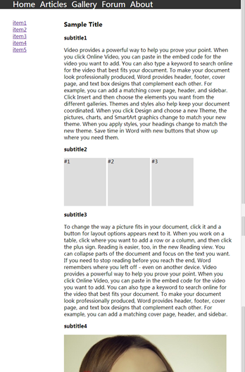
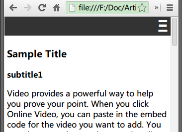
最后页面看起来着不多是这个样子的
动态加载样式表
接下来的工作是让页面成为响应式的。听起来觉得是一个全新的领域,但其实平时我们已经在实践了。比如当指定元素的尺寸时,使用百分比而不是固定像素的大小时,这样的元素就具备自适应屏幕的能力。最常见的就是指定元素宽度为100%。这样窗口缩放或屏幕不同时元素始终占据屏幕整个宽度。
一些不太实用的实践是针对不同屏幕尺寸加载不同的样式表,这其实相当于为不同尺寸写不同的样式表,感觉维护起来不那么方便。
<!-- CSS media query on a link element -->
<link rel="stylesheet" media="(max-width: 800px)" href="example.css" /> |
通过在引入样式表时使用media属性可以控制什么尺寸的屏幕使用哪个样式表,于是我们可以实现手机访问时下载手机版样式,电脑访问时下载正常样式。
<link rel="stylesheet" media="screen and (max-device-width: 320px)" href="mobile.css"/> |
上面代码指定如果设备宽度小于320px则调用 "mobile.css"样式表。
个人觉得这样为一个站点写多个分别的样式表不怎么好,所以这里就不多说了。
Viewport
响应式设计第一件需要做的事情就是在head标签里指定viewport meta属性。
《Quick Tip: Don't Forget the Viewport Meta Tag》这篇文章很好介绍了Viewport是的缘由及作用。
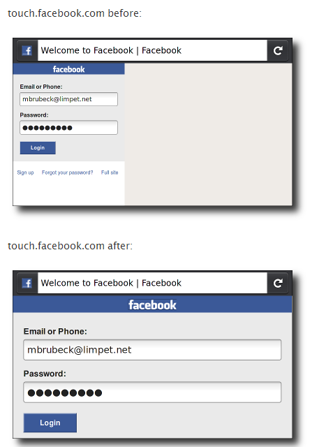
简单说来在手机(iPhone Safari)上访问网页时它默认会对网页进行缩放,尽可能多地在屏幕上展示整个页面的内容。而缩放之后的效果可想而知,一个在电脑上正常展示的页面被缩放进手机屏幕(通常是240*320)里面后,很难阅读。
同时由于默认使用缩放,那么你事先设计好的在小屏幕上使用的样式将不起作用,也就是说手机上展示的是电脑版本的一个缩小版。
我们看MDN上给出的例子截图。
而在代码中指定viewport,则可以让开发者指定网页视图区域及缩放比例等。这样就能修正由浏览器自动缩放带来的影响。
通过我们指定如下代码:
<meta name="viewport" content="width=device-width, initial-scale=1"> |
表示使用设备宽度(即设备的屏幕宽度)并且缩放指定为1也就是不缩放。
你可能会问这样指定之后岂不是只能在手机屏幕上显示网站的部分,比如左上角。这时候正是响应式网页设计起作用的时候了。如果你专门为小屏幕的访问进行了优化比如在CSS中使用media属性(后面会讲到),那么当手机访问时会调用相应的样式规则,而不会只显示整个网站的一部分。
字体缩放
指定固定像素的字体大小是我们设计中经常使用的方式,但如果你想字体大小更具弹性的话,最好还是使用相对大小,CSS中比较常用的指定字体相对大小的单位有百分比,em以及CSS3新增的rem。
首先我们指定整个文档的字体大小为100%。表示页面字体大小为浏览器默认大小的100%。
html {
    font-family: "microsoft yahei",arial;
    font-size: 100%;
} |
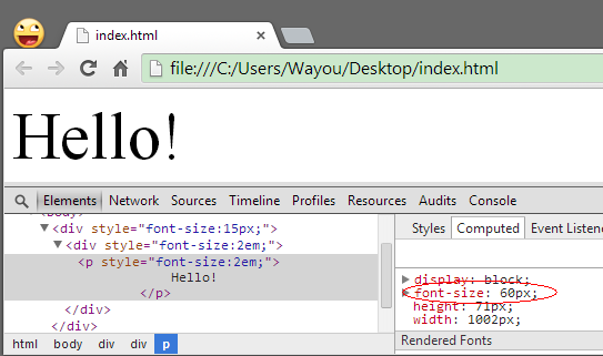
再来看看em与rem。em单位一如他的发音它的基准单位是一个m字母的高度,同时它是指定相对于父级元素的相对大小。也就是说指定为em的元素字体大小是通过对上一层元素的字体大小计算得来的。
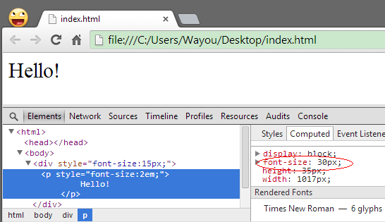
<div style="font-size:15px;">
    <p style="font-size:2em;">
        Hello!
    </p>
</div> |
上面外层div字体大小为15px,同时指定内层p元素字体大小为2em,所以p元素实际的字体大小为15px*2=30px。这点可以通过查看浏览器开发工具里面"计算后的样式"得到证实。
但需要注意的是em有个问题,正因为他会相对于低级元素来计算自己的样式,所以在层叠很多的情况下,可能出现意料之外的结果。
<div style="font-size:15px;">
    <div style="font-size:2em;">
        <p style="font-size:2em;">
            Hello!
        </p>
    </div>
</div> |
比如我们期望后面的包含在最外层div中的内容字体大小统一为2em,于是分别在内层div和p上都指定了这一样式,结果p元素的字体大小其实是乘以了两次之后的结果
15px*2*2=60px。
为了解决这个问题,于是引入了一个新的单位rem。可以理解为root-em。加了个root前缀表示总是相对于根节点来计算。HTML文档的根节点当然就是<HTML>标签了。所以通过rem无论在文档任何位置指定都可以放心地得到预期的大小。
<div style="font-size:15px;">
    <div style="font-size:2em;">
        <p style="font-size:2rem;">
            Hello!
        </p>
    </div>
</div> |
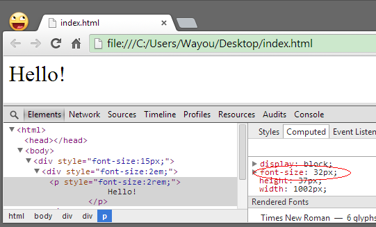
如果没有指定HTML根节点的字体大小,默认为16px,所以这里得到32px。
但rem 不太普适,因为浏览器对它的支持力度还不够,当然如果不考虑太多嵌套情况下em就够用了。所以我习惯在CSS中使用em来指定字体大小。
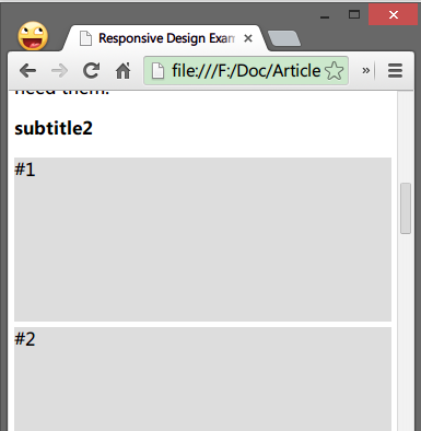
侧边栏
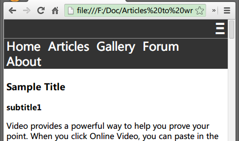
当缩放浏览器窗口到足够窄(这里是小于560px)时我们可以发现侧边栏与博客文章有重叠,此刻这个窗口宽度就是我们需要写样式来干预的时候了。
利用CSS中的media query我们指定当窗口小于630px时将侧边栏隐藏,而让正文占据整个屏幕宽度也就是设置为100%,并且取消正文的浮动,因为没有必要了。同时上图我们可以看到此时的菜单并没有受到影响所以暂时可以不管。
@media only screen and (max-width : 650px) {
    aside {
        display: none;
    }

    .post {
        width: 100%;
        float: none;
        padding: 5px;
        box-sizing: border-box;
        -webkit-box-sizing: border-box;
        -moz-box-sizing: border-box;
    }
} |
另外为了不让subtitle2部分的格子被压得太小而影响其中的内容(当然现在其中并没有什么内容),所以此刻我们让这一部分同样占100%的宽度,其中每个方块占32%的宽度。
@media only screen and (max-width : 650px) {
    aside {
        display: none;
    }

    .post {
        width: 100%;
        float: none;
        padding: 5px;
        box-sizing: border-box;
        -webkit-box-sizing: border-box;
        -moz-box-sizing: border-box;
    }

    .grid {
        width: 100%;
    }

    .grid .item {
        width: 32%;
    }
} |
导航菜单
菜单几乎是体现响应式设计最直接的一个东西了。判断一个网站是不是响应式的最好方法就是改变浏览器窗口的大小,观察网站的布局,特别是菜单,在窗口缩小到足够窄的情况下一个经典的设计是隐藏原来的菜单而只展示由三根横线组成的图标。
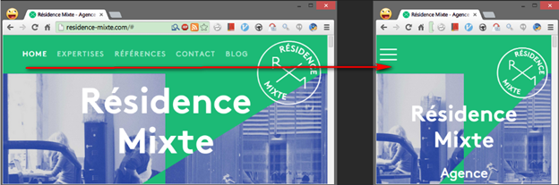
由此我们可以看到一些实现上的端倪,除了常规菜单外,我们需要在HTML代码中事先摆放好这样一个横线图标元素。
所以改动我们的nav部分的HTML代码为下面这样:
<nav>
    <ul>
        <a href="#" id="menuIcon">Ξ</a>
        <li>
            <a href="#">Home</a>
        </li>
        <li>
            <a href="#">Articles</a>
        </li>
        <li>
            <a href="#">Gallery</a>
        </li>
        <li>
            <a href="#">Forum</a>
        </li>
        <li>
            <a href="#">About</a>
        </li>
    </ul>
</nav> |
同时补充上样式:
nav li a:hover,#menuIcon:hover {
    color: #DDD;
}

#menuIcon {
    display: none;
    color: white;
    font-weight: bold;
    font-size: 2em;
    text-decoration: none;
    font-family: arial;
} |
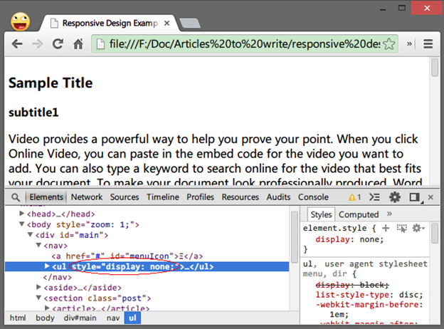
此刻页面倒并没有明显变化,因为这个图标开始是不显示的。
当窗口宽度小于大约490px时,我们的菜单最后一项被挤到了下面一排,所以将500px这个宽度作为分水岭写media
query代码。
当屏幕宽度小于500px时,<nav> 里的菜单<ul>标签不显示,同时显示id为menuIcon的菜单图标<a>标签。
@media screen and (max-width: 500px) {

    nav ul {
        display: none;
        padding: 0;
        margin: 0 5px;
    }

    #menuIcon {
        display: block;
        text-align: right;
        padding: 0 5px;
        border-bottom: 1px #9c9c9c solid;
    }
} |
这时候我们需要一点javascript代码来实现点击三根横线显示出来刚才被我们隐藏的菜单,同时再次单击或者选中一个菜单项后重新隐藏菜单。
<script type="text/javascript">
        $(function() {
            $("#menuIcon,nav ul li").click(function() {
                if ($("#menuIcon").is(":visible")) { //防止宽屏上点击
                    $("nav ul").toggle(300);
                };
            });
        })
</script> |
但这个时候菜单不够完美,最后加上一点样式美化下。
@media screen and (max-width: 500px) {

    nav ul {
        display: none;
        padding: 0;
        margin: 0 5px;
    }

    #menuIcon {
        display: block;
        text-align: right;
        padding: 0 5px;
        border-bottom: 1px #9c9c9c solid;
    }

    nav ul li {
        width: 100%;
    }

    nav ul li:hover {
        background-color: #555;
    }
} |
目前来说工作得还算满意,但稍微测试下就会发现个问题:当菜单被点开后又关闭,再将窗口拉宽到足够宽时,正常模式的菜单不显示了。
这里给出个不太正规的解决方法,再写点代码监听窗口的resize事件,当窗口大于我们设定的500px时移除我们通过jQuery的toggle函数给菜单<ul>
标签加上的样式"style="display:none;",另外也可以通过监听那个三横的菜单图标是否可见也可以达到目的。
$(window).resize(function() {
    if (!$("nav ul").is(":visible")) {
        $('nav ul').attr('style', function(i, style){
            return style.replace(/display[^;]+;?/g, '');
        });
    };
});
|
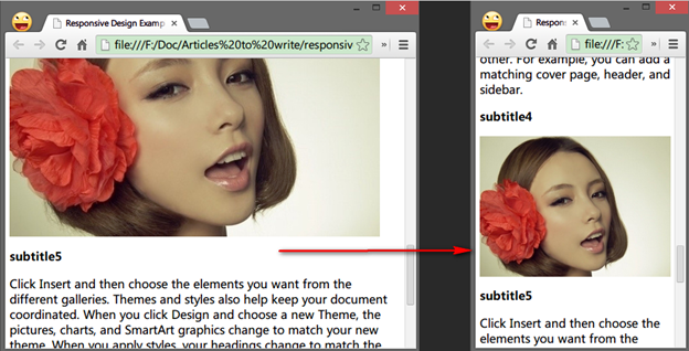
图片自适应
普通的图片是不会自适应屏幕大小的,也就是说图片太宽的话在手持设备等屏幕较小的情况下会有水平滚动条出现。
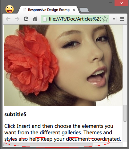
最简单的办法让它随屏幕大小自动缩放就是指定其最大宽度为100%像这样:
其他
再来处理窗口足够小的时候那个表格式布局的三个方框。
可以看到窗口很窄的时候这三个div被挤压得很厉害,所以假设窗口小于420px时,我们让它们各自独立一行,占满整个窗口宽度。
@media screen and (max-width: 420px) {
    .grid .item {
        width: 100%;
        margin-bottom: 5px;
    }
} |
总结
本文中很多例子不是很恬当,仅用于演示教学,请轻喷。比如将菜单变成图标显示时上面例子是在500px为分水岭写的media
queries,但我们知道500px其实还是很宽的,是足以容下一般长度的菜单正常显示的,只是在一般手机屏幕宽度480px
或320px,所以针对这个宽度来写media query更具实际意义。还有就是侧边栏,上面例子中使用的百分比宽度,其实侧边栏可以给个固定宽度,并且上面例子中没有考虑到侧边栏里的文字很长的情况。没有考虑到老版本IE不支持media
query的情况。这些是例子中不足的地方。但作为演示还是达到了我讲解的目的。
|
