| БрМЭЦМі: |
БОЮФНВСЫЖдЪ§зјБъЭМЃЌМЋзјБъЭМЯёЃЌжљзДЭМЃЌЩЂСаЭМЃЌгЩРыЩЂЕФЕуЙЙГЩЕФЃЌ3DЭМЯёЃЌжївЊЪЧЕїгУ3DЭМЯёПтЃЌЯЃЭћЖдДѓМвгаАяжњЁЃ
БОЮФРДздгкcsdnЃЌгЩЛ№СњЙћШэМўDeloresБрМЃЌЭЦМіЁЃ |
|
ЪзЯШВЙГфвЛЯТЃКСНжжЬхЯЕ7жжбеЩЋ r g b y m c k ЃЈКьЃЌТЬЃЌРЖЃЌЛЦЃЌЦЗКьЃЌЧрЃЌКкЃЉ
дкПЦбаЕФЙ§ГЬжаЃЌзјБъЯЕжаЕФXYВЛвЛЖЈОЭЪЧЕШГпЖШЕФЁЃР§ШчдкЩљВЈжаЖдYжсШЁЖдЪ§ЁЃЫСвтЮвУЧвВБиаыжЊЕРетжжзјБъЯЕШчКЮЛГіРДЕФЁЃ
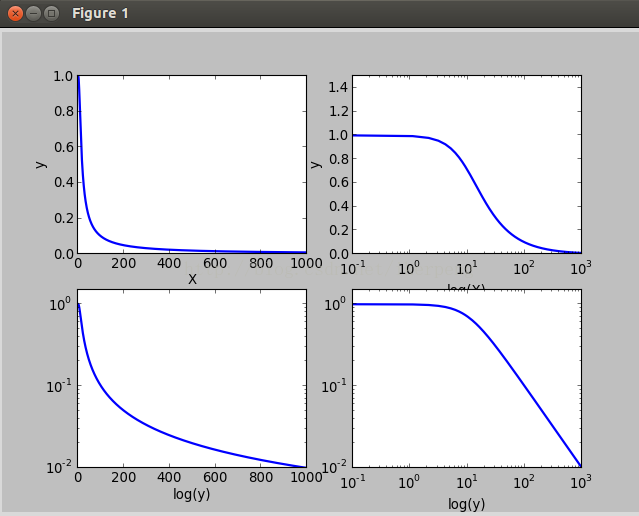
1ЃКЖдЪ§зјБъЭМ
га3ИіКЏЪ§ПЩвдЪЕЯжетжжЙІФмЃЌЗжБ№ЪЧЃКsemilogxЃЈЃЉЃЌsemilogyЃЈЃЉЃЌloglogЃЈЃЉЁЃЫќУЧЗжБ№БэЪОЖдXжсЃЌYжсЃЌXYжсШЁЖдЪ§ЁЃЯТУцдквЛИі2*2ЕФfigureРяУцРДБШНЯетЫФИізгЭМЃЈЛЙгаplotЃЈЃЉЃЉЁЃ
def drawsemilogx():
w=np.linspace(0.1,1000,1000)
p=np.abs(1/(1+0.1j*w))
plt.subplot(221)
plt.plot(w,p,lw=2)
plt.xlabel('X')
plt.ylabel('y');
plt.subplot(222)
plt.semilogx(w,p,lw=2)
plt.ylim(0,1.5)
plt.xlabel('log(X)')
plt.ylabel('y')
plt.subplot(223)
plt.semilogy(w,p,lw=2)
plt.ylim(0,1.5)
plt.xlabel('x')
plt.xlabel('log(y)')
plt.subplot(224)
plt.loglog(w,p,lw=2)
plt.ylim(0,1.5)
plt.xlabel('log(x)')
plt.xlabel('log(y)')
plt.show() |
ШчЩЯУцЕФДњТыЫљЪОЃЌЖдвЛИіЕЭЭЈТЫВЈЦїКЏЪ§ЛцЭМЁЃЕУЕНЫФИіВЛЭЌзјБъГпЖШЕФЭМЯёЁЃШчЯТЭМЫљЪО
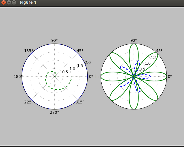
2ЃЌМЋзјБъЭМЯё
МЋзјБъЯЕжаЕФЕугЩвЛИіМаНЧКЭвЛЖЮЯрЖдгкжааФЮЛжУЕФОрРыРДБэЪОЁЃЦфЪЕдкplotЃЈЃЉКЏЪ§РяУцБОРДОЭгавЛИіpolarЕФЪєадЃЌШУЫћЮЊTrueОЭааСЫЁЃЯТУцЛцжЦвЛИіМЋзјБъЭМЯёЃК
def drawEightFlower():
theta=np.arange(0,2*np.pi,0.02)
plt.subplot(121,polar=True)
plt.plot(theta,2*np.ones_like(theta),lw=2)
plt.plot(theta,theta/6,'--',lw=2)
plt.subplot(122,polar=True)
plt.plot(theta,np.cos(5*theta),'--',lw=2)
plt.plot(theta,2*np.cos(4*theta),lw=2)
plt.rgrids(np.arange(0.5,2,0.5),angle=45)
plt.thetagrids([0,45,90]);
plt.show(); |
ећИіДњТыКмКУРэНтЃЌдкКѓУцЕФ13ЃЌ14ааУЛМћЙ§ЁЃЕквЛИіplt.rgrids(np.arange(0.5,2,0.5),angle=45) БэЪОЛцжЦАыОЖЮЊ0.5 1.0 1.5ЕФШ§ИіЭЌаФдВЃЌЭЌЪБНЋетаЉАыОЖЕФжЕБъМЧдк45ЖШЮЛжУЕФФЧИіжБОЖЩЯУцЁЃplt.thetagrids([0,45,90]) БэЪОЕФЪЧдкthetaЮЊ0ЃЌ45ЃЌ90ЖШЕФЮЛжУЩЯБъМЧЩЯЖШЪ§ЁЃЕУЕНЕФЭМЯёЪЧЃК
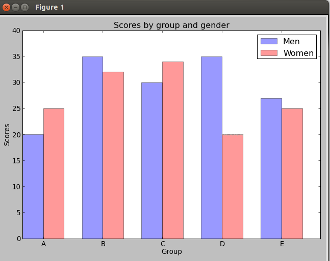
3ЃЌжљзДЭМЃК
КЫаФДњТыmatplotlib.pyplot.bar(left, height, width=0.8, bottom=None, hold=None, **kwargs)РяУцживЊЕФВЮЪ§ЪЧзѓБпЦ№ЕуЃЌИпЖШЃЌПэЖШЁЃЯТУцР§згЃК
def drawPillar():
n_groups = 5;
means_men = (20, 35, 30, 35, 27)
means_women = (25, 32, 34, 20, 25)
fig, ax = plt.subplots()
index = np.arange(n_groups)
bar_width = 0.35
opacity = 0.4
rects1 = plt.bar(index, means_men,
bar_width,alpha=opacity,
color='b',label= 'Men')
rects2 = plt.bar(index + bar_width,
means_women,
bar_width,alpha=opacity,
color='r',
label='Women')
plt.xlabel('Group')
plt.ylabel('Scores')
plt.title('Scores by group and gender')
plt.xticks(index + bar_width,
('A', 'B', 'C',
'D', 'E'))
plt.ylim(0,40);
plt.legend();
plt.tight_layout();
plt.show(); |
ЕУЕНЕФЭМЯёЪЧЃК
дйЬљвЛЭМЃК
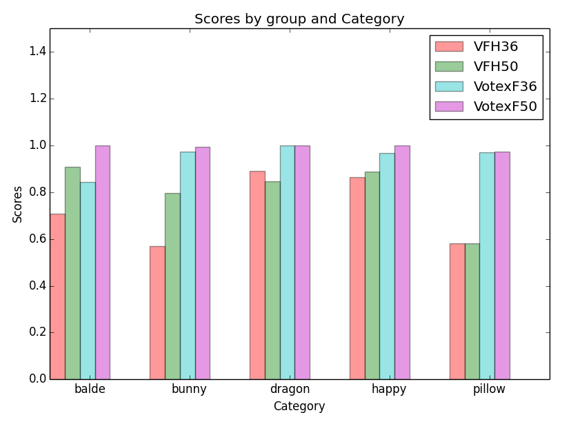
етЪЧЮвЙигкposeЪЖБ№ТЪЕФЪЕбщНсЙћЃЌИаОѕНсЙћецЪЧСюШЫВЛПЩЫМвщ
def drawBarChartPoseRatio():
n_groups = 5
means_VotexF36 = (0.84472049689441,
0.972477064220183,
1.0, 0.9655172413793104,
0.970970970970971)
means_VotexF50 = (1.0, 0.992992992992993,
1.0,
0.9992348890589136, 0.9717125382262997)
means_VFH36 = (0.70853858784893,
0.569731081926204,
0.8902900378310215,
0.8638638638638638, 0.5803008248423096)
means_VFH50 = (0.90786948176583,
0.796122576610381,
0.8475120385232745,
0.8873762376237624, 0.5803008248423096)
fig, ax = plt.subplots()
index = np.arange(n_groups)
bar_width = 0.3
opacity = 0.4
rects1 = plt.bar(index, means_VFH36,
bar_width/2,
alpha=opacity, color='r',
label='VFH36' )
rects2 = plt.bar(index+ bar_width/2,
means_VFH50,
bar_width/2, alpha=opacity,
color='g', label='VFH50'
)
rects3 = plt.bar(index+bar_width,
means_VotexF36,
bar_width/2,
alpha=opacity, color='c', label='VotexF36')
rects4 = plt.bar(index+1.5*bar_width,
means_VotexF50,
bar_width/2, alpha=opacity,
color='m', label='VotexF50')
plt.xlabel('Category')
plt.ylabel('Scores')
plt.title('Scores by group and Category')
#plt.xticks(index - 0.2+ 2*bar_width,
('balde',
'bunny', 'dragon', 'happy', 'pillow'))
plt.xticks(index - 0.2+ 2*bar_width,
('balde',
'bunny', 'dragon', 'happy', 'pillow')ЃЌ
fontsize
=18)
plt.yticks(fontsize =18) #change the num axis
size
plt.ylim(0,1.5) #The ceil
plt.legend()
plt.tight_layout()
plt.show()
|
жљзДЭМЯдЪОЃК
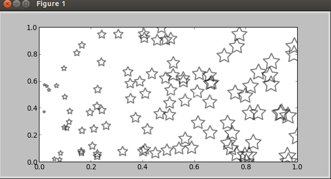
4ЃКЩЂСаЭМЃЌгЩРыЩЂЕФЕуЙЙГЩЕФЁЃ
КЏЪ§ЪЧЃК
matplotlib.pyplot.scatter(x, y, s=20, c='b', marker='o', cmap=None, norm=None, vmin=None, vmax=None, alpha=None, linewidths=None, verts=None, hold=None,**kwargs)ЃЌЦфжаЃЌxyЪЧЕуЕФзјБъЃЌsЕуЕФДѓаЁЃЌmakerЪЧаЮзДПЩвдmaker=ЃЈ5ЃЌ1ЃЉ5БэЪОаЮзДЪЧ5БпаЭЃЌ1БэЪОЪЧаЧаЭЃЈ0БэЪОЖрБпаЮЃЌ2ЗХЩфаЭЃЌ3дВаЮЃЉЃЛalphaБэЪОЭИУїЖШЃЛfacecolor=ЁЎnoneЁЏБэЪОВЛЬюГфЁЃР§згШчЯТЃК
def drawStar():
plt.figure(figsize=(8,4))
x=np.random.random(100)
y=np.random.random(100)
plt.scatter(x,y,s=x*1000,c='y',marker=(5,1),
alpha=0.5,lw=2,facecolors='none')
plt.xlim(0,1)
plt.ylim(0,1)
plt.show() |
ЩЯУцДњТыЕФfacecolorsВЮЪ§ЪЙЕУЧАУцЕФc=ЁЎyЁЏВЛЦ№зїгУСЫЁЃЭМЯёЃК
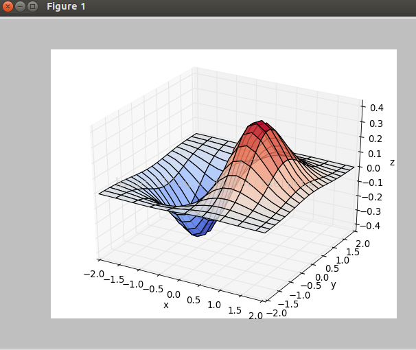
5ЃЌ3DЭМЯёЃЌжївЊЪЧЕїгУ3DЭМЯёПтЁЃПДЯТУцЕФР§згЃК
def draw3Dgrid():
x,y=np.mgrid[-2:2:20j,-2:2:20j]
z=x*np.exp(-x**2-y**2)
ax=plt.subplot(111,projection='3d')
ax.plot_surface(x,y,z,rstride=2,cstride=1,
cmap=plt.cm.coolwarm,alpha=0.8)
ax.set_xlabel('x')
ax.set_ylabel('y')
ax.set_zlabel('z')
plt.show() |
ЕУЕНЕФЭМЯёШчЯТЭМЫљЪОЃК
ЕНДЫЃЌmatplotlibЛљБОВйзїЕФбЇЯАНсЪјСЫЃЌЯраХДѓМввВПЩвдЛљБОЭъГЩздМКЕФПЦбаШЮЮёСЫЁЃ
|