| БрМЭЦМі: |
| БОЮФРДдДВЉПЭдАЃЌБОЮФжївЊНщЩмСЫЩшжУЕФБрГЬЛЗОГЃЌШЛКѓбЇЯАдѕУДЪЙгУIPython
notebookЃЌЯЃЭћЖдФњЕФбЇЯАгаЫљАяжњЁЃ |
|
ФувбООіЖЈРДбЇЯАPythonЃЌЕЋЪЧФужЎЧАУЛгаБрГЬОбщЁЃвђДЫЃЌФуГЃГЃЖдДгФФЖљзХЪжЖјИаЕНРЇЛѓЃЌетУДЖрPythonЕФжЊЪЖашвЊШЅбЇЯАЁЃвдЯТетаЉЪЧФЧаЉПЊЪМЪЙгУPythonЪ§ОнЗжЮіЕФГѕбЇепЕФЦеБщгіЕНЕФЮЪЬтЃК
ашвЊЖрОУРДбЇЯАPythonЃП
ЮвашвЊбЇЯАPythonЕНЪВУДГЬЖШВХФмРДНјааЪ§ОнЗжЮіФиЃП
бЇЯАPythonзюКУЕФЪщЛђепПЮГЬгаФФаЉФиЃП
ЮЊСЫДІРэЪ§ОнМЏЃЌЮвгІИУГЩЮЊвЛИіPythonЕФБрГЬзЈМвТ№ЃП
ЕБПЊЪМбЇЯАвЛЯюаТММЪѕЪБЃЌетаЉЖМЪЧПЩвдРэНтЕФРЇЛѓЃЌетЪЧЁЖдк20аЁЪБФкбЇЛсШЮКЮЖЋЮїЁЗЕФзїепЫљЫЕЕФЁЃВЛвЊКІХТЃЌЮвНЋЛсИцЫпФудѕбљПьЫйЩЯЪжЃЌЖјВЛБиГЩЮЊвЛИіPythonБрГЬЁАШЬепЁБЁЃ
ВЛвЊЗИЮвжЎЧАЗИЙ§ЕФДэ
дкПЊЪМЪЙгУPythonжЎЧАЃЌЮвЖдгУPythonНјааЪ§ОнЗжЮігавЛИіЮѓНтЃКЮвБиаыВЛЕУВЛЖдPythonБрГЬЬиБ№ОЋЭЈЁЃвђДЫЃЌЮвВЮМгСЫUdacityЕФPythonБрГЬШыУХПЮГЬЃЌЭъГЩСЫcode
academyЩЯЕФPythonНЬГЬЃЌЭЌЪБдФЖССЫШєИЩБОPythonБрГЬЪщМЎЁЃОЭетбљГжајСЫ3ИідТЃЈЦНОљУПЬь3ИіаЁЪБЃЉЃЌЮвФЧЛсЖљЭЈЙ§ЭъГЩаЁЕФШэМўЯюФПРДбЇЯАPythonЁЃЧУДњТыЪЧПьРжЕФЪТЖљЃЌЕЋЪЧЮвЕФФПБъВЛЪЧШЅГЩЮЊвЛИіPythonПЊЗЂШЫдБЃЌЖјЪЧвЊЪЙгУPythonЪ§ОнЗжЮіЁЃжЎКѓЃЌЮввтЪЖЕНЃЌЮвЛЈСЫКмЖрЪБМфРДбЇЯАгУPythonНјааШэМўПЊЗЂЃЌЖјВЛЪЧЪ§ОнЗжЮіЁЃ
дкМИИіаЁЪБЕФЩюЫМЪьТЧжЎКѓЃЌЮвЗЂЯжЃЌЮвашвЊбЇЯА5ИіPythonПтРДгааЇЕиНтОівЛЯЕСаЕФЪ§ОнЗжЮіЮЪЬтЁЃШЛКѓЃЌЮвПЊЪМвЛИіНгвЛИіЕФбЇЯАетаЉПтЁЃ
бЇЯАЭООЖ
Дгcode academyПЊЪМбЇЦ№ЃЌЭъГЩЩЯУцЕФЫљгаСЗЯАЁЃУПЬьЭЖШы3ИіаЁЪБЃЌФугІИУдк20ЬьФкЭъГЩЫќУЧЁЃCode
academyКИЧСЫPythonЛљБОИХФюЁЃЕЋЪЧЃЌЫќВЛЯёUdacityФЧбљвдЯюФПЮЊЕМЯђ;УЛЙиЯЕЃЌвђЮЊФуЕФФПБъЪЧДгЪТЪ§ОнПЦбЇЃЌЖјВЛЪЧЪЙгУPythonПЊЗЂШэМўЁЃ
ЕБЭъГЩСЫcode academyСЗЯАжЎКѓЃЌПДПДетИіIpython notebook:
PythonБиБИНЬГЬЃЈдкзмНсВПЗжЮввбОЬсЙЉСЫЯТдиСДНгЃЉЁЃ
ЫќАќРЈСЫcode academyжаУЛгаЬсЕНЕФвЛаЉИХФюЁЃФуФмдк1ЕН2аЁЪБФкбЇЭъетИіНЬГЬЁЃ
ЯждкЃЌФужЊЕРзуЙЛЕФЛљДЁжЊЪЖРДбЇЯАPythonПтСЫЁЃ
Numpy
ЪзЯШЃЌПЊЪМбЇЯАNumpyАЩЃЌвђЮЊЫќЪЧРћгУPythonПЦбЇМЦЫуЕФЛљДЁАќЁЃЖдNumpyКУЕФеЦЮеНЋЛсАяжњФугааЇЕиЪЙгУЦфЫћЙЄОпР§ШчPandasЁЃ
ЮввбОзМБИКУСЫIPythonБЪМЧЃЌетАќКЌСЫNumpyЕФвЛаЉЛљБОИХФюЁЃетИіНЬГЬАќКЌСЫNumpyжазюЦЕЗБЪЙгУЕФВйзїЃЌР§ШчЃЌNЮЌЪ§зщЃЌЫїв§ЃЌЪ§зщЧаЦЌЃЌећЪ§Ыїв§ЃЌЪ§зщзЊЛЛЃЌЭЈгУКЏЪ§ЃЌЪЙгУЪ§зщДІРэЪ§ОнЃЌГЃгУЕФЭГМЦЗНЗЈЃЌЕШЕШЁЃ
Numpy Basics Tutorial
Index Numpy гіЕНNumpyФАЩњКЏЪ§ЃЌВщбЏгУЗЈЃЌЭЦМіЃЁ
Pandas
PandasАќКЌСЫИпМЖЕФЪ§ОнНсЙЙКЭВйзїЙЄОпЃЌЫќУЧЪЙЕУPythonЪ§ОнЗжЮіИќМгПьЫйКЭШнвзЁЃ
НЬГЬАќКЌСЫseries, data framsЃЌДгвЛИіaxisЩОГ§Ъ§ОнЃЌШБЪЇЪ§ОнДІРэЃЌЕШЕШЁЃ
Pandas Basics Tutorial
Index Pandas гіЕНФАЩњКЏЪ§ЃЌВщбЏгУЗЈЃЌЭЦМіЃЁ
pandasНЬГЬ-АйЖШОбщ
Matplotlib
етЪЧвЛИіЗжЮЊЫФВПЗжЕФMatplolibНЬГЬЁЃ
1st ВПЗж:
ЕквЛВПЗжНщЩмСЫMatplotlibЛљБОЙІФмЃЌЛљБОfigureРраЭЁЃ
Simple Plotting example
In [113]:
%matplotlib inline
import matplotlib.pyplot as plt #importing matplot
lib library
import numpy as np
x = range(100)
#print x, print and check what is x
y =[val**2 for val in x]
#print y
plt.plot(x,y) #plotting x and y
Out[113]:
[<matplotlib.lines.Line2D at 0x7857bb0>]
|
| fig, axes = plt.subplots(nrows=1,
ncols=2)
for ax in axes:
ax.plot(x, y, 'r')
ax.set_xlabel('x')
ax.set_ylabel('y')
ax.set_title('title')
fig.tight_layout() |
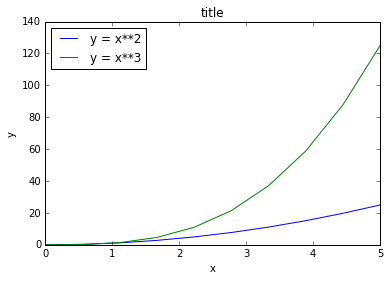
| fig, ax = plt.subplots()
ax.plot(x, x**2, label="y = x**2")
ax.plot(x, x**3, label="y = x**3")
ax.legend(loc=2); # upper left corner
ax.set_xlabel('x')
ax.set_ylabel('y')
ax.set_title('title'); |
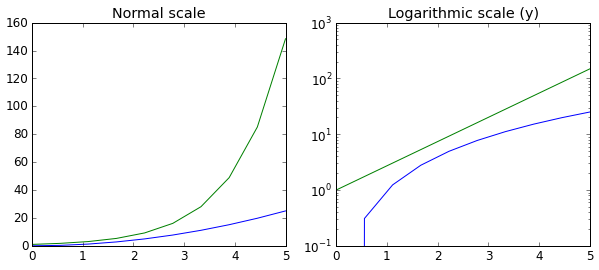
fig, axes = plt.subplots(1,
2, figsize=(10,4))
axes[0].plot(x, x**2, x, np.exp(x))
axes[0].set_title("Normal scale")
axes[1].plot(x, x**2, x, np.exp(x))
axes[1].set_yscale("log")
axes[1].set_title("Logarithmic scale (y)"); |
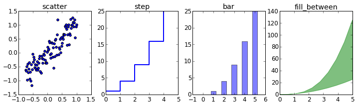
n = np.array([0,1,2,3,4,5])
In [47]:
fig, axes = plt.subplots(1, 4, figsize=(12,3))
axes[0].scatter(xx, xx + 0.25*np.random.randn(len(xx)))
axes[0].set_title("scatter")
axes[1].step(n, n**2, lw=2)
axes[1].set_title("step")
axes[2].bar(n, n**2, align="center",
width=0.5, alpha=0.5)
axes[2].set_title("bar")
axes[3].fill_between(x, x**2, x**3, color="green",
alpha=0.5);
axes[3].set_title("fill_between");
|
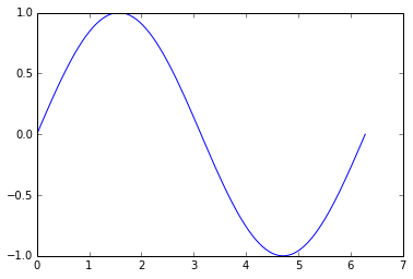
Using Numpy
In [17]:
x = np.linspace(0, 2*np.pi, 100)
y =np.sin(x)
plt.plot(x,y)
Out[17]:
[<matplotlib.lines.Line2D at 0x579aef0>]
|
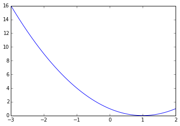
In [24]:
x= np.linspace(-3,2, 200)
Y = x ** 2 - 2 * x + 1.
plt.plot(x,Y)
Out[24]:
[<matplotlib.lines.Line2D at 0x6ffb310>]
|
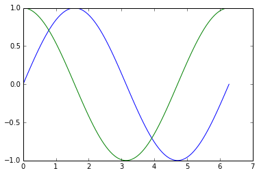
In [32]:
# plotting multiple plots
x =np.linspace(0, 2 * np.pi, 100)
y = np.sin(x)
z = np.cos(x)
plt.plot(x,y)
plt.plot(x,z)
plt.show()
# Matplot lib picks different colors for different
plot. |
In [35]:
cd C:\Users\tk\Desktop\Matplot
C:\Users\tk\Desktop\Matplot
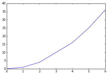
In [39]:
data = np.loadtxt('numpy.txt')
plt.plot(data[:,0], data[:,1]) # plotting column
1 vs column 2
# The text in the numpy.txt should look like this
# 0 0
# 1 1
# 2 4
# 4 16
# 5 25
# 6 36
Out[39]:
[<matplotlib.lines.Line2D at 0x740f090>]
|
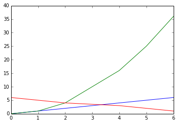
In [56]:
data1 = np.loadtxt('scipy.txt') # load the file
print data1.T
for val in data1.T: #loop over each and every
value in data1.T
plt.plot(data1[:,0], val) #data1[:,0] is the
first row in data1.T
# data in scipy.txt looks like this:
# 0 0 6
# 1 1 5
# 2 4 4
# 4 16 3
# 5 25 2
# 6 36 1
[[ 0. 1. 2. 4. 5. 6.]
[ 0. 1. 4. 16. 25. 36.]
[ 6. 5. 4. 3. 2. 1.]] |
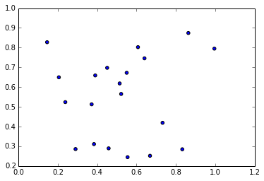
Scatter Plots and Bar Graphs
In [64]:
sct = np.random.rand(20, 2)
print sct
plt.scatter(sct[:,0], sct[:,1]) # I am plotting
a scatter plot.
[[ 0.51454542 0.61859101]
[ 0.45115993 0.69774873]
[ 0.29051205 0.28594808]
[ 0.73240446 0.41905186]
[ 0.23869394 0.5238878 ]
[ 0.38422814 0.31108919]
[ 0.52218967 0.56526379]
[ 0.60760426 0.80247073]
[ 0.37239096 0.51279078]
[ 0.45864677 0.28952167]
[ 0.8325996 0.28479446]
[ 0.14609382 0.8275477 ]
[ 0.86338279 0.87428696]
[ 0.55481585 0.24481165]
[ 0.99553336 0.79511137]
[ 0.55025277 0.67267026]
[ 0.39052024 0.65924857]
[ 0.66868207 0.25186664]
[ 0.64066313 0.74589812]
[ 0.20587731 0.64977807]]
Out[64]:
<matplotlib.collections.PathCollection at 0x78a7110>
|
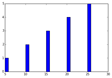
In [65]:
ghj =[5, 10 ,15, 20, 25]
it =[ 1, 2, 3, 4, 5]
plt.bar(ghj, it) # simple bar graph
Out[65]:
<Container object of 5 artists> |
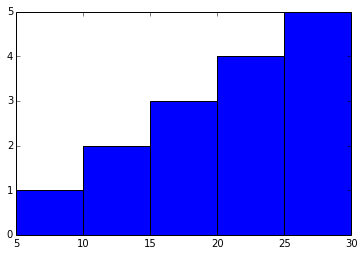
In [74]:
ghj =[5, 10 ,15, 20, 25]
it =[ 1, 2, 3, 4, 5]
plt.bar(ghj, it, width =5)# you can change the
thickness of a bar, by default the bar will have
a thickness of 0.8 units
Out[74]:
<Container object of 5 artists> |
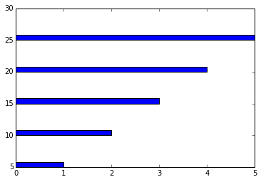
In [75]:
ghj =[5, 10 ,15, 20, 25]
it =[ 1, 2, 3, 4, 5]
plt.barh(ghj, it) # barh is a horizontal bar graph
Out[75]:
<Container object of 5 artists> |
In [95]:
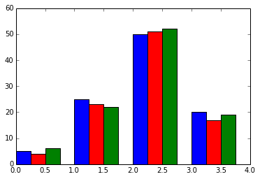
new_list = [[5., 25., 50., 20.], [4., 23., 51.,
17.], [6., 22., 52., 19.]]
x = np.arange(4)
plt.bar(x + 0.00, new_list[0], color ='b', width
=0.25)
plt.bar(x + 0.25, new_list[1], color ='r', width
=0.25)
plt.bar(x + 0.50, new_list[2], color ='g', width
=0.25)
#plt.show() |
In [100]:
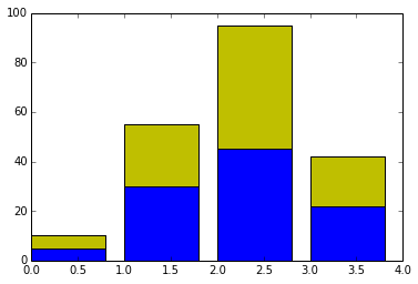
#Stacked Bar charts
p = [5., 30., 45., 22.]
q = [5., 25., 50., 20.]
x =range(4)
plt.bar(x, p, color ='b')
plt.bar(x, q, color ='y', bottom =p)
Out[100]:
<Container object of 4 artists> |
In [35]:
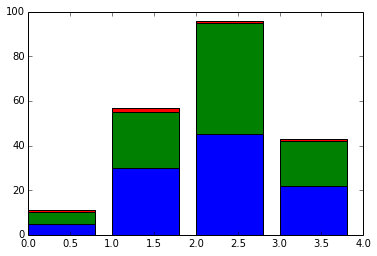
# plotting more than 2 values
A = np.array([5., 30., 45., 22.])
B = np.array([5., 25., 50., 20.])
C = np.array([1., 2., 1., 1.])
X = np.arange(4)
plt.bar(X, A, color = 'b')
plt.bar(X, B, color = 'g', bottom = A)
plt.bar(X, C, color = 'r', bottom = A + B) # for
the third argument, I use A+B
plt.show() |
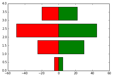
In [94]:
black_money = np.array([5., 30., 45., 22.])
white_money = np.array([5., 25., 50., 20.])
z = np.arange(4)
plt.barh(z, black_money, color ='g')
plt.barh(z, -white_money, color ='r')# - notation
is needed for generating, back to back charts
Out[94]:
<Container object of 4 artists> |
Other Plots
In [114]:
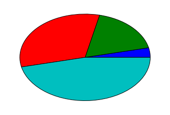
#Pie charts
y = [5, 25, 45, 65]
plt.pie(y)
Out[114]:
([<matplotlib.patches.Wedge at 0x7a19d50>,
<matplotlib.patches.Wedge at 0x7a252b0>,
<matplotlib.patches.Wedge at 0x7a257b0>,
<matplotlib.patches.Wedge at 0x7a25cb0>],
[<matplotlib.text.Text at 0x7a25070>,
<matplotlib.text.Text at 0x7a25550>,
<matplotlib.text.Text at 0x7a25a50>,
<matplotlib.text.Text at 0x7a25f50>]) |
In [115]:
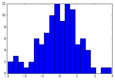
#Histograms
d = np.random.randn(100)
plt.hist(d, bins = 20)
Out[115]:
(array([ 2., 3., 2., 1., 2., 6., 5., 7., 10.,
12., 9.,
12., 11., 5., 6., 4., 1., 0., 1., 1.]),
array([-2.9389701 , -2.64475645, -2.35054281,
-2.05632916, -1.76211551,
-1.46790186, -1.17368821, -0.87947456, -0.58526092,
-0.29104727,
0.00316638, 0.29738003, 0.59159368, 0.88580733,
1.18002097,
1.47423462, 1.76844827, 2.06266192, 2.35687557,
2.65108921,
2.94530286]),
<a list of 20 Patch objects>)
|
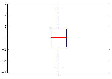
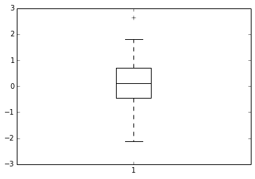
In [116]:
d = np.random.randn(100)
plt.boxplot(d)
#1) The red bar is the median of the distribution
#2) The blue box includes 50 percent of the data
from the lower quartile to the upper quartile.
# Thus, the box is centered on the median of the
data.
Out[116]:
{'boxes': [<matplotlib.lines.Line2D at 0x7cca090>],
'caps': [<matplotlib.lines.Line2D at 0x7c02d70>,
<matplotlib.lines.Line2D at 0x7cc2c90>],
'fliers': [<matplotlib.lines.Line2D at 0x7cca850>,
<matplotlib.lines.Line2D at 0x7ccae10>],
'medians': [<matplotlib.lines.Line2D at 0x7cca470>],
'whiskers': [<matplotlib.lines.Line2D at 0x7c02730>,
<matplotlib.lines.Line2D at 0x7cc24b0>]}
|
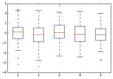
In [118]:
d = np.random.randn(100, 5) # generating multiple
box plots
plt.boxplot(d)
Out[118]:
{'boxes': [<matplotlib.lines.Line2D at 0x7f49d70>,
<matplotlib.lines.Line2D at 0x7ea1c90>,
<matplotlib.lines.Line2D at 0x7eafb90>,
<matplotlib.lines.Line2D at 0x7ebea90>,
<matplotlib.lines.Line2D at 0x7ece990>],
'caps': [<matplotlib.lines.Line2D at 0x7f2b3b0>,
<matplotlib.lines.Line2D at 0x7f49990>,
<matplotlib.lines.Line2D at 0x7ea14d0>,
<matplotlib.lines.Line2D at 0x7ea18b0>,
<matplotlib.lines.Line2D at 0x7eaf3d0>,
<matplotlib.lines.Line2D at 0x7eaf7b0>,
<matplotlib.lines.Line2D at 0x7ebe2d0>,
<matplotlib.lines.Line2D at 0x7ebe6b0>,
<matplotlib.lines.Line2D at 0x7ece1d0>,
<matplotlib.lines.Line2D at 0x7ece5b0>],
'fliers': [<matplotlib.lines.Line2D at 0x7e98550>,
<matplotlib.lines.Line2D at 0x7e98930>,
<matplotlib.lines.Line2D at 0x7ea8470>,
<matplotlib.lines.Line2D at 0x7ea8a10>,
<matplotlib.lines.Line2D at 0x7eb6370>,
<matplotlib.lines.Line2D at 0x7eb6730>,
<matplotlib.lines.Line2D at 0x7ec6270>,
<matplotlib.lines.Line2D at 0x7ec6810>,
<matplotlib.lines.Line2D at 0x8030170>,
<matplotlib.lines.Line2D at 0x8030710>],
'medians': [<matplotlib.lines.Line2D at 0x7e98170>,
<matplotlib.lines.Line2D at 0x7ea8090>,
<matplotlib.lines.Line2D at 0x7eaff70>,
<matplotlib.lines.Line2D at 0x7ebee70>,
<matplotlib.lines.Line2D at 0x7eced70>],
'whiskers': [<matplotlib.lines.Line2D at 0x7f2bb50>,
<matplotlib.lines.Line2D at 0x7f491b0>,
<matplotlib.lines.Line2D at 0x7e98cf0>,
<matplotlib.lines.Line2D at 0x7ea10f0>,
<matplotlib.lines.Line2D at 0x7ea8bf0>,
<matplotlib.lines.Line2D at 0x7ea8fd0>,
<matplotlib.lines.Line2D at 0x7eb6cd0>,
<matplotlib.lines.Line2D at 0x7eb6ed0>,
<matplotlib.lines.Line2D at 0x7ec6bd0>,
<matplotlib.lines.Line2D at 0x7ec6dd0>]}
|
2nd ВПЗж:
%matplotlib inline
import numpy as np
import matplotlib.pyplot as plt
In [22]:
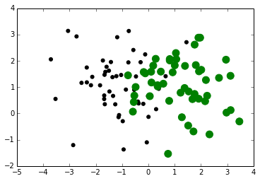
p =np.random.standard_normal((50,2))
p += np.array((-1,1)) # center the distribution
at (-1,1)
q =np.random.standard_normal((50,2))
q += np.array((1,1)) #center the distribution
at (-1,1)
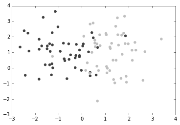
plt.scatter(p[:,0], p[:,1], color ='.25')
plt.scatter(q[:,0], q[:,1], color = '.75')
Out[22]:
<matplotlib.collections.PathCollection at
0x71dab90>
|
In [34]:
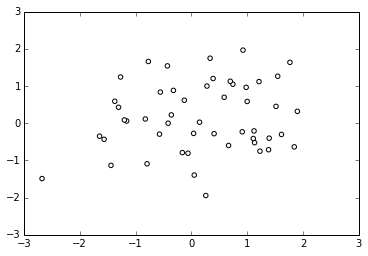
dd =np.random.standard_normal((50,2))
plt.scatter(dd[:,0], dd[:,1], color ='1.0', edgecolor
='0.0') # edge color controls the color of the
edge
Out[34]:
<matplotlib.collections.PathCollection at 0x7336670>
|
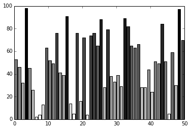
Custom Color for Bar charts,Pie charts
and box plots:
| The below bar
graph, plots x(1 to 50) (vs) y(50 random integers,
within 0-100. But you need different colors for
each value. For which we create a list containing
four colors(color_set). The list comprehension
creates 50 different color values from color_set
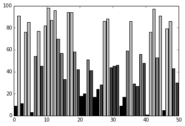
In [9]:
vals = np.random.random_integers(99, size =50)
color_set = ['.00', '.25', '.50','.75']
color_lists = [color_set[(len(color_set)* val)
// 100] for val in vals]
c = plt.bar(np.arange(50), vals, color = color_lists)
|
In [8]:
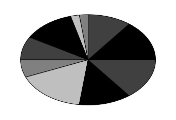
hi =np.random.random_integers(8, size =10)
color_set =['.00', '.25', '.50', '.75']
plt.pie(hi, colors = color_set)# colors attribute
accepts a range of values
plt.show()
#If there are less colors than values, then pyplot.pie()
will simply cycle through the color list. In the
preceding
#example, we gave a list of four colors to color
a pie chart that consisted of eight values. Thus,
each color will be used twice |
In [27]:
values = np.random.randn(100)
w = plt.boxplot(values)
for att, lines in w.iteritems():
for l in lines:
l.set_color('k') |
Color Maps
| know more about
hsv
In [34]:
# how to color scatter plots
#Colormaps are defined in the matplotib.cm module.
This module provides
#functions to create and use colormaps. It also
provides an exhaustive choice of predefined
color maps.
import matplotlib.cm as cm
N = 256
angle = np.linspace(0, 8 * 2 * np.pi, N)
radius = np.linspace(.5, 1., N)
X = radius * np.cos(angle)
Y = radius * np.sin(angle)
plt.scatter(X,Y, c=angle, cmap = cm.hsv)
Out[34]:
<matplotlib.collections.PathCollection at
0x714d9f0> |
In [44]:
#Color in bar graphs
import matplotlib.cm as cm
vals = np.random.random_integers(99, size =50)
cmap = cm.ScalarMappable(col.Normalize(0,99),
cm.binary)
plt.bar(np.arange(len(vals)),vals, color =cmap.to_rgba(vals))
Out[44]:
<Container object of 50 artists> |
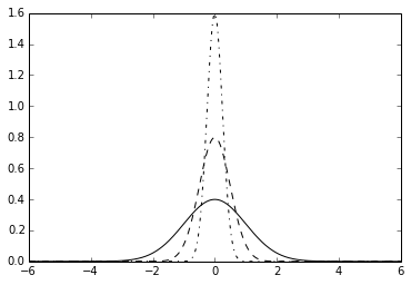
Line Styles
In [4]:
# I am creating 3 levels of gray plots, with different
line shades
def pq(I, mu, sigma):
a = 1. / (sigma * np.sqrt(2. * np.pi))
b = -1. / (2. * sigma ** 2)
return a * np.exp(b * (I - mu) ** 2)
I =np.linspace(-6,6, 1024)
plt.plot(I, pq(I, 0., 1.), color = 'k', linestyle
='solid')
plt.plot(I, pq(I, 0., .5), color = 'k', linestyle
='dashed')
plt.plot(I, pq(I, 0., .25), color = 'k', linestyle
='dashdot')
Out[4]:
[<matplotlib.lines.Line2D at 0x562ffb0>]
|
In [12]:
N = 15
A = np.random.random(N)
B= np.random.random(N)
X = np.arange(N)
plt.bar(X, A, color ='.75')
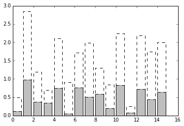
plt.bar(X, A+B , bottom = A, color ='W', linestyle
='dashed') # plot a bar graph
plt.show() |
In [20]:
def gf(X, mu, sigma):
a = 1. / (sigma * np.sqrt(2. * np.pi))
b = -1. / (2. * sigma ** 2)
return a * np.exp(b * (X - mu) ** 2)
X = np.linspace(-6, 6, 1024)
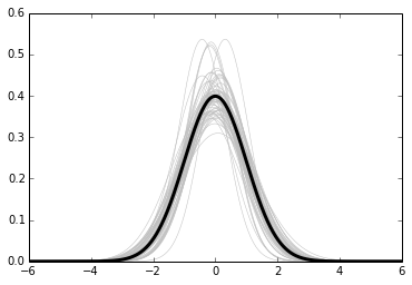
for i in range(64):
samples = np.random.standard_normal(50)
mu,sigma = np.mean(samples), np.std(samples)
plt.plot(X, gf(X, mu, sigma), color = '.75',
linewidth = .5)
plt.plot(X, gf(X, 0., 1.), color ='.00', linewidth
= 3.)
Out[20]:
[<matplotlib.lines.Line2D at 0x59fbab0>]
|
Fill surfaces with pattern
In [27]:
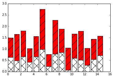
N = 15
A = np.random.random(N)
B= np.random.random(N)
X = np.arange(N)
plt.bar(X, A, color ='w', hatch ='x')
plt.bar(X, A+B,bottom =A, color ='r', hatch ='/')
# some other hatch attributes are :
#/
#\
#|
#-
#+
#x
#o
#O
#.
#*
Out[27]:
<Container object of 15 artists> |
Marker styles
In [29]:
cd C:\Users\tk\Desktop\Matplot
C:\Users\tk\Desktop\Matplot |
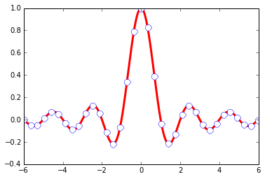
In [14]:
X= np.linspace(-6,6,1024)
Ya =np.sinc(X)
Yb = np.sinc(X) +1
plt.plot(X, Ya, marker ='o', color ='.75')
plt.plot(X, Yb, marker ='^', color='.00', markevery=
32)# this one marks every 32 nd element
Out[14]:
[<matplotlib.lines.Line2D at 0x7063150>]
|
Own Marker Shapes- come back to this
later
In [31]:
# Marker Size
A = np.random.standard_normal((50,2))
A += np.array((-1,1))
B = np.random.standard_normal((50,2))
B += np.array((1, 1))
plt.scatter(A[:,0], A[:,1], color ='k', s =25.0)
plt.scatter(B[:,0], B[:,1], color ='g', s =
100.0) # size of the marker is specified using
's' attribute
Out[31]:
<matplotlib.collections.PathCollection at
0x7d015f0> |
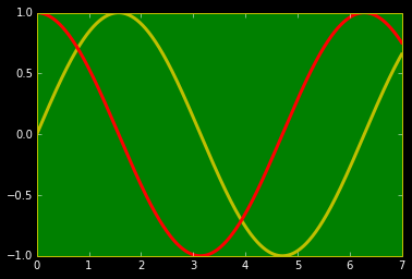
In [20]:
import matplotlib as mpl
mpl.rc('lines', linewidth =3)
mpl.rc('xtick', color ='w') # color of x axis
numbers
mpl.rc('ytick', color = 'w') # color of y axis
numbers
mpl.rc('axes', facecolor ='g', edgecolor ='y')
# color of axes
mpl.rc('figure', facecolor ='.00',edgecolor ='w')
# color of figure
mpl.rc('axes', color_cycle = ('y','r')) # color
of plots
x = np.linspace(0, 7, 1024)
plt.plot(x, np.sin(x))
plt.plot(x, np.cos(x))
Out[20]:
[<matplotlib.lines.Line2D at 0x7b0fb70>]
|
3rd ВПЗж:
ЭМЕФзЂЪЭ--АќКЌШєИЩЭМЃЌПижЦзјБъжсЗЖЮЇЃЌГЄПюБШКЭзјБъжсЁЃ
Annotation
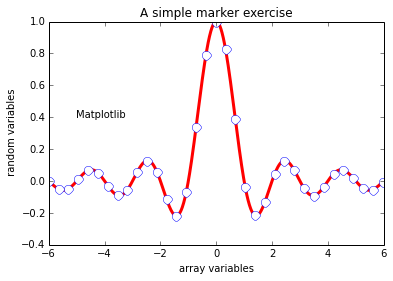
In [1]:
%matplotlib inline
import numpy as np
import matplotlib.pyplot as plt
In [28]:
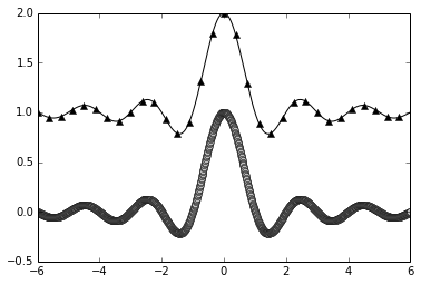
X =np.linspace(-6,6, 1024)
Y =np.sinc(X)
plt.title('A simple marker exercise')# a title
notation
plt.xlabel('array variables') # adding xlabel
plt.ylabel(' random variables') # adding ylabel
plt.text(-5, 0.4, 'Matplotlib') # -5 is the x
value and 0.4 is y value
plt.plot(X,Y, color ='r', marker ='o', markersize
=9, markevery = 30, markerfacecolor='w', linewidth
= 3.0, markeredgecolor = 'b')
Out[28]:
[<matplotlib.lines.Line2D at 0x84b6430>]
|
In [39]:
def pq(I, mu, sigma):
a = 1. / (sigma * np.sqrt(2. * np.pi))
b = -1. / (2. * sigma ** 2)
return a * np.exp(b * (I - mu) ** 2)
I =np.linspace(-6,6, 1024)
plt.plot(I, pq(I, 0., 1.), color = 'k', linestyle
='solid')
plt.plot(I, pq(I, 0., .5), color = 'k', linestyle
='dashed')
plt.plot(I, pq(I, 0., .25), color = 'k', linestyle
='dashdot')
# I have created a dictinary of styles
design = {
'facecolor' : 'y', # color used for the text
box
'edgecolor' : 'g',
'boxstyle' : 'round'
}
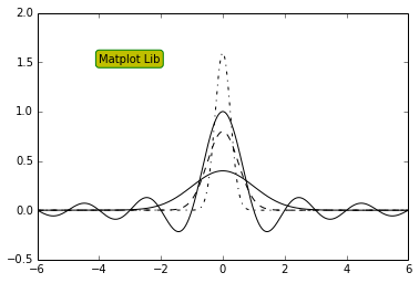
plt.text(-4, 1.5, 'Matplot Lib', bbox = design)
plt.plot(X, Y, c='k')
plt.show()
#This sets the style of the box, which can
either be 'round' or 'square'
#'pad': If 'boxstyle' is set to 'square', it
defines the amount of padding between the text
and the box's sides
|
Alignment Control
| The text is bound
by a box. This box is used to relatively align
the text to the coordinates passed to pyplot.text().
Using the verticalalignment and horizontalalignment
parameters (respective shortcut equivalents are
va and ha), we can control how the alignment is
done.
The vertical alignment options are as follows:
'center': This is relative to the center of
the textbox
'top': This is relative to the upper side of
the textbox
'bottom': This is relative to the lower side
of the textbox
'baseline': This is relative to the text's baseline
Horizontal alignment options are as follows:
align ='bottom' align ='baseline'
------------------------align = center--------------------------------------
align= 'top
In [41]:
cd C:\Users\tk\Desktop
C:\Users\tk\Desktop
In [44]:
from IPython.display import Image
Image(filename='text alignment.png')
#The horizontal alignment options are as follows:
#'center': This is relative to the center of
the textbox
#'left': This is relative to the left side of
the textbox
#'right': This is relative to the right-hand
side of the textbox
Out[44]: |
In [76]:
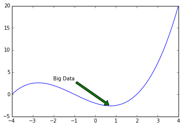
X = np.linspace(-4, 4, 1024)
Y = .25 * (X + 4.) * (X + 1.) * (X - 2.)
plt.annotate('Big Data',
ha ='center', va ='bottom',
xytext =(-1.5, 3.0), xy =(0.75, -2.7),
arrowprops ={'facecolor': 'green', 'shrink':0.05,
'edgecolor': 'black'}) #arrow properties
plt.plot(X, Y)
Out[76]:
[<matplotlib.lines.Line2D at 0x9d1def0>]
|
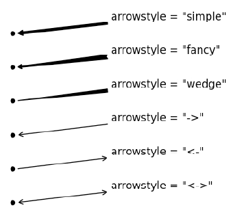
In [74]:
#arrow styles are :
from IPython.display import Image
Image(filename='arrows.png')
Out[74]: |
Legend properties:
'loc': This is the location of the legend. The
default value is 'best', which will place it automatically.
Other valid values are
'upper left', 'lower left', 'lower right', 'right',
'center left', 'center right', 'lower center',
'upper center', and 'center'.
'shadow': This can be either True or False,
and it renders the legend with a shadow effect.
'fancybox': This can be either True or False
and renders the legend with a rounded box.
'title': This renders the legend with the title
passed as a parameter.
'ncol': This forces the passed value to be
the number of columns for the legend
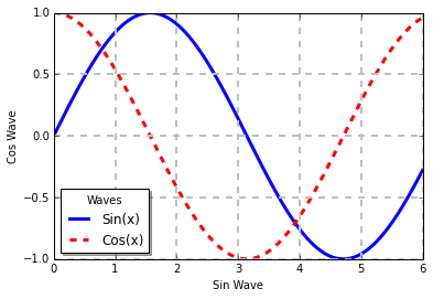
In [101]:
x =np.linspace(0, 6,1024)
y1 =np.sin(x)
y2 =np.cos(x)
plt.xlabel('Sin Wave')
plt.ylabel('Cos Wave')
plt.plot(x, y1, c='b', lw =3.0, label ='Sin(x)')
# labels are specified
plt.plot(x, y2, c ='r', lw =3.0, ls ='--', label
='Cos(x)')
plt.legend(loc ='best', shadow = True, fancybox
= False, title ='Waves', ncol =1) # displays
the labels
plt.grid(True, lw = 2, ls ='--', c='.75') #
adds grid lines to the figure
plt.show() |
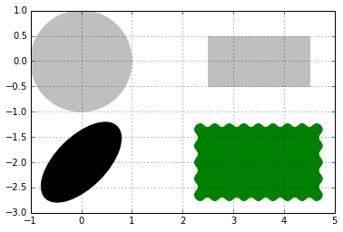
Shapes
In [4]:
#Paths for several kinds of shapes are available
in the matplotlib.patches module
import matplotlib.patches as patches
dis = patches.Circle((0,0), radius = 1.0, color
='.75' )
plt.gca().add_patch(dis) # used to render the
image.
dis = patches.Rectangle((2.5, -.5), 2.0, 1.0,
color ='.75') #patches.rectangle((x & y
coordinates), length, breadth)
plt.gca().add_patch(dis)
dis = patches.Ellipse((0, -2.0), 2.0, 1.0,
angle =45, color ='.00')
plt.gca().add_patch(dis)
dis = patches.FancyBboxPatch((2.5, -2.5), 2.0,
1.0, boxstyle ='roundtooth', color ='g')
plt.gca().add_patch(dis)
plt.grid(True)
plt.axis('scaled') # displays the images within
the prescribed axis
plt.show()
#FancyBox: This is like a rectangle but takes
an additional boxstyle parameter
#(either 'larrow', 'rarrow', 'round', 'round4',
'roundtooth', 'sawtooth', or 'square') |
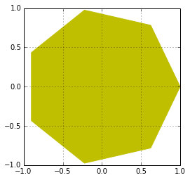
In [22]:
import matplotlib.patches as patches
theta = np.linspace(0, 2 * np.pi, 8) # generates
an array
vertical = np.vstack((np.cos(theta), np.sin(theta))).transpose()
# vertical stack clubs the two arrays.
#print vertical, print and see how the array looks
plt.gca().add_patch(patches.Polygon(vertical,
color ='y'))
plt.axis('scaled')
plt.grid(True)
plt.show()
#The matplotlib.patches.Polygon()constructor
takes a list of coordinates as the inputs, that
is, the vertices of the polygon |
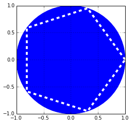
In [34]:
# a polygon can be imbided into a circle
theta = np.linspace(0, 2 * np.pi, 6) # generates
an array
vertical = np.vstack((np.cos(theta), np.sin(theta))).transpose()
# vertical stack clubs the two arrays.
#print vertical, print and see how the array looks
plt.gca().add_patch(plt.Circle((0,0), radius =1.0,
color ='b'))
plt.gca().add_patch(plt.Polygon(vertical, fill
=None, lw =4.0, ls ='dashed', edgecolor ='w'))
plt.axis('scaled')
plt.grid(True)
plt.show() |
In [54]:
#In matplotlib, ticks are small marks on both
the axes of a figure
import matplotlib.ticker as ticker
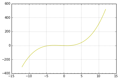
X = np.linspace(-12, 12, 1024)
Y = .25 * (X + 4.) * (X + 1.) * (X - 2.)
pl =plt.axes() #the object that manages the axes
of a figure
pl.xaxis.set_major_locator(ticker.MultipleLocator(5))
pl.xaxis.set_minor_locator(ticker.MultipleLocator(1))
plt.plot(X, Y, c = 'y')
plt.grid(True, which ='major') # which can take
three values: minor, major and both
plt.show() |
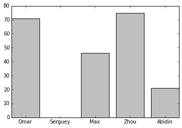
In [59]:
name_list = ('Omar', 'Serguey', 'Max', 'Zhou',
'
Abidin')
value_list = np.random.randint(0, 99, size =
len(name_list))
pos_list = np.arange(len(name_list))
ax = plt.axes()
ax.xaxis.set_major_locator(ticker.FixedLocator
((pos_list)))
ax.xaxis.set_major_formatter(ticker.FixedFormatter
((name_list)))
plt.bar(pos_list, value_list, color = '.75',align
=
'center')
plt.show() |
4th ВПЗж:
АќКЌСЫвЛаЉИДдгЭМаЮЁЃ
Working with figures
In [4]:
%matplotlib inline
import numpy as np
import matplotlib.pyplot as plt
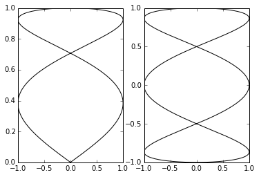
In [5]:
T = np.linspace(-np.pi, np.pi, 1024) #
fig, (ax0, ax1) = plt.subplots(ncols =2)
ax0.plot(np.sin(2 * T), np.cos(0.5 * T), c = 'k')
ax1.plot(np.cos(3 * T), np.sin(T), c = 'k')
plt.show() |
Setting aspect ratio
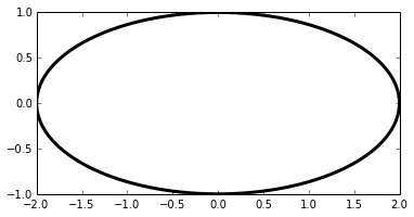
In [7]:
T = np.linspace(0, 2 * np.pi, 1024)
plt.plot(2. * np.cos(T), np.sin(T), c = 'k', lw
= 3.)
plt.axes().set_aspect('equal') # remove this line
of code and see how the figure looks
plt.show() |
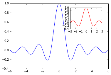
In [12]:
X = np.linspace(-6, 6, 1024)
Y1, Y2 = np.sinc(X), np.cos(X)
plt.figure(figsize=(10.24, 2.56)) #sets size of
the figure
plt.plot(X, Y1, c='r', lw = 3.)
plt.plot(X, Y2, c='.75', lw = 3.)
plt.show() |
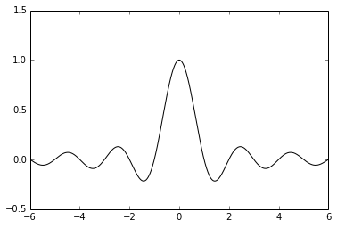
In [8]:
X = np.linspace(-6, 6, 1024)
plt.ylim(-.5, 1.5)
plt.plot(X, np.sinc(X), c = 'k')
plt.show() |
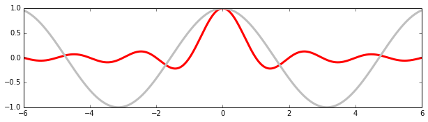
In [16]:
X = np.linspace(-6, 6, 1024)
Y = np.sinc(X)
X_sub = np.linspace(-3, 3, 1024)#coordinates of
subplot
Y_sub = np.sinc(X_sub) # coordinates of sub plot
plt.plot(X, Y, c = 'b')
sub_axes = plt.axes([.6, .6, .25, .25])# coordinates,
length and width of the subplot frame
sub_axes.plot(X_detail, Y_detail, c = 'r')
plt.show() |
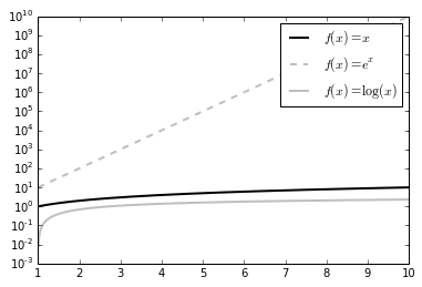
Log Scale
In [20]:
X = np.linspace(1, 10, 1024)
plt.yscale('log') # set y scale as log. we would
use plot.xscale()
plt.plot(X, X, c = 'k', lw = 2., label = r'$f(x)=x$')
plt.plot(X, 10 ** X, c = '.75', ls = '--', lw
= 2., label = r'$f(x)=e^x$')
plt.plot(X, np.log(X), c = '.75', lw = 2., label
= r'$f(x)=\log(x)$')
plt.legend()
plt.show()
#The logarithm base is 10 by default, but it
can be changed with the optional parameters
basex and basey. |
Polar Coordinates
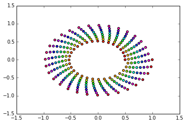
In [23]:
T = np.linspace(0 , 2 * np.pi, 1024)
plt.axes(polar = True) # show polar coordinates
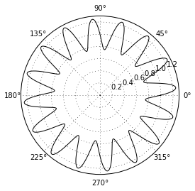
plt.plot(T, 1. + .25 * np.sin(16 * T), c= 'k')
plt.show() |
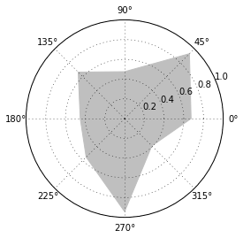
In [25]:
import matplotlib.patches as patches # import
patch module from matplotlib
ax = plt.axes(polar = True)
theta = np.linspace(0, 2 * np.pi, 8, endpoint
= False)
radius = .25 + .75 * np.random.random(size = len(theta))
points = np.vstack((theta, radius)).transpose()
plt.gca().add_patch(patches.Polygon(points, color
= '.75'))
plt.show() |
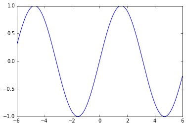
In [2]:
x = np.linspace(-6,6,1024)
y= np.sin(x)
plt.plot(x,y)
plt.savefig('bigdata.png', c= 'y', transparent
= True) #savefig function writes that data to
a file
# will create a file named bigdata.png. Its resolution
will be 800 x 600 pixels, in 8-bit colors (24-bits
per pixel) |
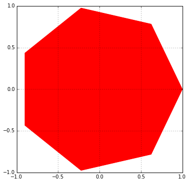
In [3]:
theta =np.linspace(0, 2 *np.pi, 8)
points =np.vstack((np.cos(theta), np.sin(theta))).T
plt.figure(figsize =(6.0, 6.0))
plt.gca().add_patch(plt.Polygon(points, color
='r'))
plt.axis('scaled')
plt.grid(True)
plt.savefig('pl.png', dpi =300) # try 'pl.pdf',
pl.svg'
#dpi is dots per inch. 300*8 x 6*300 = 2400 x
1800 pixels |
змНс
ФубЇЯАPythonЪБФмЗИЕФзюМђЕЅЕФДэЮѓжЎвЛОЭЪЧЭЌЪБШЅГЂЪдбЇЯАЙ§ЖрЕФПтЁЃЕБФуХЌСІвЛЯТзгбЇЛсУПбљЖЋЮїЪБЃЌФуЛсЛЈЗбКмЖрЪБМфРДЧаЛЛетаЉВЛЭЌИХФюжЎМфЃЌБфЕУОкЩЅЃЌзюКѓзЊвЦЕНЦфЫћЪТЧщЩЯЁЃ
ЫљвдЃЌМсГжЙизЂетИіЙ§ГЬЃК
1.РэНтPythonЛљДЁ
2.бЇЯАNumpy
3.бЇЯАPandas
4.бЇЯАMatplolib |