| БрМЭЦМі: |
| РДдДcsdn
,ЮФеТЭЈЙ§УРЙњЙйЗНЭјеОЕФМИИіАИР§ЯъЯИНВНтСЫPythonЪ§ОнЗжЮіЃЌНщЩмНЯЮЊЯъЯИЃЌИќЖрФкШнЧыВЮдФЯТЮФЁЃ |
|
import json
import numpy as np
import pandas as pd
import matplotlib.pyplot as plt |
1.USA.gov Data from Bitly
ДЫЪ§ОнЪЧУРЙњЙйЗНЭјеОДггУЛЇФЧЫбМЏЕНЕФФфУћЪ§ОнЁЃ
path='datasets/bitly_usagov/example.txt'
data=[json.loads(line) for line in open(path)]
df=pd.DataFrame(data) |

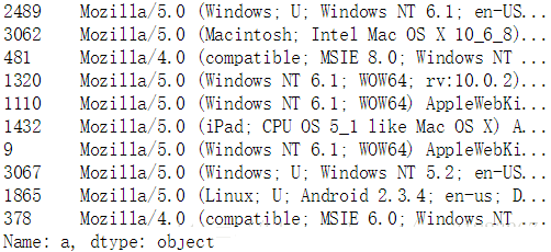
tzзжЖЮАќКЌЕФЪЧЪБЧјаХЯЂЁЃ
| df.loc[:,'tz'].value_counts()[:10] |
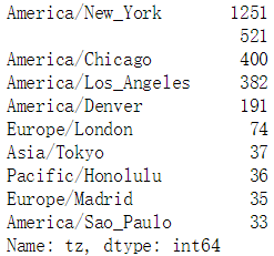
ИљОнinfo()гыvalue_counts()ЕФЗЕЛиНсЙћРДПДЃЌtzСаДцдкШБЪЇжЕгыПежЕЃЌЪзЯШЬюГфШБЪЇжЕЃЌШЛКѓДІРэПежЕЃК
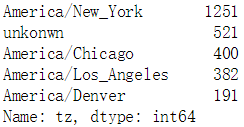
clean_tz=df.loc[:,'tz'].fillna('missing')
clean_tz.loc[clean_tz=='']='unkonwn'
clean_tz.value_counts()[:5] |
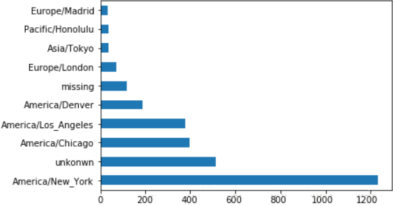
plt.clf()
subset=clean_tz.value_counts()[:10]
subset.plot.barh()
plt.show() |
aзжЖЮАќКЌЕФЪЧфЏРРЦїЁЂЩшБИгыгІгУЕШаХЯЂЁЃ
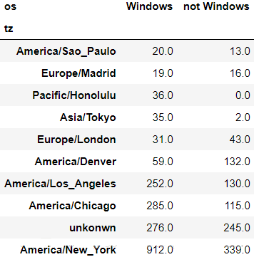
МйЩшЮвУЧашвЊЭГМЦwindowsгыЗЧwindowsЕФЯрЙиСПЃЌЮвУЧвЊзЅШЁaзжЖЮжаЕФЁЏWindowsЁЏзжЗћДЎЁЃвђЮЊaзжЖЮЭЌбљДцдкШБЪЇжЕЃЌетРяЮвУЧбЁдёЖЊЦњШБЪЇжЕЃК
clean_df=df[df.loc[:,'a'].notnull()]
mask=clean_df.loc[:,'tz']==''
clean_df.loc[:,'tz'].loc[mask]='unkonwn'
mask=clean_df.loc[:,'a'].str.contains('Windows')
clean_df.loc[:,'os']=np.where(mask,'Windows','not
Windows')
clean_df.drop('a',axis=1,inplace=True)
|
by_tz_os=clean_df.groupby(['tz','os'])
tz_os_counts=by_tz_os.size().unstack().fillna(0)
indexer=tz_os_counts.sum(axis=1).argsort() #ЗЕЛиХХађКѓЕФЫїв§СаБэ
tz_os_counts_subset=tz_os_counts.take(indexer[-10:])
#ШЁЕУЫїв§СаБэЕФКѓЪЎЬѕ
tz_os_counts_subset
|
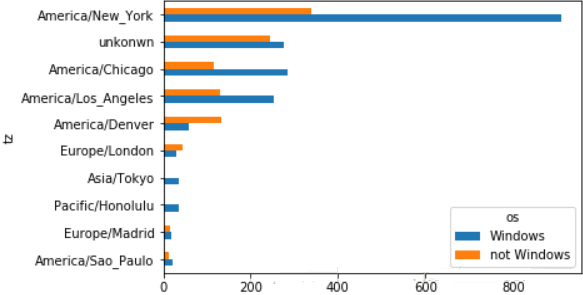
plt.clf()
tz_os_counts_subset.plot.barh()
plt.show()
|
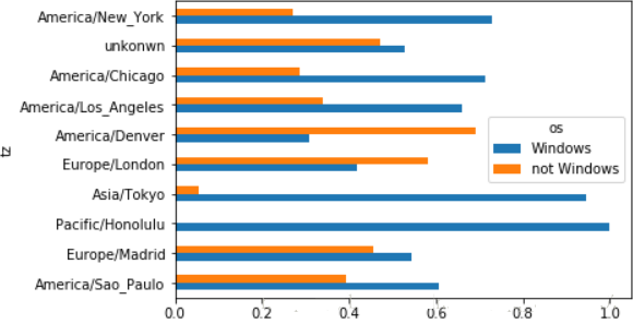
вђЮЊВЛЭЌЕиЧјЕФЪ§СПВювьаќЪтЃЌШчЙћЮвУЧвЊИќЧхГўЕУВщПДЯЕЭГВювьЃЌЛЙашвЊНЋЪ§ОнНјааЙщвЛЛЏЃК
tz_os_counts_subset_norm = tz_os_counts_subset.values / tz_os_counts_subset.sum (axis=1).values.reshape (10,1)
#зЊЛЛГЩnumpyЪ§зщРДМЦЫуАйЗжБШ
tz_os_counts_subset_norm= pd.DataFrame (tz_os_counts_subset_norm,
index= tz_os_counts_subset.index,
columns= tz_os_counts_subset.columns)
|
plt.clf()
tz_os_counts_subset_norm.plot.barh()
plt.show() |
# MovieLens
rating_col=['UserID','MovieID','Rating','Timestamp']
user_col=['UserID','Gender','Age','Occupation','Zip-code']
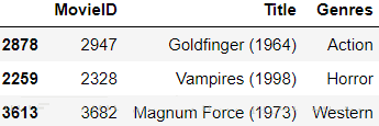
movie_col=['MovieID','Title','Genres']
ratings=pd.read_table ('datasets/movielens/ratings.dat', header=None,sep='::',names=rating_col,engine='python')
users=pd.read_table ('datasets/movielens/users.dat', header=None,sep='::',names=user_col,engine='python')
movies=pd.read_table ('datasets/movielens/movies.dat', header=None,sep='::',names=movie_col,engine='python')
|
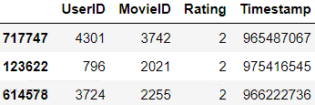

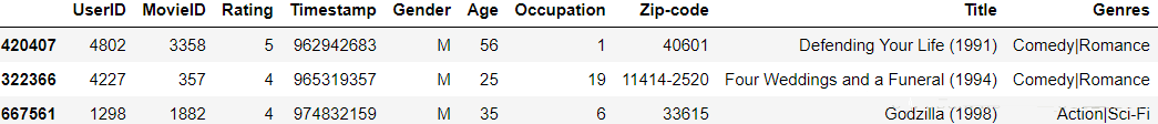
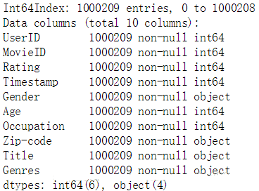
data=pd.merge(pd.merge(ratings,users),movies)
data.sample(3) |
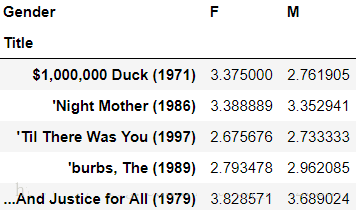
МгШыашвЊЛёЕУВЛЭЌадБ№ЖдгкИїЕчгАЕФЦНОљДђЗжЃЌЪЙгУЭИЪгБэОЭПЩвджБНгЕУЕННсЙћЃК
mean_ratings= data.pivot_table ('Rating',index='Title', columns='Gender', aggfunc='mean')
mean_ratings[:5] |
ЕчгАжаЛсДцдкРфУХзїЦЗЃЌЮвУЧПДвЛЯТЦРЗжЪ§ОнжаИїЕчгАБЛЦРМлЕФДЮЪ§ЖМгаЖрЩйЃК
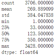
by_title=data.groupby('Title').size()
by_title.describe() |
ЮвУЧвдЖўЗжЮЛЕуЮЊЗжИюЯпЃЌШЁГіЦРЗжЪ§СПдкЖўЗжЮЛЕужЎЩЯЕФЕчгАЃК
mask=by_title>=250
#зЂвтby_titleЪЧвЛИіSeries
active_titles=by_title.index[mask]
mean_ratings=mean_ratings.loc[active_titles,:] |
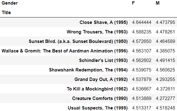
ЯТУцСаГіХЎадЙлжкзюЯВАЎЕФЕчгАЃК
top_female_tarings= mean_ratings.sort_values (by='F',ascending=False)[:10]
top_female_tarings |
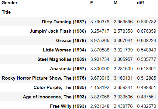
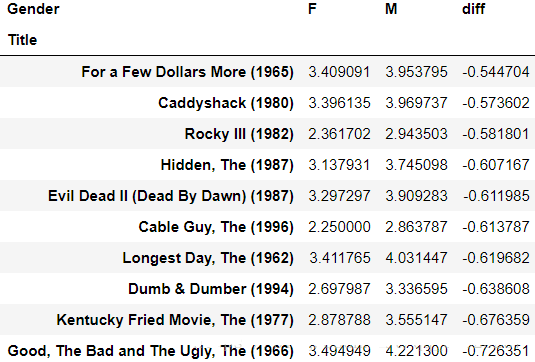
ЯТУцРДПДвЛЯТФаХЎЖдгкИїгАЦЌЕФЦРЗжВювьЃК
mean_ratings.loc[:,'diff'] =mean_ratings.loc[:,'F']-mean_ratings.loc[:,'M']
sorted_by_diff=mean_ratings.sort_values(by='diff',ascending=False)
sorted_by_diff[:10]
|
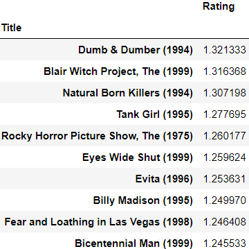
НгЯТРДЮвУЧЭГМЦФЧаЉЦРЗжељвщНЯДѓЕФгАЦЌЃЌratingЕФЗНВюдНДѓЫЕУїељвщдНДѓЃК
rating_std=data.pivot_table ('Rating',index='Title',aggfunc='std' ).loc[ active_titles,:]
rating_std.sort_values(by= 'Rating',ascending=False)[:10]
|
# US Baby Names
years=range(1880,2017)
subsets=[]
column=['name','gender','number']
for year in years:
path='datasets/babynames/yob{}.txt'.format(year)
df=pd.read_csv(path,header=None,names=column)
df.loc[:,'year']=year #ДЫДІзЂвтyearетвЛСаЕФжЕЮЊећЪ§РраЭ
subsets.append(df)
names=pd.concat(subsets,ignore_index=True) #ЦДНгЖрИіdfВЂжиаТБрХХааКХ
|
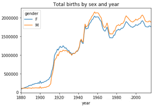
ЮвУЧЯШИљОнДЫЪ§ОнРДДѓжТЙлВьвЛЯТУПФъЕФФаХЎГіЩњЧщПіЃК
birth_by_gender=pd.pivot_table (names,values='number', index='year', columns='gender',aggfunc='sum')
plt.clf()
birth_by_gender.plot(title='Total births by sex
and year')
plt.show()
|
ЮвУЧдкЪ§ОнжадіМгвЛИіБШР§ЯЕЪ§ЃЌетИіБШР§ФмЯдЪОФГИіУћзждкетвЛФъФкеМФГИіадБ№ЕФБШР§ЃК
def add_prop(group):
group.loc[:,'prop']= group.loc[:,'number']/group.loc [:,'number'].sum()
return group
|
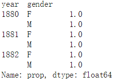
names_with_prop=names.groupby(['year','gender']).apply(add_prop)
#зЂвтgroupbyгыpivot_tableЕФЧјБ№
names_with_prop.groupby(['year','gender'])['prop'].sum()[:6]
#е§ШЗадМьВщ,зЂвтgroupbyгыpivot_tableЕФЧјБ№
|
ЯТУцШЁГіАДyearгыgenderЗжзщКѓЕФзюЪмЛЖгЕФЧА100ИіУћзжЃК
def get_top(group,n=100):
return group.sort_values(by='number',ascending=False)[:n]
|
groupby_obj=names_with_prop.groupby(['year','gender'])
top100=groupby_obj.apply(get_top)
top100.reset_index(drop=True,inplace=True) #ЖЊЦњвђЗжзщВњЩњЕФааЫїв§
top100[:5]
|

НгЯТРДЮвУЧЪЙгУетаЉзюГЃМћЕФУћзжРДзіИќЩюШыЕФЗжЮіЃК
total_birth=pd.pivot_table(top100,values='number', index='year', columns='name')
total_birth.fillna (0,inplace=True) |
ЮвУЧбЁШЁМИИіЗЧГЃОпгаДњБэадЕФУћзжЃЌРДЙлВьетаЉУћзжИљОнФъЗнЕФБфЛЏЧїЪЦЃК
subset=total_birth.loc[:,['John','Harry','Mary','Marilyn']]
subset.plot(subplots=True,title='Number of birth
per year')
plt.show() |
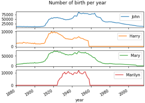
ПЩвдПДГіетМИИіУћзждкЬиЖЈЕФЪБЦкГіЯжСЫОЎХчЯжЯѓЃЌЕЋдНППНќЯждкЕФЪБМфЖЮЃЌетаЉУћзжГіЯжЕФЦЕТЪдНЕЭЃЌетПЩФмЫЕУїМвГЄУЧИјБІБІЦ№УћзжВЛдйЫцДѓСїЁЃЯТУцРДбщжЄетИіЯыЗЈЃК
ЛљБОЫМЯыЪЧЪЙгУУћзжЦЕТЪЕФЗжЮЛЪ§ЃЌЪ§ОнЕФЗжЮЛЪ§ФмДѓжТЬхЯжГіЪ§ОнЕФЗжВМЃЌШчЙћЪ§ОндкФГвЛЖЮЬиБ№УмМЏЃЌдђФГСНИіЗжЮЛЪ§ПЯЖЈППЕФЬиБ№НќЃЌЛђепЗжЮЛЪ§ЕФађКХЛсЦЋРыБъзМжЕЗЧГЃдЖЁЃ
ЯШвдФаКЂЮЊР§ЃЌШЁСНИіФъЗнРДМђЕЅбщжЄЯТвдЩЯВТЯыЃК
boys=top100[top100.loc[:,'gender']=='M']
boys[boys.loc[:,'year']==1940].sort_values (by='prop').loc[:,'prop'].describe() |
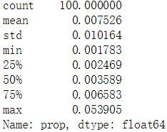
гЩЩЯЪіЪ§ОнПЩвдПДЕНЃЌpropЕФзюДѓжЕЮЊ0.05ЃЌЫЕУїзюГЃМћЕФУћзжЕФПЩЙлВтТЪЮЊ5%ЃЌЖјЧвpropЕФОљжЕДІгк[75%,max]ЧјМфФкЃЌЫЕУїОјДѓЖрЪ§ЕФаТЩњЖљЙВЯэвЛИіКмаЁЕФУћзжГиЁЃ
| boys[boys.loc[:,'year'] ==2016].sort_values(by='prop' ).loc[:,'prop'].describe() |
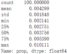
дк2016ФъЃЌpropЕФзюДѓжЕНЕЕНСЫ0.01ЃЌОљжЕДІгк[50%,75%]ЧјМфФкЃЌетЫЕУїаТЩњЖљЕФШЁУћИќЖрбљЛЏСЫЁЃ
ЯТУцЮвУЧРДМЦЫуеМОнаТЩњЖљЧА25%ЕФУћзжЪ§СПЃК
def get_quantile_index(group,q=0.25):
group=group.sort_values(by='prop',ascending=False)
sorted_arr=group.loc[:,'prop'].cumsum().values
index=sorted_arr.searchsorted(0.25)+1 #0ЮЊЦ№ЪМЕФЫїв§
return index
|
diversity=top100.groupby (['year','gender']).apply (get_quantile_index)
diversity=diversity.unstack()
|
plt.clf()
diversity.plot(title='number of popular names
in top 25%')
plt.show()
|
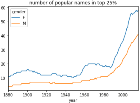
ПЩвдУїЯдПДГіЪБМфЯпдНППНќЯждкЃЌЧА25%ЕФаТЩњЖљУћзжЪ§СПвВдНЖрЃЌетШЗЪЕЫЕУїМвГЄУЧИјБІБІЦ№УћзжИќЖрбљЛЏСЫЁЃВЂЧвЛЙзЂвтЕНХЎКЂУћзжЕФЪ§СПзмЪЧЖргкФаКЂЁЃ
ЯТУцЗжЮіУћзжЕФзюКѓвЛИізжФИЃК
get_last_letter=lambda
x:x[-1]
last_letters=names.loc[:,'name'].map(get_last_letter)
#ЗЕЛивЛИіSeries
last_letters.name='last_letter'
letter_table=pd.pivot_table (names,values='number' ,index=last_letters,columns= ['gender','year'],aggfunc='sum')
letter_table.fillna(0,inplace=True)
|
ШЁГіШ§ИіФъЗнРДНјааДжТдЗжЮіЃК
subset=letter_table.reindex (columns=[1910,1960,2010], level='year')
#жиЫїв§
subset.fillna(0,inplace=True)
letter_prop_subset=subset/subset.sum(axis=0)
|
plt.clf()
fig,axes=plt.subplots(2,1,figsize=(10,8))
letter_prop_subset.loc [:,'M'].plot (kind='bar',rot=0,ax=axes[0],title='Boy')
letter_prop_subset.loc [:,'F'].plot (kind='bar',rot=0,ax=axes[1],title='Girl')
plt.show()
|
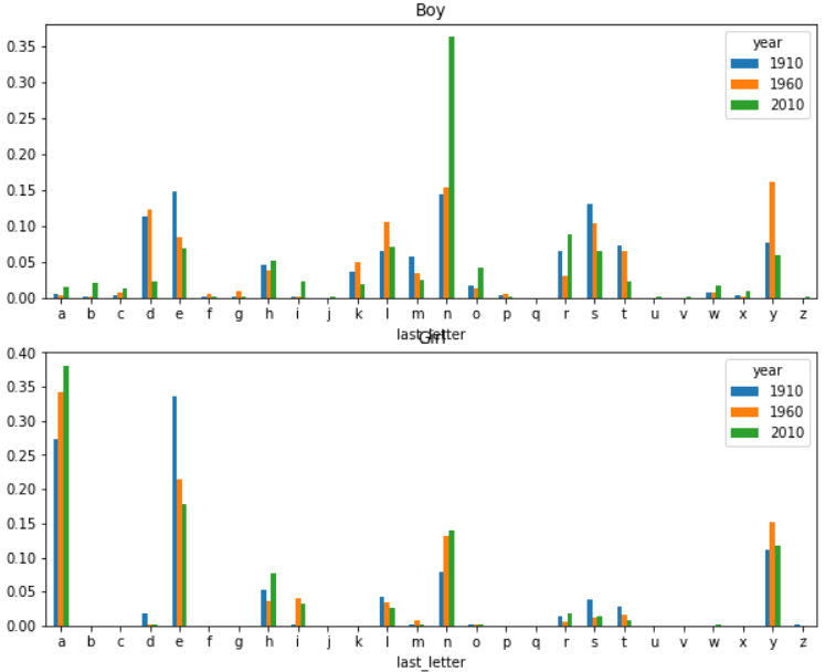
ДгЩЯУцЕФДжТдЗжЮіПЩвдПДЕНМИИіУїЯдЕФЧщПіЃК
- дкboyЕФЪ§ОнРяЃЌвдзжФИnЮЊНсЮВЕФУћзждк1960ФъКѓГіЯжСЫБЌеЈЪНдіГЄ
- ЖдgirlЖјбдЃЌзжФИaНсЮВЕФУћзжНЯГЃМћЃЌЖјзжФИeНсЮВЕФУћзждђдНРДдНЩй
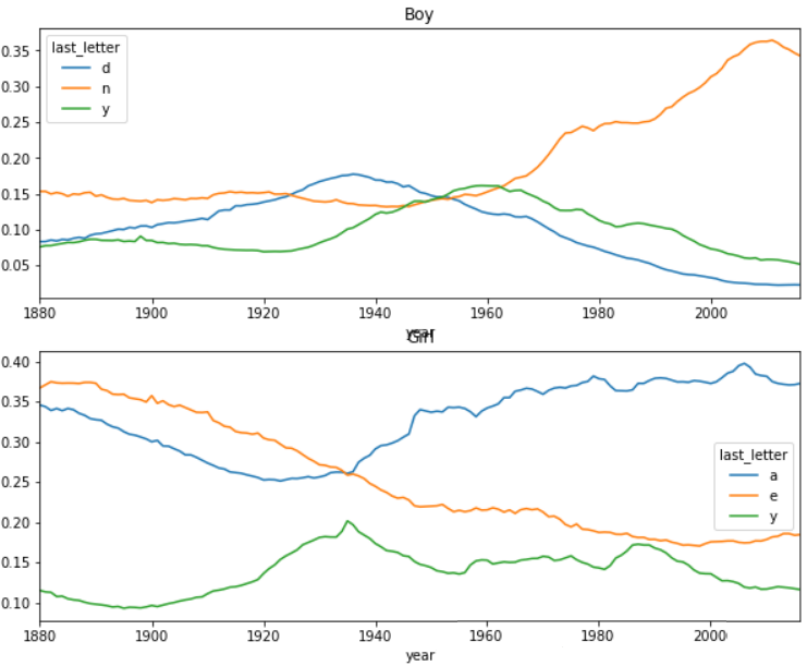
ЯТУцЗжБ№еыЖдboyгыgirlЬєбЁГізюГЃМћЕФУћзжЮВзжФИЃЌЛцжЦГіетаЉзжФИвдЫцЪБМфЕФБфЛЏЧњЯпЃК
letter_prop=letter_table/letter_table.sum(axis=0)
boy_letter=letter_prop.loc[['d','n','y'],'M']
boy_letter_ts=boy_letter.T
girl_letter=letter_prop.loc[['a','e','y'],'F']
girl_letter_ts=girl_letter.T
|
plt.clf()
fig,axes=plt.subplots(2,1,figsize=(10,8))
boy_letter_ts.plot(ax=axes[0],title='Boy')
girl_letter_ts.plot(ax=axes[1],title='Girl')
plt.show()
|
ИљОнвЛИігаШЄЕФЗЂЯжЃЌБэУїгааЉФаКЂЕФУћзже§ж№НЅзЊЯђБЛИќЖрЕФХЎКЂЪЙгУЃЌБШШчЫЕLesleyКЭLeslieЃЌЯТУцОЭЩИбЁГіАќКЌleslЕФУћзжРДбщжЄетИіЫЕЗЈЃК
uni_names=names.loc[:,'name'].unique()
#ЗЕЛивЛИіnumpyЪ§зщ
uni_names=pd.Series(uni_names)
mask=uni_names.str.lower().str.contains('lesl')
#ser->str->ser->str-bool_ser
lesl=uni_names[mask]
|
mask=names.loc[:,'name'].isin(lesl)
lesl_subset=names[mask] |
lesl_table=pd.pivot_table
(lesl_subset, values='number', index='year', columns='gender',
aggfunc='sum')
lesl_table.fillna(0,inplace=True)
lesl_table.loc[:,'M_prop']= lesl_table.loc[:,'M']/lesl_table.sum(axis=1)
lesl_table.loc[:,'F_prop']= lesl_table.loc[:,'F']/lesl_table.sum(axis=1)
|
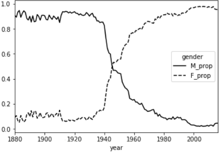
plt.clf()
lesl_table.loc[:, ['M_prop','F_prop']].plot( style={'M_prop':'k-','F_prop':'k--'})
plt.show()
|
USDA Food Database
db=json.load(open('datasets/usda_food/database.json'))
len(db) |
6636
етРяУПИіЬѕФПАќКЌЕФаХЯЂЬЋЖрЃЌВЛИјГіНиЭМСЫЁЃ
ПЩвдПДЕНЪ§ОнжаУПИіЬѕФПАќКЌвдЯТаХЯЂЃК
- description
- group
- id
- manufacturer
- nutrientsЃКгЊбјГЩЗжЃЌзжЕфЕФСаБэ
- portions
- tags
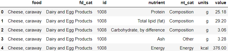
вђЮЊnutrientsЯюЪЧвЛИізжЕфЕФСаБэЃЌШчЙћНЋdbжБНгзЊЛЏЮЊdataframeЕФЛАетвЛЯюОЭЛсБЛЙщЕНвЛИіСажаЃЌЗЧГЃгЕМЗЁЃЮЊСЫБугкРэНтЃЌДДНЈСНИіdfЃЌвЛИіАќКЌГ§СЫnutrientsжЎЭтЕФЪГЮяаХЯЂЃЌЖјСэвЛИіАќКЌidгыnutrientsаХЯЂЃЌШЛКѓдйНЋСНепИљОнidКЯВЂЁЃ
keys=['description','group','id']
food_df=pd.DataFrame(db,columns=keys) |
subsets=[]
for item in db:
id=item['id']
df=pd.DataFrame(item['nutrients'])
df.loc[:,'id']=id
subsets.append(df)
nutrients_df=pd.concat(subsets,ignore_index=True)
nutrients_df.drop_duplicates(inplace=True)
|

ЙлВьЕНСНИіБэжаГіЯжСЫЭЌбљЕФСаЫїв§ЃЌЮЊСЫКЯВЂБэЪБВЛГіЯжУЌЖмЃЌИќИФСаЫїв§УћГЦЃК
fd_col_map={
'description':'food',
'group':'fd_cat'
}
food_df=food_df.rename(columns=fd_col_map)
nt_col_map={
'description':'nutrient',
'group':'nt_cat'
}
nutrients_df=nutrients_df.rename(columns=nt_col_map)
|
print('{}\n{}'.format (food_df.columns,nutrients_df.columns))
|

| data=pd.merge(food_df,nutrients_df,on='id',how='outer')
|
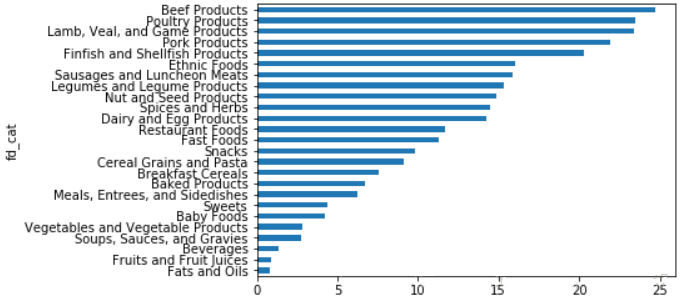
зЂвтетИіБэжаЃЌЮЈвЛОпгаЭГМЦвтвхЕФжЕЪЧvalueСаЃЌЦфгрЖМЪЧУшЪіадаХЯЂЁЃ
МйЩшЯждкашвЊЭГМЦФФжжЪГЮяРрБ№гЕгаЕФгЊбјСПОљжЕЃЌПЩвдЯШНЋБэЖдnutrientгыfd_catНјааЗжзщЃЌдйНјааХХађЪфГіЃК
| nt_result=data.loc [:,'value'].groupby ([data.loc[:,'nutrient'], data.loc[:,'fd_cat']]).mean() |
plt.clf()
nt_result.loc ['Protein'].sort_values().plot(kind='barh')
#АДЕААзжЪКЌСПОљжЕЛцжЦЭМаЮ
plt.show() |
2012 Federal Election Commission Database
| fec=pd.read_csv('datasets/fec/P00000001-ALL.csv',low_memory=False)
#БмУтОЏИц |
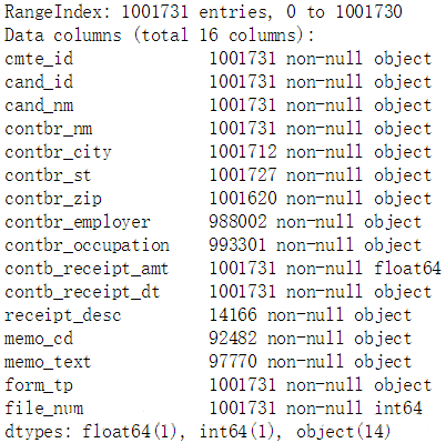
зЂвтЕНЪ§ОнжаУЛгаКђбЁШЫЫљЪєЕФЕГХЩетвЛаХЯЂЃЌЫљвдПЩвдПМТЧШЫЮЊМгЩЯетвЛаХЯЂЁЃЪзЯШЭГМЦГіЪ§ОнжагаЖрЩйЮЛКђбЁШЫЃК
| fec.loc[:,'cand_nm'].unique() |

nm2pt={
'Bachmann, Michelle': 'Republican',
'Romney, Mitt': 'Republican',
'Obama, Barack': 'Democrat',
"Roemer,
Charles E. 'Buddy' III": 'Republican',
'Pawlenty, Timothy': 'Republican',
'Johnson, Gary Earl': 'Republican',
'Paul, Ron': 'Republican',
'Santorum, Rick': 'Republican',
'Cain, Herman': 'Republican',
'Gingrich, Newt': 'Republican',
'McCotter, Thaddeus G': 'Republican',
'Huntsman, Jon': 'Republican',
'Perry, Rick': 'Republican',
}
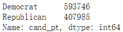
fec.loc[:,'cand_pt']=fec.loc[:,'cand_nm'].map(nm2pt)
|
fec.loc[:,'cand_pt'].value_counts()
|
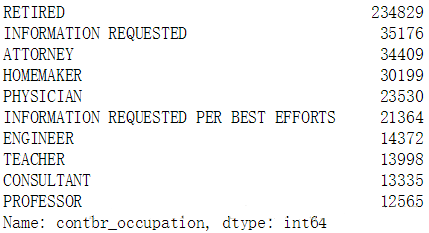
ОнЫЕгавЛИіЯжЯѓЃЌТЩЪІЛсЧуЯђгкОшИјУёжїЕГЃЌЖјОМУШЫЪПЛсЧуЯђгкОшИјЙВКЭЕГЃЌЯТУцОЭРДбщжЄетвЛЫЕЗЈЃК
fec.loc[:,'contbr_occupation'].value_counts()[:10]
|
occ_map={
'INFORMATION REQUESTED PER BEST EFFORTS':'UNKNOW',
'INFORMATION REQUESTED':'UNKNOW',
'C.E.O.':'CEO' #етвЛЬѕЪЧдкКѓУцЗжЮіжаЗЂЯжЕФЯю
}
f=lambda x:occ_map.get(x,x) #ЛёШЁxЖдгІЕФvalue,ШчЙћУЛгаЖдгІЕФvalueдђЗЕЛиx
|
fec.loc[:,'contbr_occupation'] =fec.loc [:,'contbr_occupation'].map(f)
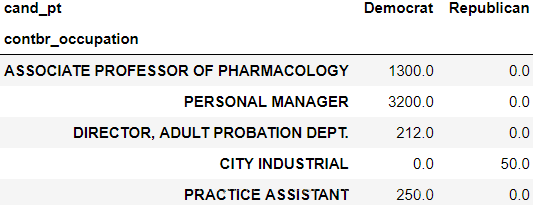
by_occupation=pd.pivot_table (fec,values ='contb_receipt_amt', index= 'contbr_occupation', columns='cand_pt',aggfunc='sum')
by_occupation.fillna(0,inplace=True)
by_occupation.sample(5)
|

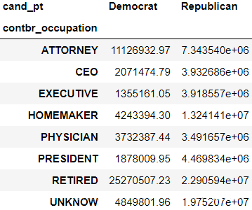
ПДГіОшЯзН№ЖюЗжВМЕФМЋЖШВЛЦНКтЃЌЮвУЧжЛбЁГізмЪ§Дѓгк5e6ЕФЬѕФПЃК
mask=by_occupation.sum(axis=1)>5e6
over5mm=by_occupation[mask]
over5mm |
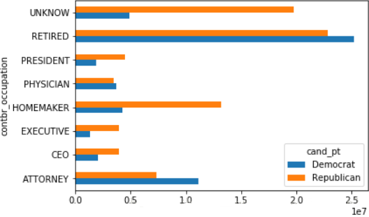
plt.clf()
over5mm.plot(kind='barh')
plt.show() |
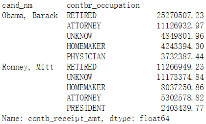
ЯТУцЮвУЧЖдObama BarackгыRomney MittЕФЪ§ОнНјааЗжЮіЃК
mask=fec.loc[:,'cand_nm'].isin (['Obama,
Barack','Romney, Mitt'])
fec_subset=fec[mask] |
МйЩшашвЊЗжБ№ЭГМЦГіЖдетСНИіШЫжЇГжзюДѓЕФИїжАвЕЃЌПЩвдетбљзіЃК
def get_top(group,key,n=5):
totals=group.groupby(key)['contb_receipt_amt'].sum()
return totals.nlargest(n) |
grouped=fec_subset.groupby('cand_nm')
grouped.apply(get_top,'contbr_occupation',5) |
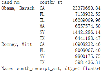
ЯТУцПДИїжнЖдСНШЫЕФжЇГжЧщПіЃК
by_stat=fec_subset.groupby(['cand_nm','contbr_st'])['contb_receipt_amt'].sum(axes=0)
mask=by_stat>5e6
by_stat=by_stat[mask] |
|