| 编辑推荐: |
| 来源infoq,通过
Matplotlib,开发者可以仅需要几行代码,便可以生成绘图,直方图,功率谱,条形图,错误图,散点图等。文中主要介绍了怎么样绘制图。 |
|
Matplotlib
一 简介:
Matplotlib是一个Python 2D绘图库,它可以在各种平台上以各种硬拷贝格式和交互式环境生成出具有出版品质的图形。
Matplotlib可用于Python脚本,Python和IPython shell,Jupyter笔记本,Web应用程序服务器和四个图形用户界面工具包
Matplotlib试图让简单的事情变得更简单,让无法实现的事情变得可能实现。 只需几行代码即可生成绘图,直方图,功率谱,条形图,错误图,散点图等。
有关示例,请参阅示例图和缩略图库。
为了简单绘图,pyplot模块提供了类似于MATLAB的界面,特别是与IPython结合使用时。 对于高级用户,您可以通过面向对象的界面或MATLAB用户熟悉的一组函数完全控制线条样式,字体属性,轴属性等。
二 相关文档:
官网教程文档:https://matplotlib.org/users/index.html
各个平台的安装教程:https://matplotlib.org/users/installing.html
三 入门与进阶案例
1- 简单图形绘制
根据坐标点绘制:
import numpy as
np
import matplotlib.pyplot as plt
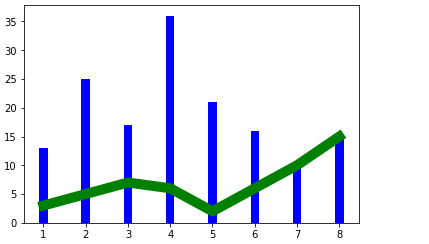
x = np.array([1,2,3,4,5,6,7,8])
y = np.array([3,5,7,6,2,6,10,15])
plt.plot(x,y,'r')# 折线 1 x 2 y 3 color
plt.plot(x,y,'g',lw=10)# 4 line w
# 折线 饼状 柱状
x = np.array([1,2,3,4,5,6,7,8])
y = np.array([13,25,17,36,21,16,10,15])
plt.bar(x,y,0.2,alpha=1,color='b')# 5 color 4
透明度 3 0.9
plt.show()
|
传入参数是numpy数组时的效果:
import numpy as
np
import matplotlib.pyplot as plt
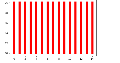
for i in range(0,15):
# 1 柱状图
dateOne = np.zeros([2])
dateOne[0] = i;
dateOne[1] = i;
y = np.zeros([2])
y[0] = 10
y[1] = 20
plt.plot(dateOne,y,'r',lw=8)
plt.show()
|
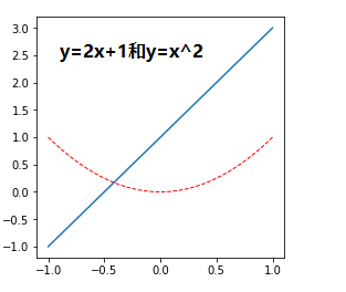
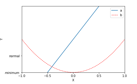
根据函数图像绘制:
# -*- coding:
utf-8 -*-
"""
简单图形绘制
"""
import matplotlib.pyplot as plt
import numpy as np
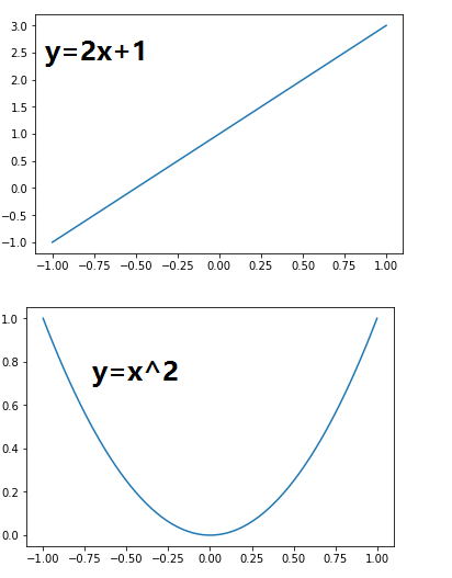
#从-1-----1之间等间隔采66个数.也就是说所画出来的图形是66个点连接得来的
#注意:如果点数过小的话会导致画出来二次函数图像不平滑
x = np.linspace(-1, 1,66)
# 绘制y=2x+1函数的图像
y = 2 * x + 1
plt.plot(x, y)
plt.show()
# 绘制x^2函数的图像
y = x**2
plt.plot(x, y)
plt.show()
|
2- figure的简单使用
# -*- coding:
utf-8 -*-
"""
figure的使用
"""
import matplotlib.pyplot as plt
import numpy as np
#
x = np.linspace(-1, 1, 50)# figure 1
y1 = 2 * x + 1
plt.figure()
plt.plot(x, y1)# figure 2
y2 = x**2
plt.figure()
plt.plot(x, y2)# figure 3,指定figure的编号并指定figure的大小,
指定线的颜色, 宽度和类型
#一个坐标轴上画了两个图形
y2 = x**2
plt.figure(num = 5, figsize = (4, 4))
plt.plot(x, y1)
plt.plot(x, y2, color = 'red', linewidth = 1.0,
linestyle = '--')
plt.show()
|
一共会画出三张图,前两张和上面的简单案例画出来的两张一样。第三张:
3- 设置坐标轴
# -*- coding:
utf-8 -*-
"""
设置坐标轴
"""
import matplotlib.pyplot as plt
import numpy as np
# 绘制普通图像
x = np.linspace(-1, 1, 50)
y1 = 2 * x + 1
y2 = x**2
plt.figure()
plt.plot(x, y1)
plt.plot(x, y2, color = 'red', linewidth = 1.0,
linestyle = '--')
# 设置坐标轴的取值范围
plt.xlim((-1, 1))
plt.ylim((0, 3))
# 设置坐标轴的lable
#标签里面必须添加字体变量:fontproperties='SimHei',fontsize=14。不然可能会乱码
plt.xlabel(u'这是x轴',fontproperties='SimHei',fontsize=14)
plt.ylabel(u'这是y轴',fontproperties='SimHei',fontsize=14)
# 设置x坐标轴刻度, 之前为0.25, 修改后为0.5
#也就是在坐标轴上取5个点,x轴的范围为-1到1所以取5个点之后刻度就变为0.5了
plt.xticks(np.linspace(-1, 1, 5))
plt.show()
|
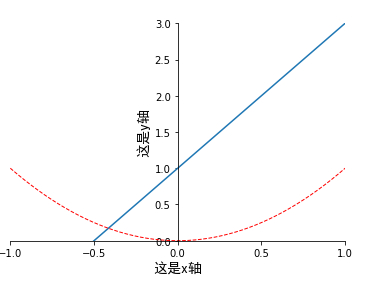
上面代码的基础上加上下面代码(直接加载最后一句代码前面即可):
# 获取当前的坐标轴, gca
= get current axis
ax = plt.gca()
# 设置右边框和上边框
ax.spines['right'].set_color('none')
ax.spines['top'].set_color('none')
# 设置x坐标轴为下边框
ax.xaxis.set_ticks_position('bottom')
# 设置y坐标轴为左边框
ax.yaxis.set_ticks_position('left')
# 设置x轴, y周在(0, 0)的位置
ax.spines['bottom'].set_position(('data', 0))
ax.spines['left'].set_position(('data', 0))
|
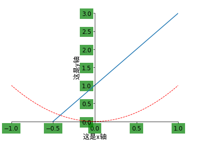
如果在上面代码的最后一句之前加上下面的代码:
# 设置坐标轴label的大小,背景色等信息
for label in ax.get_xticklabels() + ax.get_yticklabels():
label.set_fontsize(12)
label.set_bbox(dict(facecolor = 'green', edgecolor
= 'None', alpha = 0.7))
|
4- 设置legend图例
# -*- coding:
utf-8 -*-
"""
设置坐标轴
"""
import matplotlib.pyplot as plt
import numpy as np
# 绘制普通图像
x = np.linspace(-1, 1, 50)
y1 = 2 * x + 1
y2 = x**2
plt.figure()
plt.plot(x, y1)
plt.plot(x, y2, color = 'red', linewidth = 1.0,
linestyle = '--')
# 设置坐标轴的取值范围
plt.xlim((-1, 1))
plt.ylim((0, 3))
# 设置坐标轴的lable
#标签里面必须添加字体变量:fontproperties='SimHei',fontsize=14。不然可能会乱码
plt.xlabel(u'这是x轴',fontproperties='SimHei',fontsize=14)
plt.ylabel(u'这是y轴',fontproperties='SimHei',fontsize=14)
# 设置x坐标轴刻度, 之前为0.25, 修改后为0.5
#也就是在坐标轴上取5个点,x轴的范围为-1到1所以取5个点之后刻度就变为0.5了
plt.xticks(np.linspace(-1, 1, 5))
# 获取当前的坐标轴, gca = get current axis
ax = plt.gca()
# 设置右边框和上边框
ax.spines['right'].set_color('none')
ax.spines['top'].set_color('none')
# 设置x坐标轴为下边框
ax.xaxis.set_ticks_position('bottom')
# 设置y坐标轴为左边框
ax.yaxis.set_ticks_position('left')
# 设置x轴, y周在(0, 0)的位置
ax.spines['bottom'].set_position(('data', 0))
ax.spines['left'].set_position(('data', 0))
plt.show()
|
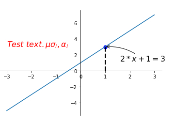
5- 添加注解和绘制点以及在图形上绘制线或点
# -*- coding:
utf-8 -*-
"""
添加注解和绘制点以及在图形上绘制线或点
"""
import matplotlib.pyplot as plt
import numpy as np
# 绘制普通图像
x = np.linspace(-3, 3, 50)
y = 2 * x + 1
plt.figure()
plt.plot(x, y)
# 将上、右边框去掉
ax = plt.gca()
ax.spines['right'].set_color('none')
ax.spines['top'].set_color('none')
# 设置x轴的位置及数据在坐标轴上的位置
ax.xaxis.set_ticks_position('bottom')
ax.spines['bottom'].set_position(('data', 0))
# 设置y轴的位置及数据在坐标轴上的位置
ax.yaxis.set_ticks_position('left')
ax.spines['left'].set_position(('data', 0))
# 定义(x0, y0)点
x0 = 1
y0 = 2 * x0 + 1
# 绘制(x0, y0)点
plt.scatter(x0, y0, s = 50, color = 'blue')
# 绘制虚线
plt.plot([x0, x0], [y0, 0], 'k--', lw = 2.5)
# 绘制注解一
plt.annotate(r'$2 * x + 1 = %s$' % y0, xy = (x0,
y0), xycoords = 'data', xytext = (+30, -30), \
textcoords = 'offset points', fontsize = 16, arrowprops
= dict(arrowstyle = '->', connectionstyle =
'arc3, rad = .2'))
# 绘制注解二
plt.text(-3, 3, r'$Test\ text. \mu \sigma_i, \alpha_i$',
fontdict = {'size': 16, 'color': 'red'})
plt.show()
|
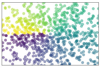
6- 绘制散点图
# -*- coding:
utf-8 -*-
"""
绘制散点图
"""
import numpy as np
import matplotlib.pyplot as plt
# 数据个数
n = 1024
# 均值为0, 方差为1的随机数
x = np.random.normal(0, 1, n)
y = np.random.normal(0, 1, n)
# 计算颜色值
color = np.arctan2(y, x)
# 绘制散点图
plt.scatter(x, y, s = 75, c = color, alpha = 0.5)
# 设置坐标轴范围
plt.xlim((-1.5, 1.5))
plt.ylim((-1.5, 1.5))
# 不显示坐标轴的值
plt.xticks(())
plt.yticks(())
plt.show()
|
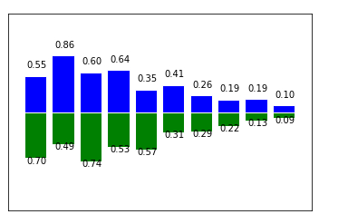
7- 绘制柱状图
# -*- coding:
utf-8 -*-
"""
绘制柱状图
"""
import matplotlib.pyplot as plt
import numpy as np
# 数据数目
n = 10
x = np.arange(n)
# 生成数据, 均匀分布(0.5, 1.0)之间
y1 = (1 - x / float(n)) * np.random.uniform(0.5,
1.0, n)
y2 = (1 - x / float(n)) * np.random.uniform(0.5,
1.0, n)
# 绘制柱状图, 向上
plt.bar(x, y1, facecolor = 'blue', edgecolor =
'white')
# 绘制柱状图, 向下
plt.bar(x, -y2, facecolor = 'green', edgecolor
= 'white')temp = zip(x, y2)
# 在柱状图上显示具体数值, ha水平对齐, va垂直对齐
for x, y in zip(x, y1):
plt.text(x + 0.05, y + 0.1, '%.2f' % y, ha = 'center',
va = 'bottom')
for x, y in temp:
plt.text(x + 0.05, -y - 0.1, '%.2f' % y, ha =
'center', va = 'bottom')
# 设置坐标轴范围
plt.xlim(-1, n)
plt.ylim(-1.5, 1.5)
# 去除坐标轴
plt.xticks(())
plt.yticks(())
plt.show()
|
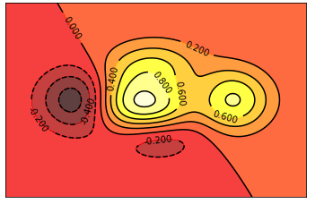
8- 绘制登高线图
# -*- coding:
utf-8 -*-
"""
绘制登高线图
"""
import matplotlib.pyplot as plt
import numpy as np
# 定义等高线高度函数
def f(x, y):
return (1 - x / 2 + x ** 5 + y ** 3) * np.exp(-
x ** 2 - y ** 2)
# 数据数目
n = 256
# 定义x, y
x = np.linspace(-3, 3, n)
y = np.linspace(-3, 3, n)
# 生成网格数据
X, Y = np.meshgrid(x, y)# 填充等高线的颜色, 8是等高线分为几部分
plt.contourf(X, Y, f(X, Y), 8, alpha = 0.75, cmap
= plt.cm.hot)
# 绘制等高线
C = plt.contour(X, Y, f(X, Y), 8, colors = 'black',
linewidth = 0.5)
# 绘制等高线数据
plt.clabel(C, inline = True, fontsize = 10)
# 去除坐标轴
plt.xticks(())
plt.yticks(())
plt.show()
|
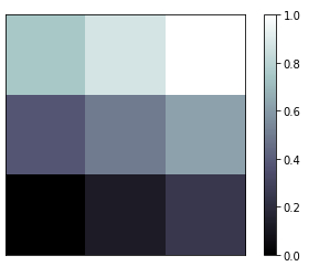
9- 绘制Image
# -*- coding:
utf-8 -*-
"""
绘制Image
"""
import matplotlib.pyplot as plt
import numpy as np
# 定义图像数据
a = np.linspace(0, 1, 9).reshape(3, 3)
# 显示图像数据
plt.imshow(a, interpolation = 'nearest', cmap
= 'bone', origin = 'lower')
# 添加颜色条
plt.colorbar()
# 去掉坐标轴
plt.xticks(())
plt.yticks(())
plt.show() |
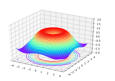
10- 绘制3D图形
# -*- coding:
utf-8 -*-
"""
绘制3d图形
"""
import matplotlib.pyplot as plt
import numpy as np
from mpl_toolkits.mplot3d import Axes3D
# 定义figure
fig = plt.figure()
# 将figure变为3d
ax = Axes3D(fig)
# 数据数目
n = 256
# 定义x, y
x = np.arange(-4, 4, 0.25)
y = np.arange(-4, 4, 0.25)
# 生成网格数据
X, Y = np.meshgrid(x, y)
# 计算每个点对的长度
R = np.sqrt(X ** 2 + Y ** 2)
# 计算Z轴的高度
Z = np.sin(R)
# 绘制3D曲面
ax.plot_surface(X, Y, Z, rstride = 1, cstride
= 1, cmap = plt.get_cmap('rainbow'))
# 绘制从3D曲面到底部的投影
ax.contour(X, Y, Z, zdim = 'z', offset = -2, cmap
= 'rainbow')
# 设置z轴的维度
ax.set_zlim(-2, 2)
plt.show()
|
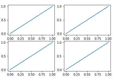
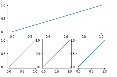
11subplot绘制多图
# -*- coding:
utf-8 -*-
"""
subplot绘制多图
"""
import matplotlib.pyplot as plt
plt.figure()
# 绘制第一个图
plt.subplot(2, 2, 1)
plt.plot([0, 1], [0, 1])
# 绘制第二个图
plt.subplot(2, 2, 2)
plt.plot([0, 1], [0, 1])
# 绘制第三个图
plt.subplot(2, 2, 3)
plt.plot([0, 1], [0, 1])
# 绘制第四个图
plt.subplot(2, 2, 4)
plt.plot([0, 1], [0, 1])
plt.show()
|
# -*- coding:
utf-8 -*-
"""
subplot绘制多图
"""
import matplotlib.pyplot as plt
plt.figure()
# 绘制第一个图
plt.subplot(2, 1, 1)
plt.plot([0, 1], [0, 1])
# 绘制第二个图
plt.subplot(2, 3, 4)
plt.plot([0, 1], [0, 1])
# 绘制第三个图
plt.subplot(2, 3, 5)
plt.plot([0, 1], [0, 1])
# 绘制第四个图
plt.subplot(2, 3, 6)
plt.plot([0, 1], [0, 1])
plt.show()
|
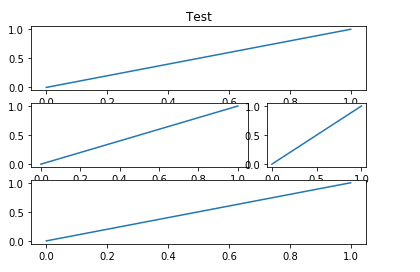
12- figure绘制多图
# -*- coding:
utf-8 -*-
"""
figure绘制多图
"""
# -*- coding: utf-8 -*-
"""
figure绘制多图
"""
import matplotlib.pyplot as plt
# 定义figure
plt.figure()
# figure分成3行3列, 取得第一个子图的句柄, 第一个子图跨度为1行3列, 起点是表格(0,
0)
ax1 = plt.subplot2grid((3, 3), (0, 0), colspan
= 3, rowspan = 1)
ax1.plot([0, 1], [0, 1])
ax1.set_title('Test')
# figure分成3行3列, 取得第二个子图的句柄, 第二个子图跨度为1行3列, 起点是表格(1,
0)
ax2 = plt.subplot2grid((3, 3), (1, 0), colspan
= 2, rowspan = 1)
ax2.plot([0, 1], [0, 1])
# figure分成3行3列, 取得第三个子图的句柄, 第三个子图跨度为1行1列, 起点是表格(1,
2)
ax3 = plt.subplot2grid((3, 3), (1, 2), colspan
= 1, rowspan = 1)
ax3.plot([0, 1], [0, 1])
# figure分成3行3列, 取得第四个子图的句柄, 第四个子图跨度为1行3列, 起点是表格(2,
0)
ax4 = plt.subplot2grid((3, 3), (2, 0), colspan
= 3, rowspan = 1)
ax4.plot([0, 1], [0, 1])
plt.show()
|
或
# -*- coding:
utf-8 -*-
"""
figure绘制多图
"""
import matplotlib.pyplot as plt
import matplotlib.gridspec as gridspec
# 定义figure
plt.figure()
# 分隔figure
gs = gridspec.GridSpec(3, 3)
ax1 = plt.subplot(gs[0, :])
ax2 = plt.subplot(gs[1, 0:2])
ax3 = plt.subplot(gs[1, 2])
ax4 = plt.subplot(gs[2, :])
# 绘制图像
ax1.plot([0, 1], [0, 1])
ax1.set_title('Test')
ax2.plot([0, 1], [0, 1])
ax3.plot([0, 1], [0, 1])
ax4.plot([0, 1], [0, 1])
plt.show()
|
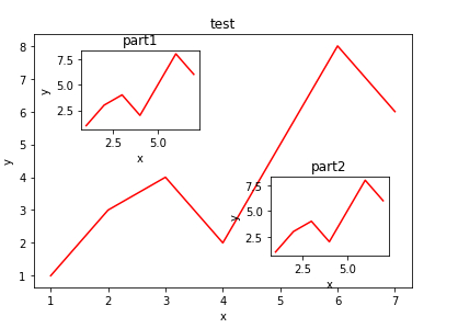
13- figure图的嵌套
# -*- coding:
utf-8 -*-
"""
figure图的嵌套
"""
import matplotlib.pyplot as plt
# 定义figure
fig = plt.figure()
# 定义数据
x = [1, 2, 3, 4, 5, 6, 7]
y = [1, 3, 4, 2, 5, 8, 6]
# figure的百分比, 从figure 10%的位置开始绘制, 宽高是figure的80%
left, bottom, width, height = 0.1, 0.1, 0.8, 0.8
# 获得绘制的句柄
ax1 = fig.add_axes([left, bottom, width, height])
# 绘制点(x,y)
ax1.plot(x, y, 'r')
ax1.set_xlabel('x')
ax1.set_ylabel('y')
ax1.set_title('test')# 嵌套方法一
# figure的百分比, 从figure 10%的位置开始绘制, 宽高是figure的80%
left, bottom, width, height = 0.2, 0.6, 0.25,
0.25
# 获得绘制的句柄
ax2 = fig.add_axes([left, bottom, width, height])
# 绘制点(x,y)
ax2.plot(x, y, 'r')
ax2.set_xlabel('x')
ax2.set_ylabel('y')
ax2.set_title('part1')# 嵌套方法二
plt.axes([bottom, left, width, height])
plt.plot(x, y, 'r')
plt.xlabel('x')
plt.ylabel('y')
plt.title('part2')
plt.show()
|
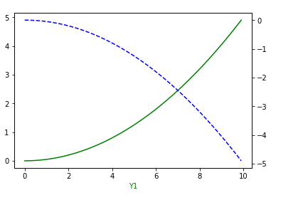
14- 主次坐标轴
# -*- coding:
utf-8 -*-
"""
主次坐标轴
"""
import numpy as np
import matplotlib.pyplot as plt
# 定义数据
x = np.arange(0, 10, 0.1)
y1 = 0.05 * x ** 2
y2 = -1 * y1
# 定义figure
fig, ax1 = plt.subplots()
# 得到ax1的对称轴ax2
ax2 = ax1.twinx()
# 绘制图像
ax1.plot(x, y1, 'g-')
ax2.plot(x, y2, 'b--')
# 设置label
ax1.set_xlabel('X data')
ax1.set_xlabel('Y1', color = 'g')
ax2.set_xlabel('Y2', color = 'b')
plt.show()
|
15- 创建动画
# -*- coding:
utf-8 -*-
"""
动画
"""
import numpy as np
import matplotlib.pyplot as plt
from matplotlib import animation# 定义figure
fig, ax = plt.subplots()
# 定义数据
x = np.arange(0, 2 * np.pi, 0.01)
# line, 表示只取返回值中的第一个元素
line, = ax.plot(x, np.sin(x))
# 定义动画的更新
def update(i):
line.set_ydata(np.sin(x + i/10))
return line,
# 定义动画的初始值
def init():
line.set_ydata(np.sin(x))
return line,
# 创建动画
ani = animation.FuncAnimation(fig = fig, func
= update, init_func = init, interval = 10, blit
= False, frames = 200)
# 展示动画
plt.show()
# 动画保存
#我这里是保存为html文件了,打开即可完美运行
ani.save('sin.html', writer = 'imagemagick', fps
= 30, dpi = 100)
|
以上所有例子可以到我的github上下载(持续更新Python第三方库使用demo以及常见python爬虫,python微信等内容):
|