| БрМЭЦМі: |
| БОЮФРДздгкcnblogs,ЮФеТжївЊНщЩмСЫЪЙгУmatplotlibЛцжЦелЯпЭМЁЂЫцЛњТўВНвдМАPygalФЃФтжРїЛзгЕШР§згЁЃ |
|
еЊвЊЃКЪ§ОнПЩЪгЛЏжївЊжМдкНшжњгкЭМаЮЛЏЪжЖЮЃЌЧхЮњгааЇЕиДЋДягыЙЕЭЈаХЯЂЁЃЕЋЪЧЃЌетВЂВЛОЭвтЮЖзХЪ§ОнПЩЪгЛЏОЭвЛЖЈвђЮЊвЊЪЕЯжЦфЙІФмгУЭОЖјСюШЫИаЕНПндяЗІЮЖЃЌЛђепЪЧЮЊСЫПДЩЯШЅбЄРіЖрВЪЖјЯдЕУМЋЖЫИДдгЁЃЮЊСЫгааЇЕиДЋДяЫМЯыИХФюЃЌУРбЇаЮЪНгыЙІФмашвЊЦыЭЗВЂНјЃЌЭЈЙ§жБЙлЕиДЋДяЙиМќЕФЗНУцгыЬиеїЃЌДгЖјЪЕЯжЖдгкЯрЕБЯЁЪшЖјгжИДдгЕФЪ§ОнМЏЕФЩюШыЖДВьЁЃШЛЖјЃЌЩшМЦШЫдБЭљЭљВЂВЛФмКмКУЕиАбЮеЩшМЦгыЙІФмжЎМфЕФЦНКтЃЌДгЖјДДдьГіЛЊЖјВЛЪЕЕФЪ§ОнПЩЪгЛЏаЮЪНЃЌЮоЗЈДяЕНЦфжївЊФПЕФЃЌвВОЭЪЧДЋДягыЙЕЭЈаХЯЂЁЃЪ§ОнПЩЪгЛЏгыаХЯЂЭМаЮЁЂаХЯЂПЩЪгЛЏЁЂПЦбЇПЩЪгЛЏвдМАЭГМЦЭМаЮУмЧаЯрЙиЁЃЕБЧАЃЌдкбаОПЁЂНЬбЇКЭПЊЗЂСьгђЃЌЪ§ОнПЩЪгЛЏФЫЪЧвЛИіМЋЮЊЛюдОЖјгжЙиМќЕФЗНУцЁЃЁАЪ§ОнПЩЪгЛЏЁБетЬѕЪѕгяЪЕЯжСЫГЩЪьЕФПЦбЇПЩЪгЛЏСьгђгыНЯФъЧсЕФаХЯЂПЩЪгЛЏСьгђЕФЭГвЛ
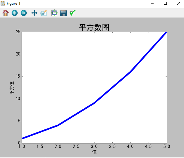
1 елЯпЭМЕФжЦзї
1.1 ашЧѓУшЪі
ЪЙгУmatplotlibЛцжЦвЛИіМђЕЅЕФелЯпЭМЃЌдкЖдЦфНјааЖЈжЦЃЌвдЪЕЯжаХЯЂИќМгЗсИЛЕФЪ§ОнПЩЪгЛЏЃЌЛцжЦЃЈ1,2,3,4,5ЃЉЕФЦНЗНелЯпЭМЁЃ
1.2 дДТы
#coding=utf-8
import matplotlib as mpl
import matplotlib.pyplot as plt
import pylab
# НтОіжаЮФТвТыЮЪЬт
mpl.rcParams['font.sans-serif']=['SimHei']
mpl.rcParams['axes.unicode_minus']=False
# squares = [1,35,43,3,56,7]
input_values = [1,2,3,4,5]
squares = [1,4,9,16,25]
# ЩшжУелЯпДжЯИ
plt.plot(input_values,squares,linewidth=5)
# ЩшжУБъЬтКЭзјБъжс
plt.title('ЦНЗНЪ§ЭМ',fontsize=24)
plt.xlabel('жЕ',fontsize=14)
plt.ylabel('ЦНЗНжЕ',fontsize=14)
# ЩшжУПЬЖШДѓаЁ
plt.tick_params(axis='both',labelsize=14)
plt.show() |
1.3 ЩњГЩНсЙћ
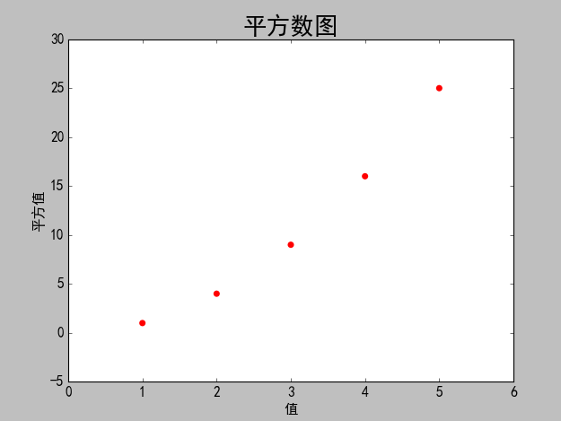
2 scatter()ЛцжЦЩЂЕуЭМ
2.1 ашЧѓУшЪі
ЪЙгУmatplotlibЛцжЦвЛИіМђЕЅЕФЩЂСаЕуЭМЃЌдкЖдЦфНјааЖЈжЦЃЌвдЪЕЯжаХЯЂИќМгЗсИЛЕФЪ§ОнПЩЪгЛЏЃЌЛцжЦЃЈ1,2,3,4,5ЃЉЕФЩЂЕуЭМЁЃ
2.2 дДТы
#coding=utf-8
import matplotlib as mpl
import matplotlib.pyplot as plt
import pylab
# НтОіжаЮФТвТыЮЪЬт
mpl.rcParams['font.sans-serif']=['SimHei']
mpl.rcParams['axes.unicode_minus']=False
# ЩшжУЩЂСаЕузнКсзјБъжЕ
x_values = [1,2,3,4,5]
y_values = [1,4,9,16,25]
# sЩшжУЩЂСаЕуЕФДѓаЁЃЌedgecolor='none'ЮЊЩОГ§Ъ§ОнЕуЕФТжРЊ
plt.scatter(x_values,y_values,c='red',edgecolor='none',
s=40)
# ЩшжУБъЬтКЭзјБъжс
plt.title('ЦНЗНЪ§ЭМ',fontsize=24)
plt.xlabel('жЕ',fontsize=14)
plt.ylabel('ЦНЗНжЕ',fontsize=14)
# ЩшжУПЬЖШДѓаЁ
plt.tick_params(axis='both',which='major',labelsize=14)
# здЖЏБЃДцЭМБэЃЌВЮЪ§2ЪЧМєВУЕєЖргрПеАзЧјгђ
plt.savefig('squares_plot.png',bbox_inches='tight')
plt.show() |
2.3 ЩњГЩНсЙћ
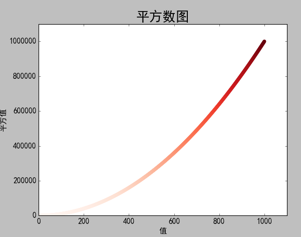
2.4 ашЧѓИФНј
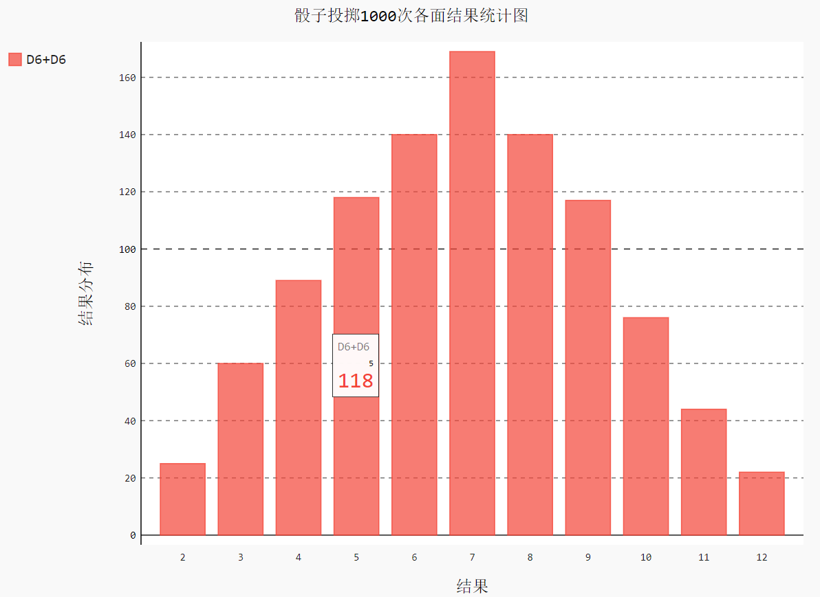
ЪЙгУmatplotlibЛцжЦвЛИіМђЕЅЕФЩЂСаЕуЭМЃЌдкЖдЦфНјааЖЈжЦЃЌвдЪЕЯжаХЯЂИќМгЗсИЛЕФЪ§ОнПЩЪгЛЏЃЌЛцжЦ1000ИіЪ§ЕФЩЂЕуЭМЁЃВЂздЖЏЭГМЦЪ§ОнЕФЦНЗНЃЌздЖЈвхзјБъжс
2.5 дДТыИФНј
#coding=utf-8
import matplotlib as mpl
import matplotlib.pyplot as plt
import pylab
# НтОіжаЮФТвТыЮЪЬт
mpl.rcParams['font.sans-serif']=['SimHei']
mpl.rcParams['axes.unicode_minus']=False
# ЩшжУЩЂСаЕузнКсзјБъжЕ
# x_values = [1,2,3,4,5]
# y_values = [1,4,9,16,25]
# здЖЏМЦЫуЪ§Он
x_values = list(range(1,1001))
y_values = [x**2 for x in x_values]
# sЩшжУЩЂСаЕуЕФДѓаЁЃЌedgecolor='none'ЮЊЩОГ§Ъ§ОнЕуЕФТжРЊ
# plt.scatter(x_values,y_values,c='red',edgecolor='none',
s=40)
# здЖЈвхбеЩЋc=(0,0.8,0.8)КьТЬРЖ
# plt.scatter(x_values,y_values,c=(0,0.8,0.8),
edgecolor='none',s=40)
# ЩшжУбеЩЋЫцyжЕБфЛЏЖјНЅБф
plt.scatter(x_values,y_values,c=y_values,cmap=plt.
cm.Reds,edgecolor='none',s=40)
# ЩшжУБъЬтКЭзјБъжс
plt.title('ЦНЗНЪ§ЭМ',fontsize=24)
plt.xlabel('жЕ',fontsize=14)
plt.ylabel('ЦНЗНжЕ',fontsize=14)
#ЩшжУзјБъжсЕФШЁжЕЗЖЮЇ
plt.axis([0,1100,0,1100000])
# ЩшжУПЬЖШДѓаЁ
plt.tick_params(axis='both',which='major',labelsize=14)
# здЖЏБЃДцЭМБэЃЌВЮЪ§2ЪЧМєВУЕєЖргрПеАзЧјгђ
plt.savefig('squares_plot.png',bbox_inches='tight')
plt.show() |
2.6 ИФНјНсЙћ
3 ЫцЛњТўВНЭМ
3.1 ашЧѓУшЪі
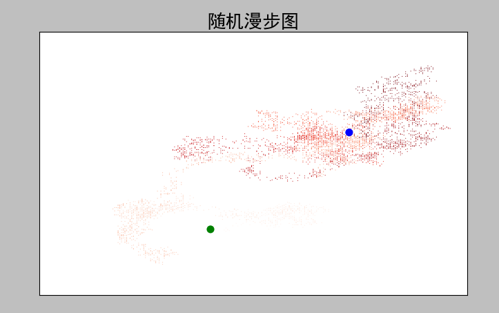
ЫцЛњТўВНЪЧУПДЮВНааЗНЯђКЭВНГЄЖМЪЧЫцЛњЕФЃЌУЛгаУїШЗЕФЗНЯђЃЌНсЙћгЩвЛЯЕСаЫцЛњОіВпОіЖЈЕФЁЃБОЪЕР§жаrandom_walkОіВпВНааЕФзѓгвЩЯЯТЗНЯђКЭВНГЄЕФЫцЛњадЃЌrw_visualЪЧЭМаЮЛЏеЙЪОЁЃ
3.2 дДТы
random_walk.py
from random
import choice
class RandomWalk():
'''вЛИіЩњГЩЫцЛњТўВНЪ§ОнЕФРр'''
def __init__(self,num_points=5000):
'''ГѕЪМЛЏЫцЛњТўВНЪєад'''
self.num_points = num_points
self.x_values = [0]
self.y_values = [0]
def fill_walk(self):
'''МЦЫуЫцЛњТўВНАќКЌЕФЫљгаЕу'''
while len(self.x_values)<self.num_points:
# ОіЖЈЧАНјЗНЯђМАбизХИУЗНЯђЧАНјЕФОрРы
x_direction = choice([1,-1])
x_distance = choice([0,1,2,3,4])
x_step = x_direction*x_distance
y_direction = choice([1,-1])
y_distance = choice([0,1,2,3,4])
y_step = y_direction*y_distance
# ОмОјдЕиЬЄВН
if x_step == 0 and y_step == 0:
continue
# МЦЫуЯТвЛИіЕуЕФxКЭy
next_x = self.x_values[-1] + x_step
next_y = self.y_values[-1] + y_step
self.x_values.append(next_x)
self.y_values.append(next_y) |
rw_visual.py
#-*- coding:
utf-8 -*-
#coding=utf-8
import matplotlib as mpl
import matplotlib.pyplot as plt
import pylab
from random_walk import RandomWalk
# НтОіжаЮФТвТыЮЪЬт
mpl.rcParams['font.sans-serif']=['SimHei']
mpl.rcParams['axes.unicode_minus']=False
# ДДНЈRandomWalkЪЕР§
rw = RandomWalk()
rw.fill_walk()
plt.figure(figsize=(10,6))
point_numbers = list(range(rw.num_points))
# ЫцзХЕуЪ§ЕФдіМгНЅБфЩюКьЩЋ
plt.scatter(rw.x_values,rw.y_values,c=point_numbers,
cmap=plt.cm.Reds,edgecolors='none',s=1)
# ЩшжУЦ№ЪМЕуКЭжеЕубеЩЋ
plt.scatter(0,0,c='green',edgecolors='none',s=100)
plt.scatter(rw.x_values[-1],rw.y_values[-1],c='blue',
edgecolors='none',s=100)
# ЩшжУБъЬтКЭзнКсзјБъ
plt.title('ЫцЛњТўВНЭМ',fontsize=24)
plt.xlabel('зѓгвВНЪ§',fontsize=14)
plt.ylabel('ЩЯЯТВНЪ§',fontsize=14)
# вўВизјБъжс
plt.axes().get_xaxis().set_visible(False)
plt.axes().get_yaxis().set_visible(False)
plt.show() |
3.3 ЩњГЩНсЙћ
4 PygalФЃФтжРїЛзг
4.1 ашЧѓУшЪі
ЖджРїЛзгЕФНсЙћНјааЗжЮіЃЌЩњГЩвЛИіжРЩИзгЕФНсЙћЪ§ОнМЏВЂИљОнНсЙћЛцжЦГівЛИіЭМаЮЁЃ
4.2 дДТы
DieРр
import random
class Die:
"""
вЛИіїЛзгРр
"""
def __init__(self, num_sides=6):
self.num_sides = num_sides
def roll(self):
# ЗЕЛивЛИі1КЭЩИзгУцЪ§жЎМфЕФЫцЛњЪ§
return random.randint(1, self.num_sides) |
die_visual.py
#coding=utf-8
from die import Die
import pygal
import matplotlib as mpl
# НтОіжаЮФТвТыЮЪЬт
mpl.rcParams['font.sans-serif']=['SimHei']
mpl.rcParams['axes.unicode_minus']=False
die1 = Die()
die2 = Die()
results = []
for roll_num in range(1000):
result =die1.roll()+die2.roll()
results.append(result)
# print(results)
# ЗжЮіНсЙћ
frequencies = []
max_result = die1.num_sides+die2.num_sides
for value in range(2,max_result+1):
frequency = results.count(value)
frequencies.append(frequency)
print(frequencies)
# жБЗНЭМ
hist = pygal.Bar()
hist.title = 'їЛзгЭЖжР1000ДЮИїУцНсЙћЭГМЦЭМ'
hist.x_labels =[x for x in range(2,max_result+1)]
hist.x_title ='НсЙћ'
hist.y_title = 'НсЙћЗжВМ'
hist.add('D6+D6',frequencies)
hist.render_to_file('die_visual.svg')
# hist.show() |
4.3 ЩњГЩНсЙћ
5 ЭЌЪБжРСНИіїЛзг
5.1 ашЧѓУшЪі
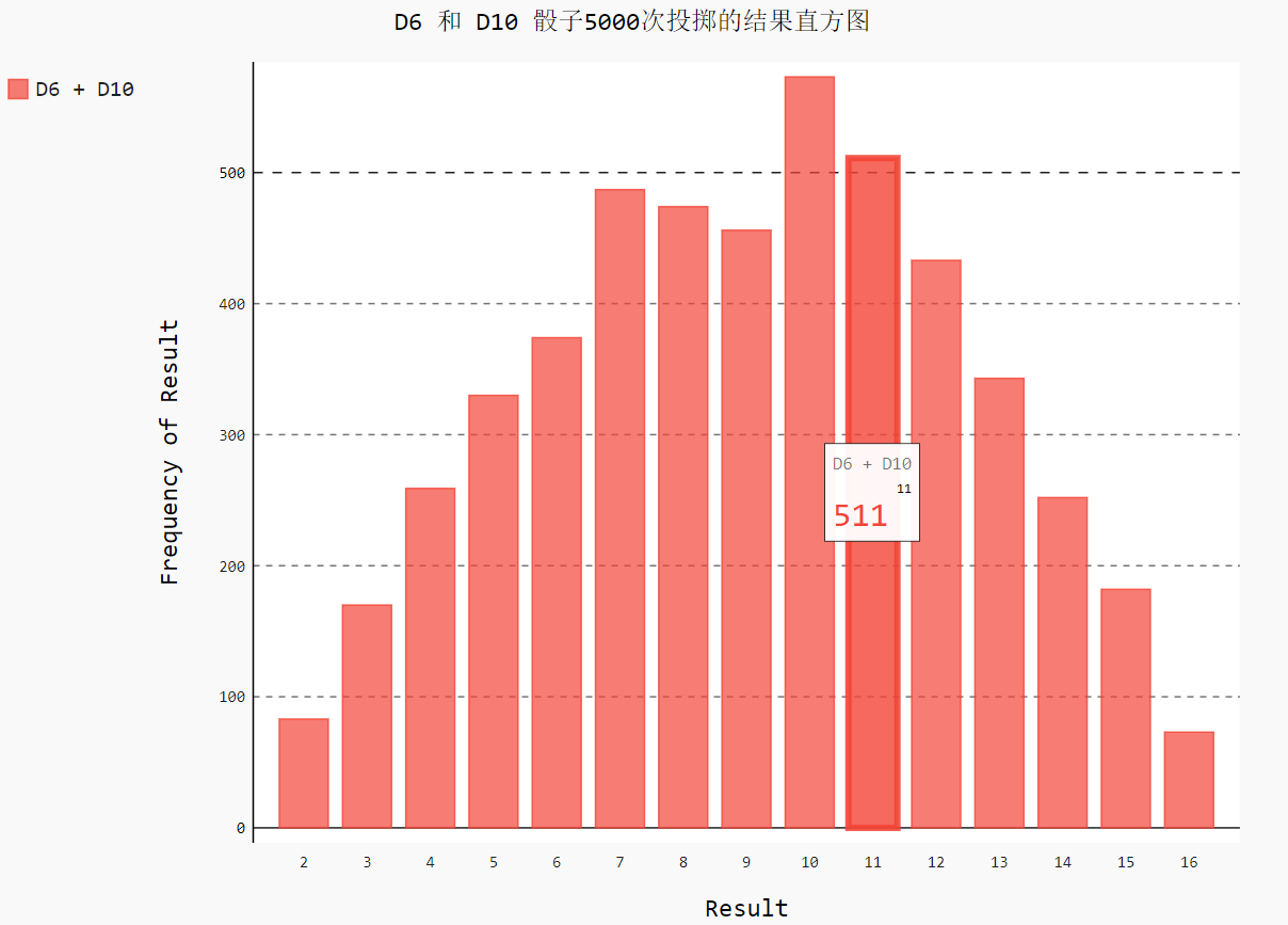
ЖдЭЌЪБжРСНИіїЛзгЕФНсЙћНјааЗжЮіЃЌЩњГЩвЛИіжРЩИзгЕФНсЙћЪ§ОнМЏВЂИљОнНсЙћЛцжЦГівЛИіЭМаЮЁЃ
5.2 дДТы
#conding=utf-8
from die import Die
import pygal
import matplotlib as mpl
# НтОіжаЮФТвТыЮЪЬт
mpl.rcParams['font.sans-serif']=['SimHei']
mpl.rcParams['axes.unicode_minus']=False
die1 = Die()
die2 = Die(10)
results = []
for roll_num in range(5000):
result = die1.roll() + die2.roll()
results.append(result)
# print(results)
# ЗжЮіНсЙћ
frequencies = []
max_result = die1.num_sides+die2.num_sides
for value in range(2,max_result+1):
frequency = results.count(value)
frequencies.append(frequency)
# print(frequencies)
hist = pygal.Bar()
hist.title = 'D6 КЭ D10 їЛзг5000ДЮЭЖжРЕФНсЙћжБЗНЭМ'
# hist.x_labels=['2','3','4','5','6','7','8','9','10',
'11','12','13','14','15','16']
hist.x_labels=[x for x in range(2,max_result+1)]
hist.x_title = 'Result'
hist.y_title ='Frequency of Result'
hist.add('D6 + D10',frequencies)
hist.render_to_file('dice_visual.svg') |
5.3 ЩњГЩНсЙћ
6 ЛцжЦЦјЮТЭМБэ
6.1 ашЧѓУшЪі
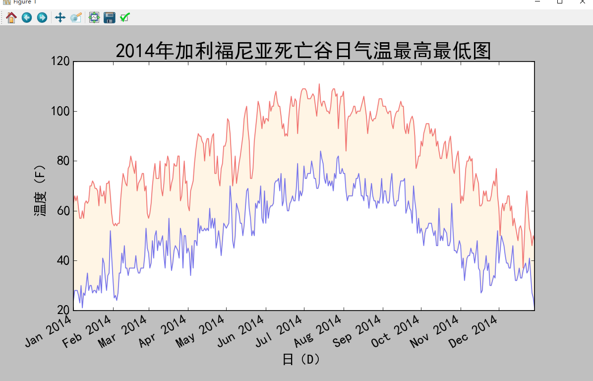
ЖдcsvЮФМўНјааДІРэЃЌЬсШЁВЂЖСШЁЬьЦјЪ§ОнЃЌЛцжЦЦјЮТБэЃЌдкЭМБэжаЬэМгШеЦкВЂЛцжЦзюИпЦјЮТКЭзюЕЭЦјЮТЕФелЯпЭМЃЌВЂЖдЦјЮТЧјгђНјаазХЩЋЁЃ
6.2 дДТы
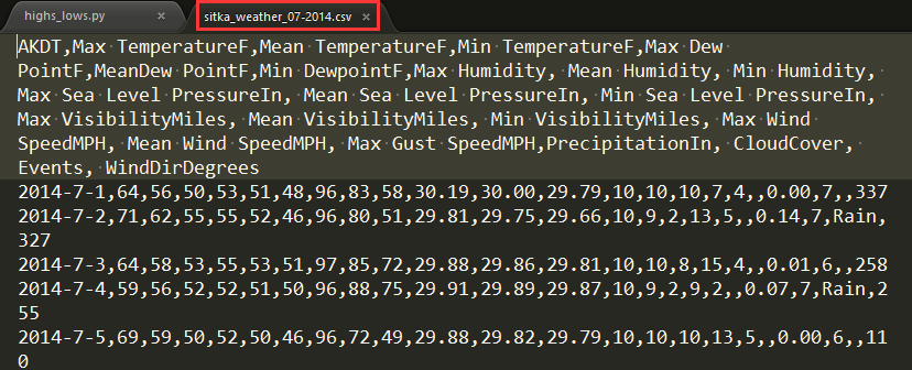
csvЮФМўжа2014Фъ7дТВПЗжЪ§ОнаХЯЂ
View Code
AKDT,Max TemperatureF,Mean
TemperatureF,
Min TemperatureF,Max Dew PointF,MeanDew
PointF,Min DewpointF,Max Humidity, Mean Humidity,
Min Humidity, Max Sea Level PressureIn,
Mean Sea
Level PressureIn, Min Sea Level PressureIn,
Max
VisibilityMiles, Mean VisibilityMiles, Min VisibilityMiles,
Max Wind SpeedMPH, Mean Wind SpeedMPH, Max Gust
SpeedMPH,PrecipitationIn, CloudCover, Events,
WindDirDegrees
2014-7-1,64,56,50,53,51,48,96,83,58,30.19,30.00,29.79,
10,10,10,7,4,,0.00,7,,337
2014-7-2,71,62,55,55,52,46,96,80,51,29.81,29.75,29.66,
10,9,2,13,5,,0.14,7,Rain,327
2014-7-3,64,58,53,55,53,51,97,85,72,29.88,29.86,29.81,
10,10,8,15,4,,0.01,6,,258
2014-7-4,59,56,52,52,51,50,96,88,75,29.91,29.89,29.87,
10,9,2,9,2,,0.07,7,Rain,255
2014-7-5,69,59,50,52,50,46,96,72,49,29.88,29.82,29.79,
10,10,10,13,5,,0.00,6,,110
2014-7-6,62,58,55,51,50,46,80,71,58,30.13,30.07,29.89,
10,10,10,20,10,29,0.00,6,Rain,213
2014-7-7,61,57,55,56,53,51,96,87,75,30.10,30.07,30.05,
10,9,4,16,4,25,0.14,8,Rain,211
2014-7-8,55,54,53,54,53,51,100,94,86,30.10,30.06,30.04,
10,6,2,12,5,23,0.84,8,Rain,159
2014-7-9,57,55,53,56,54,52,100,96,83,30.24,30.18,30.11,
10,7,2,9,5,,0.13,8,Rain,201
2014-7-10,61,56,53,53,52,51,100,90,75,30.23,30.17,30.03,
10,8,2,8,3,,0.03,8,Rain,215
2014-7-11,57,56,54,56,54,51,100,94,84,30.02,30.00,29.98,
10,5,2,12,5,,1.28,8,Rain,250
2014-7-12,59,56,55,58,56,55,100,97,93,30.18,30.06,29.99,
10,6,2,15,7,26,0.32,8,Rain,275
2014-7-13,57,56,55,58,56,55,100,98,94,30.25,30.22,30.18,
10,5,1,8,4,,0.29,8,Rain,291
2014-7-14,61,58,55,58,56,51,100,94,83,30.24,30.23,30.22,
10,7,0,16,4,,0.01,8,Fog,307
2014-7-15,64,58,55,53,51,48,93,78,64,30.27,30.25,30.24,
10,10,10,17,12,,0.00,6,,318
2014-7-16,61,56,52,51,49,47,89,76,64,30.27,30.23,30.16,
10,10,10,15,6,,0.00,6,,294
2014-7-17,59,55,51,52,50,48,93,84,75,30.16,30.04,29.82,
10,10,6,9,3,,0.11,7,Rain,232
2014-7-18,63,56,51,54,52,50,100,84,67,29.79,29.69,29.65
,10,10,7,10,5,,0.05,6,Rain,299
2014-7-19,60,57,54,55,53,51,97,88,75,29.91,29.82,29.68,
10,9,2,9,2,,0.00,8,,292
2014-7-20,57,55,52,54,52,50,94,89,77,29.92,29.87,29.78,
10,8,2,13,4,,0.31,8,Rain,155
2014-7-21,69,60,52,53,51,50,97,77,52,29.99,29.88,29.78,
10,10,10,13,4,,0.00,5,,297
2014-7-22,63,59,55,56,54,52,90,84,77,30.11,30.04,29.99,
10,10,10,9,3,,0.00,6,Rain,240
2014-7-23,62,58,55,54,52,50,87,80,72,30.10,30.03,29.96,
10,10,10,8,3,,0.00,7,,230
2014-7-24,59,57,54,54,52,51,94,84,78,29.95,29.91,29.89,
10,9,3,17,4,28,0.06,8,Rain,207
2014-7-25,57,55,53,55,53,51,100,92,81,29.91,29.87,29.83,
10,8,2,13,3,,0.53,8,Rain,141
2014-7-26,57,55,53,57,55,54,100,96,93,29.96,29.91,29.87,
10,8,1,15,5,24,0.57,8,Rain,216
2014-7-27,61,58,55,55,54,53,100,92,78,30.10,30.05,29.97,
10,9,2,13,5,,0.30,8,Rain,213
2014-7-28,59,56,53,57,54,51,97,94,90,30.06,30.00,29.96,
10,8,2,9,3,,0.61,8,Rain,261
2014-7-29,61,56,51,54,52,49,96,89,75,30.13,30.02,29.95,
10,9,3,14,4,,0.25,6,Rain,153
2014-7-30,61,57,54,55,53,52,97,88,78,30.31,30.23,30.14,
10,10,8,8,4,,0.08,7,Rain,160
2014-7-31,66,58,50,55,52,49,100,86,65,30.31,30.29,30.26,
10,9,3,10,4,,0.00,3,,217 |
highs_lows.pyЮФМўаХЯЂ
import csv
from datetime import datetime
from matplotlib import pyplot as plt
import matplotlib as mpl
# НтОіжаЮФТвТыЮЪЬт
mpl.rcParams['font.sans-serif']=['SimHei']
mpl.rcParams['axes.unicode_minus']=False
# Get dates, high, and low temperatures from
file.
filename = 'death_valley_2014.csv'
with open(filename) as f:
reader = csv.reader(f)
header_row = next(reader)
# print(header_row)
# for index,column_header in enumerate(header_row):
# print(index,column_header)
dates, highs,lows = [],[], []
for row in reader:
try:
current_date = datetime.strptime(row[0], "%Y-%m-%d")
high = int(row[1])
low = int(row[3])
except ValueError: # ДІРэ
print(current_date, 'missing data')
else:
dates.append(current_date)
highs.append(high)
lows.append(low)
# ЛужЦЪ§ОнЭМаЮ
fig = plt.figure(dpi=120,figsize=(10,6))
plt.plot(dates,highs,c='red',alpha=0.5)# alphaжИЖЈЭИУїЖШ
plt.plot(dates,lows,c='blue',alpha=0.5)
plt.fill_between(dates,highs,lows,facecolor='orange',
alpha=0.1)#НгЪевЛИіxжЕЯЕСаКЭyжЕЯЕСаЃЌИјЭМБэЧјгђзХЩЋ
#ЩшжУЭМаЮИёЪН
plt.title('2014ФъМгРћИЃФсбЧЫРЭіЙШШеЦјЮТзюИпзюЕЭЭМ',
fontsize=24)
plt.xlabel('ШеЃЈDЃЉ',fontsize=16)
fig.autofmt_xdate() # ЛцжЦаБЬхШеЦкБъЧЉ
plt.ylabel('ЮТЖШЃЈFЃЉ',fontsize=16)
plt.tick_params(axis='both',which='major',labelsize=16)
# plt.axis([0,31,54,72]) # здЖЈвхЪ§жсЦ№ЪМПЬЖШ
plt.savefig('highs_lows.png',bbox_inches='tight')
plt.show() |
6.3 ЩњГЩНсЙћ
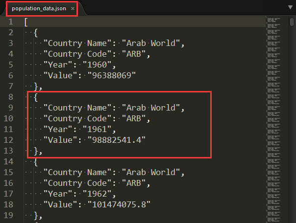
7 жЦзїЪРНчШЫПкЕиЭМЃКJSONИёЪН
7.1 ашЧѓУшЪі
ЯТдиjsonИёЪНЕФШЫПкЪ§ОнЃЌВЂЪЙгУjsonФЃПщРДДІРэЁЃ
7.2 дДТы
jsonЪ§Онpopulation_data.jsonВПЗжаХЯЂ
countries.py
from pygal.maps.world
import COUNTRIES
for country_code in sorted(COUNTRIES.keys()):
print(country_code, COUNTRIES[country_code]) |
countries_codes.py
from pygal.maps.world
import COUNTRIES
def get_country_code(country_name):
"""Return
the Pygal 2-digit country code for the given country."""
for code, name in COUNTRIES.items():
if name == country_name:
return code
# If the country wasn't found, return None.
return
print(get_country_code('Thailand'))
# print(get_country_code('Andorra')) |
americas.py
import pygal
wm =pygal.maps.world.World()
wm.title = 'North, Central, and South America'
wm.add('North America', ['ca', 'mx', 'us'])
wm.add('Central America', ['bz', 'cr', 'gt',
'hn', 'ni', 'pa', 'sv'])
wm.add('South America', ['ar', 'bo', 'br', 'cl',
'co', 'ec', 'gf',
'gy', 'pe', 'py', 'sr', 'uy', 've'])
wm.add('Asia', ['cn', 'jp', 'th'])
wm.render_to_file('americas.svg') |
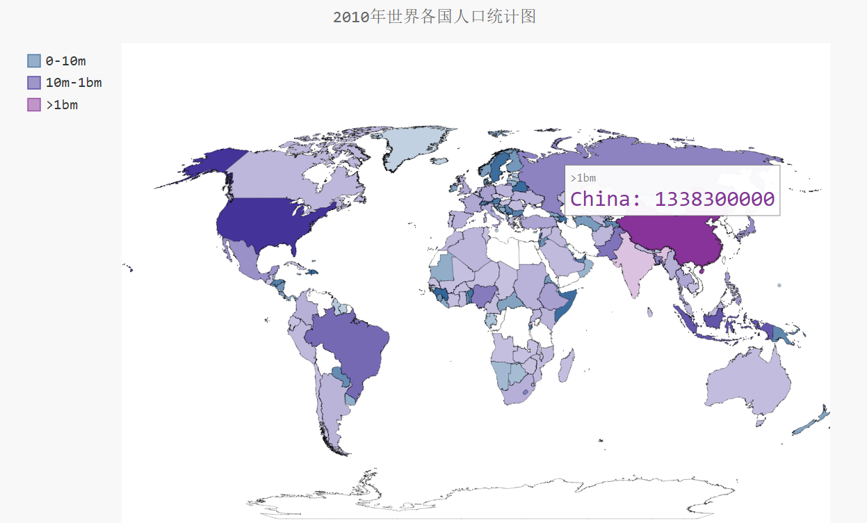
world_population.py
#conding = utf-8
import json
from matplotlib import pyplot as plt
import matplotlib as mpl
from country_codes import get_country_code
import pygal
from pygal.style import RotateStyle
from pygal.style import LightColorizedStyle
# НтОіжаЮФТвТыЮЪЬт
mpl.rcParams['font.sans-serif']=['SimHei']
mpl.rcParams['axes.unicode_minus']=False
# МгдиjsonЪ§Он
filename='population_data.json'
with open(filename) as f:
pop_data = json.load(f)
# print(pop_data[1])
# ДДНЈвЛИіАќКЌШЫПкЕФзжЕф
cc_populations={}
# cc1_populations={}
# ДђгЁУПИіЙњМв2010ФъЕФШЫПкЪ§СП
for pop_dict in pop_data:
if pop_dict['Year'] == '2010':
country_name = pop_dict['Country Name']
population = int(float(pop_dict['Value'])) #
зжЗћДЎЪ§жЕзЊЛЏЮЊећЪ§
# print(country_name + ":" + str(population))
code = get_country_code(country_name)
if code:
cc_populations[code] = population
# elif pop_dict['Year'] == '2009':
# country_name = pop_dict['Country Name']
# population = int(float(pop_dict['Value']))
# зжЗћДЎЪ§жЕзЊЛЏЮЊећЪ§
# # print(country_name + ":" + str(population))
# code = get_country_code(country_name)
# if code:
# cc1_populations[code] = population
cc_pops_1,cc_pops_2,cc_pops_3={},{},{}
for cc,pop in cc_populations.items():
if pop <10000000:
cc_pops_1[cc]=pop
elif pop<1000000000:
cc_pops_2[cc]=pop
else:
cc_pops_3[cc]=pop
# print(len(cc_pops_1),len(cc_pops_2),len(cc_pops_3))
wm_style = RotateStyle('#336699',base_style=LightColorizedStyle)
wm =pygal.maps.world.World(style=wm_style)
wm.title = '2010ФъЪРНчИїЙњШЫПкЭГМЦЭМ'
wm.add('0-10m', cc_pops_1)
wm.add('10m-1bm',cc_pops_2)
wm.add('>1bm',cc_pops_3)
# wm.add('2009', cc1_populations)
wm.render_to_file('world_populations.svg') |
7.3 ЩњГЩНсЙћ
countries.py
world_population.py
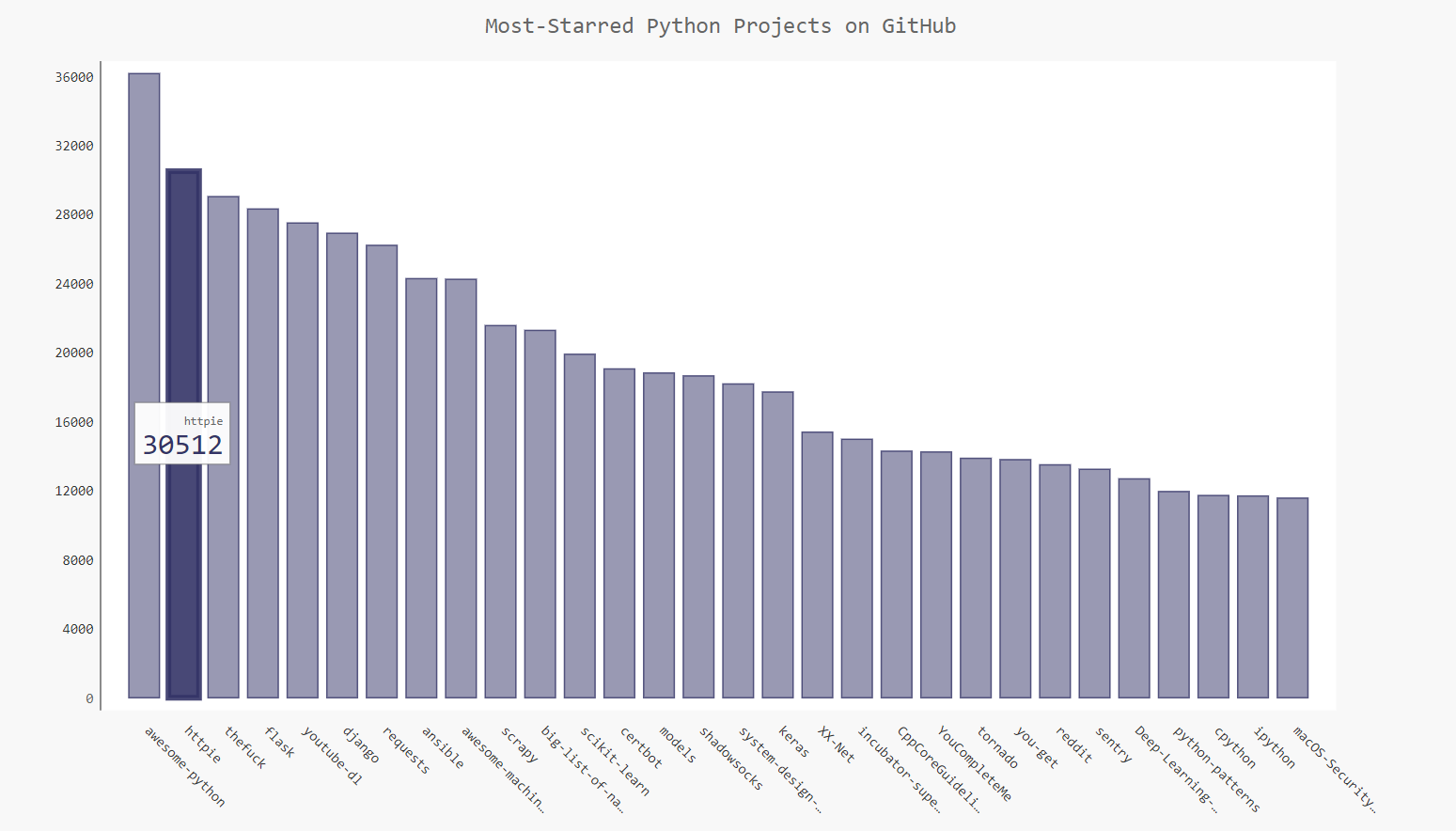
8 PygalПЩЪгЛЏgithubВжПт
8.1 ашЧѓУшЪі
ЕїгУweb APIЖдGitHubЪ§ОнВжПтНјааПЩЪгЛЏеЙЪО:https://api.github.com/search/repositories?q=language:python&sort=stars
8.2 дДТы
python_repos.py
# coding=utf-8
import requests
import pygal
from pygal.style import LightColorizedStyle as
LCS, LightenStyle as LS
# Make an API call, and store the response.
url = 'https://api.github.com/search/repositories?q=language:python&sort=stars'
r = requests.get(url)
print("Status code:", r.status_code)
# ВщПДЧыЧѓЪЧЗёГЩЙІЃЌ200БэЪОГЩЙІ
response_dict = r.json()
# print(response_dict.keys())
print("Total repositories:", response_dict['total_count'])
# Explore information about the repositories.
repo_dicts = response_dict['items']
print("Repositories returned:",len(repo_dicts))
# ВщПДЯюФПаХЯЂ
# repo_dict =repo_dicts[0]
# print('\n\neach repository:')
# for repo_dict in repo_dicts:
# print("\nName:",repo_dict['name'])
# print("Owner:",repo_dict['owner']['login'])
# print("Stars:",repo_dict['stargazers_count'])
# print("Repository:",repo_dict['html_url'])
# print("Description:",repo_dict['description'])
# ВщПДУПИіЯюФПЕФМќ
# print('\nKeys:',len(repo_dict))
# for key in sorted(repo_dict.keys()):
# print(key)
names, plot_dicts = [], []
for repo_dict in repo_dicts:
names.append(repo_dict['name'])
plot_dicts.append(repo_dict['stargazers_count'])
# ПЩЪгЛЏ
my_style = LS('#333366', base_style=LCS)
my_config = pygal.Config() # PygalРрConfigЪЕР§ЛЏ
my_config.x_label_rotation = 45 # xжсБъЧЉа§зЊ45ЖШ
my_config.show_legend = False # show_legendвўВиЭМР§
my_config.title_font_size = 24 # ЩшжУЭМБъБъЬтжїБъЧЉИББъЧЉЕФзжЬхДѓаЁ
my_config.label_font_size = 14
my_config.major_label_font_size = 18
my_config.truncate_label = 15 # НЯГЄЕФЯюФПУћГЦЫѕЖЬ15зжЗћ
my_config.show_y_guides = False # вўВиЭМБэжаЕФЫЎЦНЯп
my_config.width = 1000 # здЖЈвхЭМБэЕФПэЖШ
chart = pygal.Bar(my_config, style=my_style)
chart.title = 'Most-Starred Python Projects
on GitHub'
chart.x_labels = names
chart.add('', plot_dicts)
chart.render_to_file('python_repos.svg') |
8.3 ЩњГЩНсЙћ
9 ВЮПМЮФЯз
1 matplotlibЙйЭј
2 ЬьЦјЪ§ОнЙйЭј
3 ЪЕбщЪ§ОнЯТди
4 google charts
5 Plotly
6 Jpgraph |