| 编辑推荐: |
| 本文来自于segmentfault,主要详细介绍了Flutter的各个控件的使用及代码实例,希望对您能有所帮助。 |
|
开始
搞前端的同学可能都习惯了CSS局部的思维,过去也出现过一些跟布局或者样式相关的标签,例如:big,
center, font, s, strike, tt, u;但是目前也被CSS所代替,已经不推荐使用。但是在Flutter里面,是没有CSS这样一个概念的,布局和样式都可能会是一个组件或者是组件里面的属性所定义和实现的,对于习惯写样式的前端同学可能需要适应一下。
个人思考
现在可能要想一下,Flutter为啥没有像浏览器一样抽离出CSS?
我们知道在浏览器里面JS,CSS,HTML各司其职:行为,表现和结构,已经深入人心,也被很多人所推崇。但是Flutter好像反其道而行之,样式糅合在结构里面,这样究竟有啥意思尼?
首先应该是一个性能的考虑,浏览器解析CSS其实也是一个性能消耗点,没有CSS解析自然也可以加快页面的显示。
其次再讨论一下CSS,CSS确实非常适合描述样式和布局,但是也有很明显的缺点:作用域全局性,代码冗余,代码难以重用,难以模块化等;我们修修补补,又创造了less,sass等工具帮助我们去解决问题,但是自身的缺陷依然会存在,甚至有点钻牛角尖,因为存在了CSS,所以只能改进CSS。
而在Flutter,没有了CSS,以上的问题自然荡然无存,那么描述样式会不会变得很麻烦?大道行之,我们的前辈们早就在代码上总结出很多设计模式或者技术去解决代码重用,代码冗余,模块化的问题,为什么我们不去用已经存在很久而且行之有效的技术去解决问题尼。自然把样式糅合进结构会增加信息量,对我们阅读代码可能会是一个小小的挑战,但是应该也会很快适应下来的,我相信。
我们很多时候都在创造新的工具的解决问题,其实也有可能创造出新的问题,有时候回归根本,不一定是一件坏事。
各种各样的控件
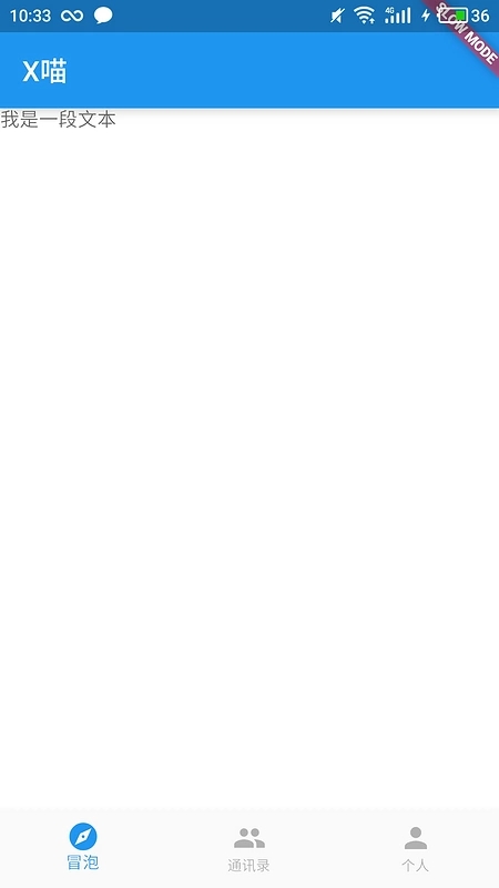
Directionality
主要控制文字方向
Widget build(BuildContext
context) {
return new Container(
color: Colors.white,
child: new Text('我是一段文本')
);
} |
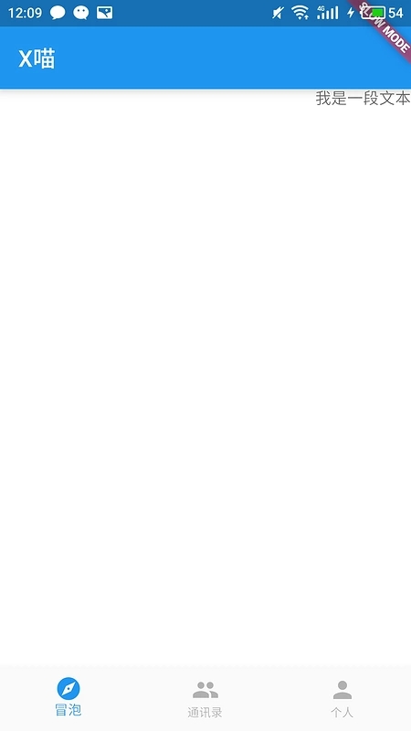
加入控件后
Widget build(BuildContext
context) {
return new Container(
color: Colors.white,
child: new Directionality(
textDirection: TextDirection.rtl,
child: new Text('我是一段文本')
)
);
} |
DefaultTextStyle
跟文本相关的还有一个DefaultTextStyle控件,提供了更多的控制选项:textAlign,softWrap,style和maxLines等,都是控制整体:换行,文字居中和多行省略等,相对style提供都是文字自身样式相关:字重,字体大小等
const TextStyle({
this.inherit: true,
this.color,
this.fontSize,
this.fontWeight,
this.fontStyle,
this.letterSpacing,
this.wordSpacing,
this.textBaseline,
this.height,
this.decoration,
this.decorationColor,
this.decorationStyle,
this.debugLabel,
String fontFamily,
String package,
}) |
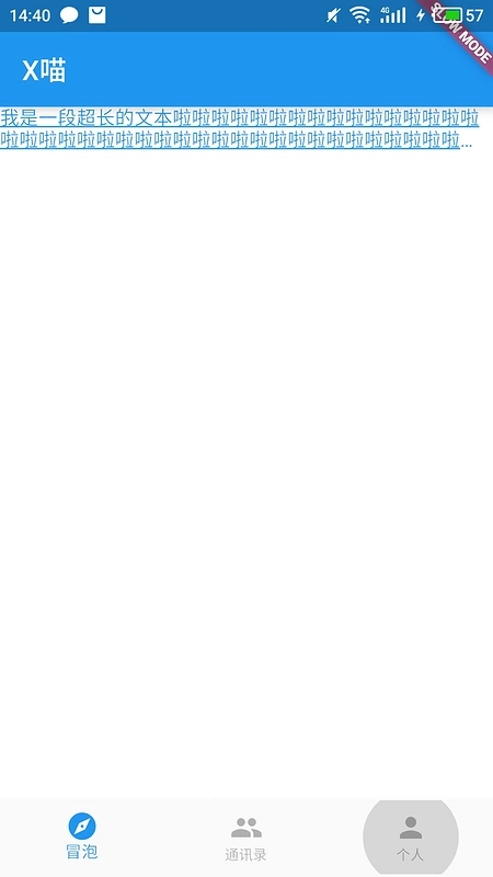
演示一下效果:
Widget build(BuildContext
context) {
return new Container(
color: Colors.white,
child: new Directionality(
textDirection: TextDirection.ltr,
child: new DefaultTextStyle(
style: new TextStyle(
fontSize: 14.0,
color: Colors.blue,
decoration: TextDecoration.underline
),
maxLines: 2,
softWrap: true,
overflow: TextOverflow.ellipsis,
child: new Text('我是一段超长的文本啦啦啦啦啦啦啦啦啦啦啦啦啦啦啦啦'
'啦啦啦啦啦啦啦啦啦啦啦啦啦啦啦啦啦啦啦啦啦啦啦啦啦啦啦啦啦啦啦啦啦'
'啦啦啦啦啦啦啦啦啦啦啦啦啦啦啦啦啦啦啦啦啦啦啦啦啦啦啦啦啦啦啦啦啦啦'
'啦啦啦啦啦啦啦啦啦啦啦啦啦啦啦啦啦啦')
)
)
);
} |
其实Text控件就已经带上这些属性:
const Text(this.data,
{
Key key,
this.style,
this.textAlign,
this.textDirection,
this.softWrap,
this.overflow,
this.textScaleFactor,
this.maxLines,
}) |
为什么又要独立出这些控件专门管理呢,我们知道CSS属性里面有些属性时继承父元素的,例如:字体大小,颜色等;这样的话,我们很容易统一一个模块里面的样式,并不需要每个元素都要去设置一遍,这里的这些控件也是起到这样的功能,其实除了些字体样式还有很多地方会有这种继承关系,例如:主题颜色,语言文字等等。所以后面Text控件很容易从控件树上找到这些父控件,获取它们设置的属性,就这样就可以把父控件的样式继承下来。
怎么做到的呢,无论Directionality还是DefaultTextStyle都是InheritedWidget的子类,InheritedWidget实现了一个发布/订阅的模式,当子控件调用inheritFromWidgetOfExactType方法获取父控件时,同时也把自己加入到InheritedWidget的订阅者列表里面,所以当InheritedWidget属性改变的时候,就会调起子组件didChangeDependencies方法去通知子组件。
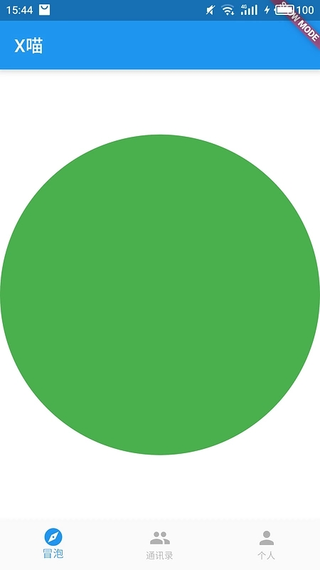
CustomPaint
这个控件感觉必须得介绍一下,因为在前端我们有一个canvas元素,可以提供给我们直接去绘制元素,给了我们很大的灵活性,那么Flutter中对应的应该就是这个控件了。
如何使用:
先继承CustomPainter
class CustomPainterSample
extends CustomPainter {
double progress;
CustomPainterSample({this.progress: 0.0});
@override
void paint(Canvas canvas, Size size) {
Paint p = new Paint();
p.color = Colors.green;
p.isAntiAlias = true;
p.style = PaintingStyle.fill;
canvas.drawCircle(size.center(const Offset(0.0,
0.0)), size.width / 2 * progress, p);
}
@override
bool shouldRepaint(CustomPainter oldDelegate)
{
return true;
}
} |
这里我画了一个绿色的圆,然后把这个CustomPainterSample传到CustomPaint控件。
Widget build(BuildContext
context) {
return new Container(
color: Colors.white,
child: new CustomPaint(
painter: new CustomPainterSample(progress: this.progress),
)
);
} |
当然了,既然可以随便画点东西,做点动画也是妥妥的,好再加个放大的动画,完整代码:
class SquareFragmentState
extends State<SquareFragment> with TickerProviderStateMixin
{
double progress = 0.0;
@override
void initState() {
AnimationController ac = new AnimationController(
vsync: this,
duration: const Duration(milliseconds: 10000)
);
ac.addListener(() {
this.setState(() {
this.progress = ac.value;
});
});
ac.forward();
}
@override
Widget build(BuildContext context) {
return new Container(
color: Colors.white,
child: new CustomPaint(
painter: new CustomPainterSample(progress: this.progress),
)
);
}
} |
这里mixin了TickerProviderStateMixin,里面有一个createTicker方法,主要是监听每一帧生成然后回调,主要是由SchedulerBinding.instance.scheduleFrameCallback方法所驱动的。
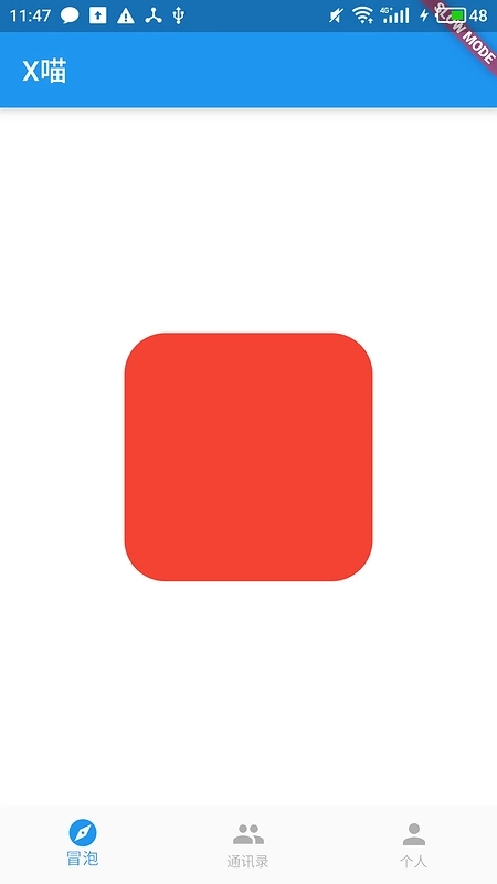
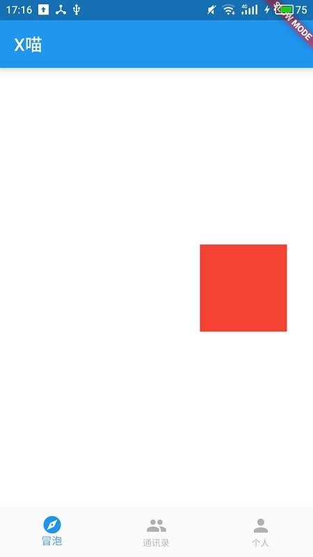
ClipRRect
剪切元素的边界,这里类似CSS的border-radius属性;
Widget build(BuildContext
context) {
return new Container(
color: Colors.white,
child: new Align(
alignment: Alignment.center,
child: new ClipRRect(
borderRadius: const BorderRadius.all(const Radius.circular(30.0)),
child: new Container(
width: 180.0,
height: 180.0,
color: Colors.red,
),
),
),
);
} |
效果:
把radius值调到90,变成了圆形:
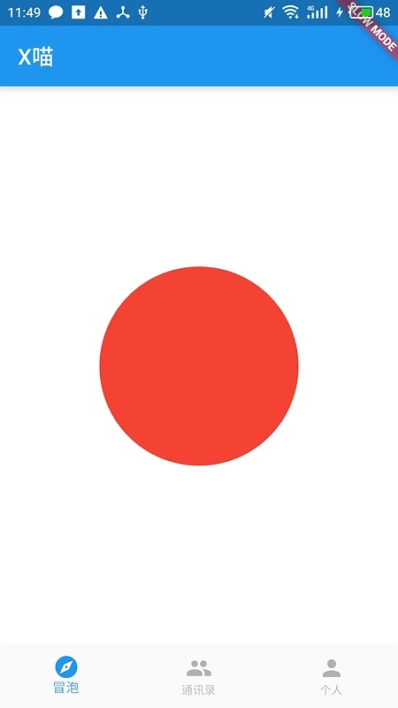
类似的可以剪切元素的还有ClipOval,ClipPath,这里就不深入介绍了。
PhysicalModel
先看效果:
Widget build(BuildContext
context) {
return new Container(
color: Colors.white,
child: new Align(
alignment: Alignment.center,
child: new PhysicalModel(
color: Colors.black,
elevation: 6.0,
child: new Container(
width: 180.0,
height: 180.0,
color: Colors.red,
),
),
),
);
} |
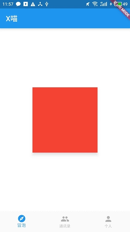
可以看到红色方块底下有一个阴影,让红色方块有一种悬浮的感觉,有material design的风格。
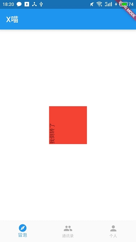
Transform
类似于CSS的transform属性,可以提供沿着X,Y或者Z轴旋转,位移拉伸等效果。
Widget build(BuildContext
context) {
return new Container(
color: Colors.white,
child: new Align(
alignment: Alignment.center,
child: new Transform(
transform: new Matrix4.rotationZ(PI / 2),
child: new Container(
color: Colors.black,
child: new Text('垂直文字', style: const TextStyle(color:
Colors.red),)
)
),
),
);
} |
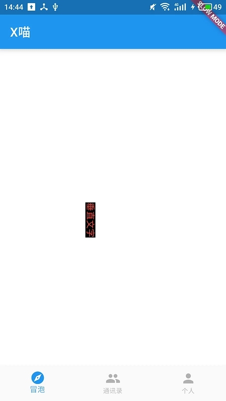
得注意一下,Transform控件中的transformHitTests属性,如果我们沿着X轴位移一个按钮,一般来说,我们照样可以直接点击位移之后的按钮,因为transformHitTests为true的时候,在hitTest会判断点击落点是否在transfrom所做的操作(旋转,拉伸或者位移等)后的区域里面,但是如果为false,此时点击按钮原来的区域仍然会触发点击事件,但是直接点击就不行了。
FractionalTranslation
可以提供位移,但是并没有Tranform控件提供那么多变换,仅仅是上下左右的位移,而且位移的基准是以child的大小进行的。
Widget build(BuildContext
context) {
return new Container(
color: Colors.white,
alignment: Alignment.center,
child: new FractionalTranslation(
translation: const Offset(1.0, 0.0),
child: new Container(
width: 100.0,
height: 100.0,
color: Colors.red,
),
)
);
} |
效果:
红色方块往右边移动了一个身位,就跟CSS中transfrom: translate(100%, 0)效果一样的。
RotatedBox
旋转盒子,可以使用quarterTurns属性控制旋转,每次旋转quarterTurns
* 90度。
Widget build(BuildContext
context) {
return new Container(
color: Colors.white,
alignment: Alignment.center,
child: new RotatedBox(
quarterTurns: -1,
child: new Container(
width: 100.0,
height: 100.0,
color: Colors.red,
child: new Text('我倒转了'),
),
)
);
} |
Padding
在前端每个元素都基本会有border, margin, padding,但是在Flutter里面可能不得不吐槽连padding都要用个控件,未免太过于麻烦。对于此框架的开发者们也有自己一套看法,在Flutter里面组合简单的控件去实现复杂的控件,而不是通过继承去实现可以说是Flutter的主要设计思想,所以你会发现尽管Container控件提供了padding的参数,但其实它也背后也是通过创建Padding控件来实现效果的。
FittedBox
在CSS中有background-position和background-size两个属性控制背景图如何平铺,例如:如果背景图比元素尺寸大或者小的时候,是否要进行拉伸,如果要拉伸,是拉伸图片宽度还是拉伸图片高度来适应等等。
而FittedBox所做的事情也是差不多,它有两个很重要的参数:aligment 和 fit。
fit可取值:
BoxFit.fill
BoxFit.contain
BoxFit.cover
BoxFit.fitWidth
BoxFit.fitHeight
基本这个跟CSS的background-size取值都一样的。
而aligment则是控制,当子元素大小没有完全占满父元素的时候,如何定位,是居中还是靠左靠右。
虽然拿background-size来做对比,但是background-size只是控制背景图片,而FittedBox几乎可以对任何元素起作用,因为它是通过Transform放大缩小子元素来达到刚才所说的效果。
Widget build(BuildContext
context) {
return new Container(
color: Colors.white,
alignment: Alignment.center,
child: new Container(
width: 200.0,
height: 100.0,
color: Colors.black
child: new FittedBox(
fit: BoxFit.fitHeight,
alignment: Alignment.bottomRight,
child: new Container(
color: Colors.red,
width: 300.0,
height: 240.0,
alignment: Alignment.center,
child: new Text('AAA'),
),
)
)
);
} |
效果:
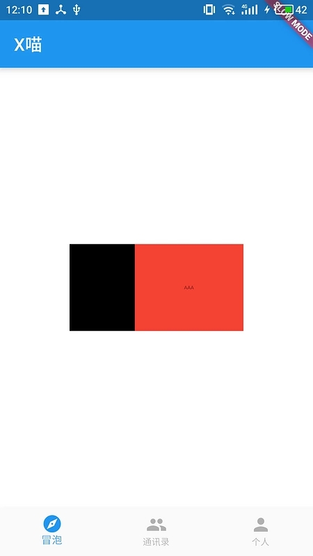
这里红盒子大小是比黑盒子大的,但是fit为BoxFit.fitHeight就会通过拉伸高度来适应黑盒子,如果把fit属性改成BoxFit.fitWidth,效果就是这样的:
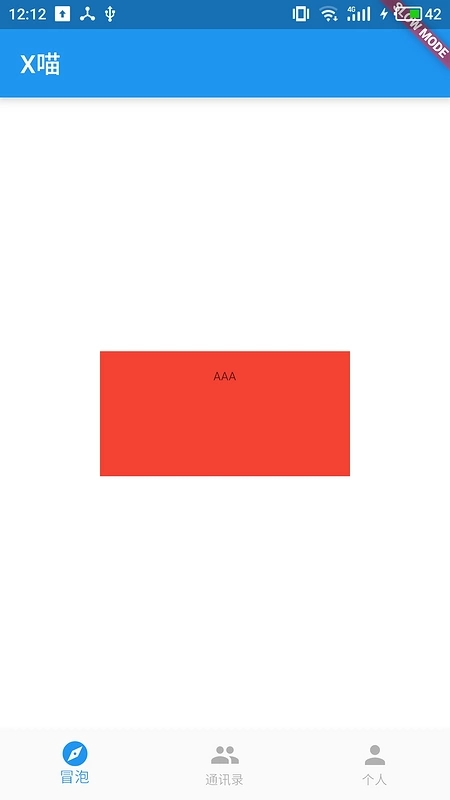
可以看到字体是被直接缩小了。
SizedBox & ConstrainedBox
为什么把两个控件一起讲呢?因为它们都依赖了相同的RenderObject:RenderConstrainedBox,而RenderConstrainedBox只有一个参数:additionalConstraints。
而这个参数在performLayout中:
void performLayout()
{
if (child != null) {
child.layout(_additionalConstraints .enforce(constraints),
parentUsesSize: true);
size = child.size;
} else {
size = _additionalConstraints.enforce(constraints)
.constrain(Size.zero);
}
} |
可见additionalConstraints是在原基础constraints增加了自己的约束,但是并不会打破原来的约束条件。
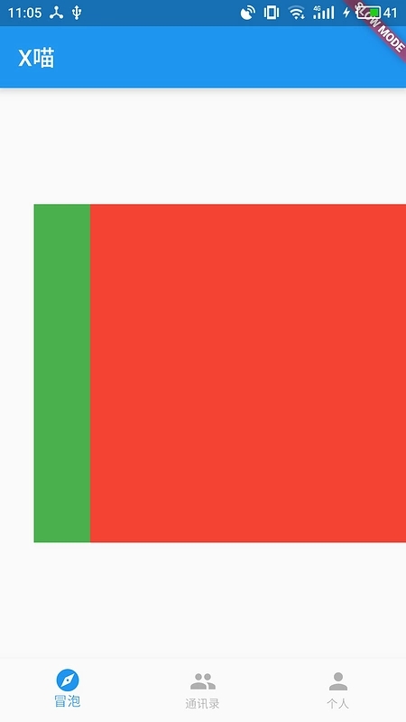
FractionallySizedBox
主要有三个参数:aligment, widthFactor 和 heightFactor。
aligment参数控制child的定位;widthFactor 和 heightFactor 控制child的约束,如果widthFactor或者heightFactor不为null,会产生一个新的BoxConstraints:它的minWidth
和 maxWidth为原BoxConstraint.maxWidth widthFactor;minHeight
和 maxHeight为原BoxConstraint.maxHeight heightFactor。
代码:
BoxConstraints
enforce(BoxConstraints constraints) {
return new BoxConstraints(
minWidth: minWidth.clamp(constraints.minWidth,
constraints.maxWidth),
maxWidth: maxWidth.clamp(constraints.minWidth,
constraints.maxWidth),
minHeight: minHeight.clamp(constraints.minHeight,
constraints.maxHeight),
maxHeight: maxHeight.clamp(constraints.minHeight,
constraints.maxHeight)
);
} |
效果:
可以看到当widthFactor和heigthFractor时,红色盒子宽高都为绿色的一半。
LimitedBox
看名称也知道跟控制尺寸有关了,这个控件主要有两个参数:maxWidth和maxHeight,当constraints是unbounded的时候,也就是maxWidth和maxHeight都是infinite的时候,会用maxWidth和maxHeight替换原来的maxWidth和maxHeight,所以如果contraints是bounded的时候并不会起作用。
关键代码:
BoxConstraints
_limitConstraints(BoxConstraints constraints)
{
return new BoxConstraints(
minWidth: constraints.minWidth,
maxWidth: constraints.hasBoundedWidth ? constraints.maxWidth
: constraints.constrainWidth(maxWidth),
minHeight: constraints.minHeight,
maxHeight: constraints.hasBoundedHeight ? constraints.maxHeight
: constraints.constrainHeight(maxHeight)
);
}
@override
void performLayout() {
if (child != null) {
child.layout(_limitConstraints(constraints), parentUsesSize:
true);
size = constraints.constrain(child.size);
} else {
size = _limitConstraints(constraints).constrain(Size.zero);
}
} |
对比ConstrainedBox,明显使用范围就没有那么广了。
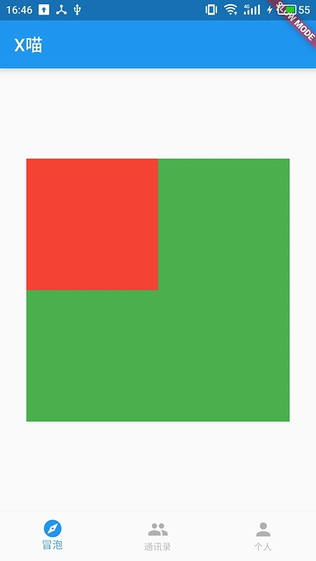
OverflowBox
从前面的几个控件:SizedBox,ConstrainedBox和LimitedBox分析知道,我们似乎没有办法打破由parent传递下来的约束条件,但是我们总会有一些情况是子组件的尺寸大于父组件的情况,那么怎么解决的尼?来,就看这里的OverflowBox控件,这个控件提供了几个参数:minWidth,minHeight,maxWidth,maxHeight
和 aligment;先看代码:
BoxConstraints
_getInnerConstraints(BoxConstraints constraints)
{
return new BoxConstraints(
minWidth: _minWidth ?? constraints.minWidth,
maxWidth: _maxWidth ?? constraints.maxWidth,
minHeight: _minHeight ?? constraints.minHeight,
maxHeight: _maxHeight ?? constraints.maxHeight
);
}
void performLayout() {
if (child != null) {
child.layout(_getInnerConstraints(constraints),
parentUsesSize: true);
alignChild();
}
} |
这里可以看到直接使用我们传入的参数替换了原本的minxWidth,maxWidth等,所以底下的组件可以根据新的约束条件来布局。
做一下demo:
Widget build(BuildContext
context) {
return new Align(
alignment: Alignment.center,
child: new Container(
color: Colors.green,
alignment: Alignment.center,
width: 300.0,
height: 300.0,
child: new OverflowBox(
maxWidth: double.INFINITY,
maxHeight: double.INFINITY,
child: new Container(
height: 600.0,
width: 200.0,
color: Colors.red,
),
)
)
);
} |
效果:
如果没有OverflowBox控件,红色的盒子是不可能超过绿色盒子的;而aligment可以控制红色盒子在绿色盒子里面的定位,现在是居中显示的。
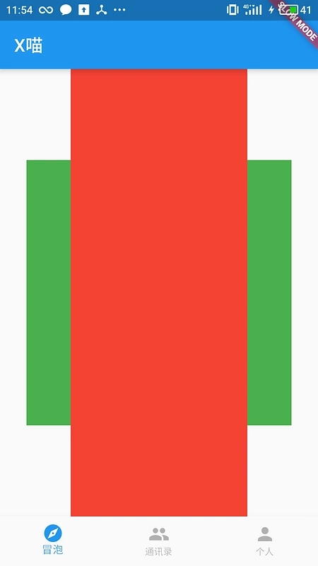
SizedOverflowBox
刚才OverflowBox是因为我们修改了约束条件所以child布局大小确实被改变了,所以会发生溢出,而SizedOverflowBox这个控件并不会改变约束条件,但是它还是可能会发生溢出,为什么尼?因为SizedOverflowBox可以让控件看上去“变小一点”,这怎样做到的尼?这个控件有一个参数:size,这个参数就是让我们决定这个控件看上去应该多大。
关键代码在RenderSizedOverflowBox类中:
@override
double computeMinIntrinsicWidth(double height)
{
return _requestedSize.width;
}
@override
double computeMaxIntrinsicWidth(double height)
{
return _requestedSize.width;
}
@override
double computeMinIntrinsicHeight(double width)
{
return _requestedSize.height;
}
@override
double computeMaxIntrinsicHeight(double width)
{
return _requestedSize.height;
}
void performLayout() {
size = constraints.constrain(_requestedSize);
if (child != null) {
child.layout(constraints);
alignChild();
}
} |
示例代码:
Widget build(BuildContext
context) {
return new Align(
alignment: Alignment.center,
child: new Container(
color: Colors.green,
alignment: Alignment.center,
width: 300.0,
height: 300.0,
child: new SizedOverflowBox(
size: new Size(200.0, 300.0),
child: new Container(
color: Colors.red
)
)
)
);
} |
截图:
Offstage
在CSS有一个属性visibility,当设置为hidden时,元素是存在但是不会绘制出来;在Flutter中Offstage也可以做到这种效果。
在RenderOffstage类中:
class RenderOffstage
extends RenderProxyBox {
...
@override
void performLayout() {
if (offstage) {
child?.layout(constraints);
} else {
super.performLayout();
}
}
@override
bool hitTest(HitTestResult result, { Offset
position }) {
return !offstage && super.hitTest(result,
position: position);
}
@override
void paint(PaintingContext context, Offset offset)
{
if (offstage)
return;
super.paint(context, offset);
}
...
} |
可见当offstage为true时,布局还是会继续进行的,但是paint方法里面会直接返回,hitTest方法也会直接跳过,也就是不能响应任何手势。
AspectRatio
这个控件可以用来让子控件大小维持在一个固定宽高比,例如:16:9。
直接看布局算法:
Size _applyAspectRatio(BoxConstraints
constraints) {
if (constraints.isTight)
return constraints.smallest;
double width = constraints.maxWidth;
double height;
// We default to picking the height based
on the width, but if the width
// would be infinite, that's not sensible so
we try to infer the height
// from the width.
if (width.isFinite) {
height = width / _aspectRatio;
} else {
height = constraints.maxHeight;
width = height * _aspectRatio;
}
// Similar to RenderImage, we iteratively
attempt to fit within the given
// constraints while maintaining the given aspect
ratio. The order of
// applying the constraints is also biased towards
inferring the height
// from the width.
if (width > constraints.maxWidth) {
width = constraints.maxWidth;
height = width / _aspectRatio;
}
if (height > constraints.maxHeight) {
height = constraints.maxHeight;
width = height * _aspectRatio;
}
if (width < constraints.minWidth) {
width = constraints.minWidth;
height = width / _aspectRatio;
}
if (height < constraints.minHeight) {
height = constraints.minHeight;
width = height * _aspectRatio;
}
return constraints.constrain(new Size(width,
height));
} |
简单分析一下:
如果constraints是tight,那么这个控件并不会起啥作用,所以这个控件一般需要Align控件包裹一下。
如果宽度不是Inifinte,它首先会选择最大宽度,否则根据maxHeight来反推宽度。
万一高度超出约束条件,它就会反过来,选择最大的高度反推出宽度,那么万一宽度小于最小宽度,它又会根据最小宽度计算高度等等。
当然最后还是会根据约束条件来规范最终的Size,所以可能出来效果是跟我们预设的宽高比不一致,但是这种情况应该很少。
示例代码:
Widget build(BuildContext
context) {
return new Align(
alignment: Alignment.center,
child: new Container(
color: Colors.green,
alignment: Alignment.center,
width: 300.0,
height: 300.0,
child: new AspectRatio(
aspectRatio: 2.0,
child: new Container(
color: Colors.red,
),
)
)
);
} |
截图:
IntrinsicWidth & IntrinsicHeight
Sizes its child's width to the child's maximum intrinsic
width.
说实在这个控件看了半天没想出用于哪些场景,搜了一下代码,基本都用在一些浮窗上。布局过程是调用getMaxIntrinsicWidth方法递归询问子控件最大的intrinsicWidth,因为这个方法需要递归下去,如果每个控件都调用比较耗性能,当获取到intrinsicWidth,就会使用这个值作为约束条件(当然也受到原始的约束条件约束),然后传递给child,所以正如上面的话所说,但是还是想不到哪些场景会需要。
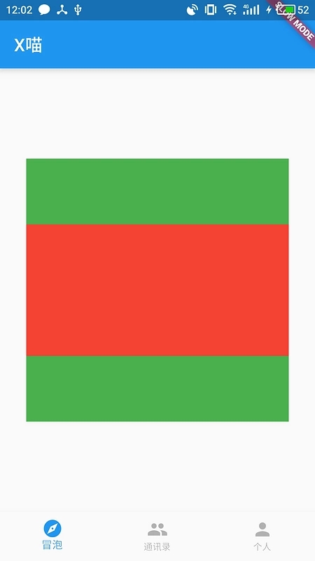
Baseline
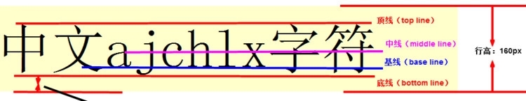
正如图上,基线可以影响着文字水平排布;如果两段文字的基线不一样,两段文字的可能会出现一上一下,并不是在同一水平线上排布,就像这样:
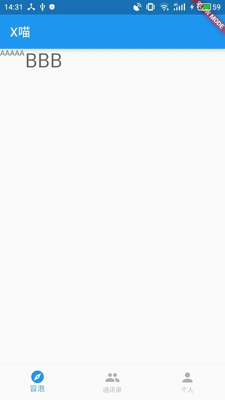
这是两个Text控件,文字大小分别是12dp和32dp,所以他们的基线位置是不一样的,所以这样的排布并不是我们想要的,所以我们可以使用Baseline控件让他们都在一样的基线上,修改后:
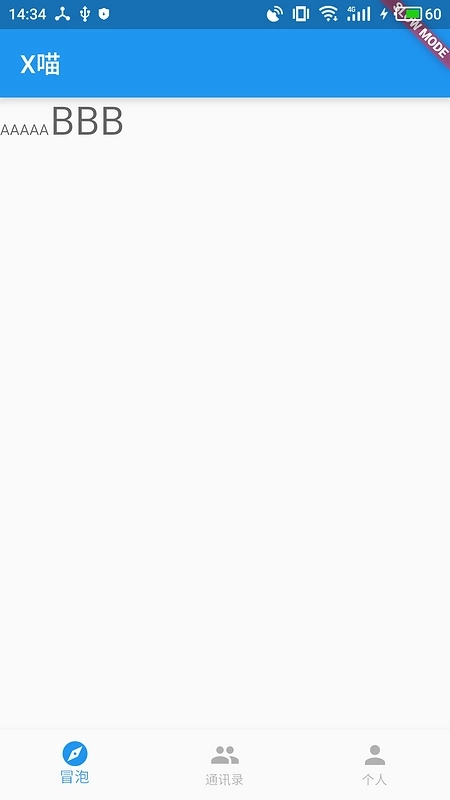
这才是我们常见的,代码如下:
Widget build(BuildContext
context) {
return new Wrap(
children: <Widget>[
new Baseline(
baseline: 30.0,
baselineType: TextBaseline.alphabetic,
child:
new Text(
'AAAAA',
style: new TextStyle(
fontSize: 12.0,
textBaseline: TextBaseline.alphabetic,
),
)
),
new Baseline(
baseline: 30.0,
baselineType: TextBaseline.alphabetic,
child:
new Text(
'BBB',
style: new TextStyle(
fontSize: 32.0,
textBaseline: TextBaseline.alphabetic,
),
),
)
],
); |
把基线的位置都定义为30,两段文字都会在来30的水平线上排布,就可以看到现在整齐的效果。
|


