| 利用css画图形,是个有利有弊的写法,好处是不用画图,且节省了一些流量,坏处是要写长串的css样式,而且有可能流量并没有减少,用与否视情况而定,个人选择。
下面是我做测试的一些图形,也是参考了一些网站,简单的注解一下和归纳了一下,其中并没涉及到复杂的css画图形。
其中用了css3.0的一些属性,所以这里声明:请用支持css3.0的浏览器看此文章!
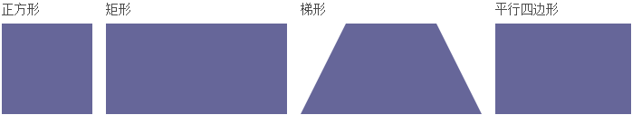
上面这几个相对比较简单,没什么可解释的,看下面源码
/*正方形*/.Square { width: 100px; height: 100px; background: #669; }
/*矩形*/rectangle { width: 200px; height: 100px; background: #669; }
/*梯形*/trapezoid { border-bottom: 100px solid #669; border-left: 50px solid transparent;
border-right: 50px solid transparent; height: 0; width: 100px; }
	/*平行四边形*/.parallelogram { width: 150px; height: 100px; -webkit-transform: skew(-20deg)
; -moz-transform: skew(-20deg); -o-transform: skew(-20deg); background: #669;margin-left:20px; } |
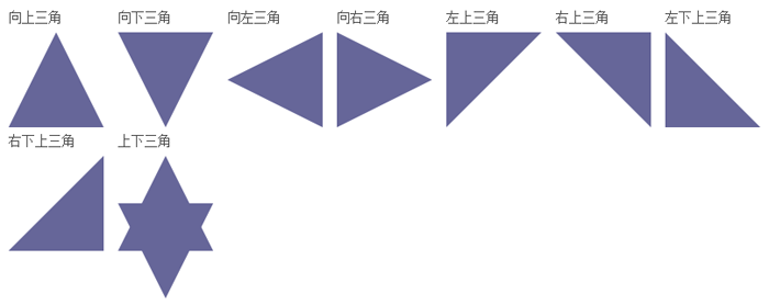
上面这些三角,其实也很常见,主要原理是利用了相邻两个边框的接壤处分配原则,如果没有宽度和高度的话,其实应该是四个三角形的矩形,下面是上面图形的源码:
.triangle-up { width: 0; height: 0; border-left: 50px solid transparent;
    border-right: 50px solid transparent; border-bottom: 100px solid #669; }
.triangle-down { width: 0; height: 0; border-left: 50px solid transparent;
    border-right: 50px solid transparent; border-top: 100px solid #669; }
.triangle-left { width: 0; height: 0; border-top: 50px solid transparent;
     border-right: 100px solid #669; border-bottom: 50px solid transparent; }
.triangle-right { width: 0; height: 0; border-top: 50px solid transparent;
    border-left: 100px solid #669; border-bottom: 50px solid transparent; }
.triangle-updown { width: 0; height: 0; border-left: 50px solid transparent;
     border-right: 50px solid transparent;border-bottom: 100px solid #669;
     position:relative;margin-bottom:50px}
.triangle-updown:after {content:" "; width: 0; height: 0; border-left: 50px solid transparent;
    border-right: 50px solid transparent; border-top: 100px solid #669;
   position:absolute;top:50px;left:-50px;}

.triangle-topleft { width: 0; height: 0; border-top: 100px solid #669;
    border-right: 100px solid transparent; }
.triangle-topright { width: 0; height: 0; border-top: 100px solid #669;
    border-left: 100px solid transparent; }
.triangle-bottomleft { width: 0; height: 0; border-bottom: 100px solid #669;
   border-right: 100px solid transparent; }
.triangle-bottomright { width: 0; height: 0; border-bottom: 100px solid #669;
    border-left: 100px solid transparent; }
|
看下面例子,清楚的标明了,四个边的情况,上面的三角形都是利用了这个原理,让不想显示的边框透明transparent:
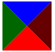
| <div
style="border-left:50px solid #060;border-right:50px
solid #600;border-bottom:50px solid #f00;border-top:50px
solid #00f;width:0px;height:0px;"></div> |
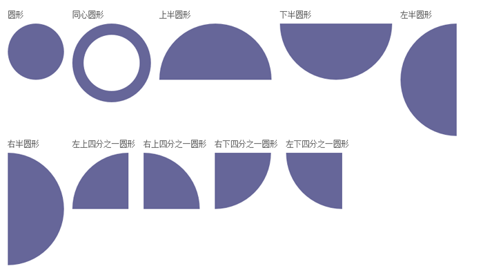
其实这个跟上面画三角形的原理很相似,都是利用相邻边框接壤的配原则。另还主要利用了css3.0的圆角属性
border-radius 适当的调整大小会有不同的效果!结合border-width调整,可以得到不同的图形。
当然适当的调整角度和组合,可以得到更多的图形。
/*圆形 主要利用了css3.0的圆角属性 border-radius 适当的调整大小会有不同的效果*/
.circle { width: 100px; height: 100px; background: #669; -moz-border-radius: 50px;
    -webkit-border-radius: 50px; border-radius: 50px; }
.circle-circle { width: 100px; height: 100px; border:20px solid #669;background: #fff;
   -moz-border-radius: 100px; -webkit-border-radius: 100px; border-radius: 100px; }
.circle-up { width: 100px; height: 0px;border:0 solid transparent;border-top:100px solid #669;
  border-right:100px solid #669;  -moz-border-radius: 100px 100px 0 0; -webkit-border-radius: 100px 100px 0 0;
   border-radius: 100px 100px 0 0; }
.circle-down { width: 100px; height: 0px;border:0 solid transparent;border-bottom:100px solid #669;
    border-right:100px solid #669;  -moz-border-radius:0 0 100px 100px;
   -webkit-border-radius:0 0 100px 100px; border-radius:0 0 100px 100px; }
.circle-left { width: 100px; height: 0px;border:0 solid transparent;border-bottom:100px solid #669;
  border-top:100px solid #669;  -moz-border-radius:100px 0 0 100px;
  -webkit-border-radius:100px 0 0 100px; border-radius:100px 0 0 100px; }
.circle-right { width: 100px; height: 0px;border:0 solid transparent;
   border-bottom:100px solid #669;border-top:100px solid #669;  -moz-border-radius:0 100px 100px 0;
    -webkit-border-radius:0 100px 100px 0; border-radius:0 100px 100px 0; }
.circle-lefttop { width: 100px; height: 0px;border:0 solid transparent;border-top:100px solid #669;
   -moz-border-radius:0 100px 100px 0; -webkit-border-radius:0 100px 100px 0; border-radius:100px 0 0 0; }
.circle-righttop { width: 100px; height: 0px;border:0 solid transparent;border-top:100px solid #669;
    -moz-border-radius:0 100px 0 0; -webkit-border-radius:0 100px 0 0; border-radius:0 100px 0 0; }
.circle-rightbottom { width: 100px; height: 0px;border:0 solid transparent;border-bottom:100px solid #669;
   -moz-border-radius:0 0 100px 0; -webkit-border-radius:0 0 100px 0; border-radius:0 0 100px 0; }
.circle-leftbottom { width: 100px; height: 0px;border:0 solid transparent;border-bottom:100px solid #669;
-moz-border-radius:0 0 0 100px; -webkit-border-radius:0 0 0 100px; border-radius:0 0 0 100px; } |
下面是适当的调整边框宽度和圆角得到的效果:
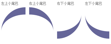
/*适当的调整边框宽度和圆角得到的效果*/
.tail-lefttop{border: 0 solid transparent; border-top:30px solid #669;-moz-border-radius:100px 0 0 0;
  -webkit-border-radius:100px 0 0 0;border-radius:100px 0 0 0;width:100px;height:100px;}
.tail-righttop{border: 0 solid transparent; border-top:30px solid #669;
   -moz-border-radius:0 100px 0 0;-webkit-border-radius:0 100px 0 0;border-radius:0 100px 0 0;width:100px;height:100px;}
.tail-rightbottom{border: 0 solid transparent; border-bottom:30px solid #669;
  -moz-border-radius:0 0 100px 0;-webkit-border-radius:0 0 100px 0;border-radius:0 0 100px 0;width:100px;height:100px;;}
.tail-leftbottom{border: 0 solid transparent; border-bottom:30px solid #669;
-moz-border-radius:0 0 0 100px;-webkit-border-radius:0 0 0 100px;
border-radius:0 0 0 100px;width:100px;height:100px;}
|
当然可以通过上面延伸画出更多的效果比如:提示泡
先看效果:
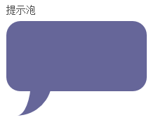
.pop{width:200px;height:100px;-moz-border-radius:20px;-webkit-border-radius:20px;
	  border-radius:20px;background:#669;margin-top:20px;position:relative}
.pop:after{content: "";border: 0 solid transparent; border-bottom:30px solid #669;
   -moz-border-radius:0 0 0 200px;-webkit-border-radius:0 0 0 200px;
border-radius:0 0 0 200px;width:50px;height:50px;
position:relative;margin-top:20px;-webkit-transform: rotate(-90deg); -moz-transform: rotate(-90deg);
   -ms-transform: rotate(-90deg); -o-transform: rotate(-90deg);position:absolute;top:50px;}
|
上面是css实现代码,基本原理又多了一项,就是利用了:after伪类,小尾巴上面已经介绍过了,这里又利用了一个css3.0的属性transform:rotate旋转了一个角度,
同时还实现了另外的一个图形--圆角矩形,这是最基本radius的用法,没什么可讲的。当然这里也可以延伸出另一个伪类:before画出第二个小尾巴,当然也不仅限于
小尾巴,上面的圆角矩形也可以换成椭圆。
下面给出实现代码:
.oval-pop{width: 200px; height: 100px; background: #669;
	 -moz-border-radius: 100px / 50px; -webkit-border-radius: 100px / 50px; border-radius: 100px / 50px;
   margin-bottom:50px;position:relative}
.oval-pop:after{content: "";border: 0 solid transparent; border-bottom:30px solid #669;
   -moz-border-radius:0 0 0 200px;-webkit-border-radius:0 0 0 200px;
border-radius:0 0 0 200px;width:50px;height:50px;position:relative;margin-top:20px;
   -webkit-transform: rotate(-90deg); -moz-transform: rotate(-90deg);
  -ms-transform: rotate(-90deg); -o-transform: rotate(-90deg);
  position:absolute;top:50px;left:20px}
|
效果如下
: 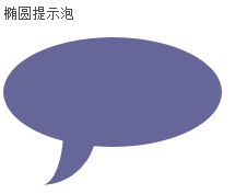
同时,也给出了椭圆的实现代码。 其中 border-radius:
100px / 50px; 中有一个“/” 这个符号是很少出现在css样式中的。
因为,圆角有水平方向也有垂直方向,所以"/"前面代表水平方向,后面代表垂直方向。
于是我们又多了一个属性,又多了一个发挥的方向。突然间我们发现css画图形其实就是对属性的组合创造。多试几次,相信每个人都很好的掌握这个技能!
下面再看一个属性,其实是对上面讲过的属性的一个扩展。
可以说是画圆的扩展也可以说是对圆角矩形的扩展---胶囊形:
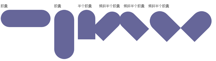
下面是实现代码,基本属性上面我们都利用过,只是稍做调整:
.capsule{border: 0 solid transparent;
	-moz-border-radius:100px;-webkit-border-radius:100px
;border-radius:100px;width:200px;height:70px;background:#669;}
.v-capsule{border: 0 solid transparent; -moz-border-radius:100px;
  -webkit-border-radius:100px;border-radius:100px;width:80px;height:200px;background:#669}
.up-capsule{border: 0 solid transparent; -moz-border-radius:100px;
  -webkit-border-radius:100px;border-radius:100px 100px 0 0;width:70px;height:120px;
  background:#669;}
.r45-capsule{border: 0 solid transparent; -moz-border-radius:100px;
  -webkit-border-radius:100px;border-radius:100px 100px 0 0;width:70px;height:120px;
background:#669;-moz-transform: rotate(45deg);-ms-transform: rotate(45deg);
-o-transform: rotate(45deg);-webkit-transform: rotate(45deg);margin-left:20px;}
.l45-capsule{border: 0 solid transparent; -moz-border-radius:100px;
  -webkit-border-radius:100px;border-radius:100px 100px 0 0;width:70px;height:120px;
  background:#669;-moz-transform: rotate(-45deg);-ms-transform: rotate(-45deg);
   -o-transform: rotate(-45deg);-webkit-transform: rotate(-45deg);margin-left:20px;}
.lr45-capsule{width:160px;height:130px;position:relative}
.lr45-capsule:before{content:" ";border: 0 solid transparent;
  -moz-border-radius:100px;-webkit-border-radius:100px;
  border-radius:100px 100px 0 0;width:80px;
  height:120px;background:#669;-moz-transform: rotate(-45deg);
   -ms-transform: rotate(-45deg);-o-transform: rotate(-45deg);-webkit-transform: rotate(-45deg);
   position:absolute;left:20px;}
.lr45-capsule:after{content:" ";border: 0 solid transparent;
  -moz-border-radius:100px;-webkit-border-radius:100px;border-radius:100px 100px 0 0;width:80px;
  height:120px;background:#669;-moz-transform: rotate(45deg);-ms-transform: rotate(45deg);
-o-transform: rotate(45deg);-webkit-transform: rotate(45deg);
position:absolute;left:160px;top:00px;}
|
细观察一下最后两个图形如果合在一起好像能组成一个心形,其实就是一个心形:
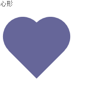
.heart{width:160px;height:200px;position:relative}
.heart:before{content:" ";border: 0 solid transparent; -moz-border-radius:100px;
  -webkit-border-radius:100px;border-radius:100px 100px 0 0;width:80px;
 height:120px;background:#669;-moz-transform: rotate(-45deg);-
 ms-transform: rotate(-45deg);-o-transform: rotate(-45deg);-webkit-transform: rotate(-45deg);
  position:absolute;left:20px;}
.heart:after{content:" ";border: 0 solid transparent;
  -moz-border-radius:100px;-webkit-border-radius:100px;border-radius:100px 100px 0 0;width:80px;
  height:120px;background:#669;-moz-transform: rotate(45deg);
  -ms-transform: rotate(45deg);-o-transform: rotate(45deg);-webkit-transform: rotate(45deg);
  position:absolute;left:48px;top:0px;}
.oval-pop{width: 200px; height: 100px; background: #669;
 	 -moz-border-radius: 100px / 50px; -webkit-border-radius: 100px / 50px;
	 border-radius: 100px / 50px;
   margin-bottom:50px;position:relative}
.oval-pop:after{content: "";border: 0 solid transparent; border-bottom:30px solid #669;
   -moz-border-radius:0 0 0 200px;-webkit-border-radius:0 0 0 200px;
border-radius:0 0 0 200px;width:50px;height:50px;position:relative;margin-top:20px;
   -webkit-transform: rotate(-90deg); -moz-transform: rotate(-90deg);
  -ms-transform: rotate(-90deg); -o-transform: rotate(-90deg);
  position:absolute;top:50px;left:20px}
|
上面讲的只是对css画图形的初步认识,基本上所有的实现都是对边框的角度的调整及组合。下节将会画些复杂的图形。
|


