|
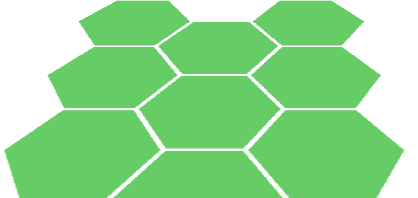
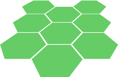
导读:最近HTML5和CSS3是越来越普及,HTML5&CSS3不会在大分辨率显示屏上出现马赛克等优点也渐渐被人注意到。很多网站都渐渐大量使用CSS3做网站美化,HTML5&CSS3的优秀作品层出不穷!甚至有的网站已经完全抛弃图片,仅使用CSS和JavaScript创造出简介而又华丽的界面。下面是国外作者@jtauber的使用CSS创作蜂巢效果的技术介绍(上面是最终效果图):
|
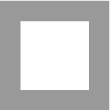
height: 100px;
width: 100px;
border: 30px solid #999;
|
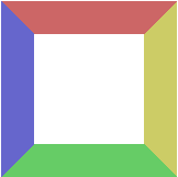
如果给每border附上不同的颜色的值:
|
height: 100px;
width: 100px;
border-top: 30px solid #C66;
border-bottom: 30px solid #6C6;
border-left: 30px solid #66C;
border-right: 30px solid #CC6;
|
现在把height属性删除,并且将div的width设置为0,效果如下:
|
width: 0;
border-top: 30px solid #C66;
border-bottom: 30px solid #6C6;
border-left: 30px solid #66C;
border-right: 30px solid #CC6;
|
删除border-top,再将border-left/border-right设置为透明:
|
width: 0;
border-bottom: 30px solid #6C6;
border-left: 30px solid transparent;
border-right: 30px solid transparent; |
两边的border不需要和bottom-border一样,bottom-border设置为30px,两边的52px,效果如下:
|
width: 0;
border-bottom: 30px solid #6C6;
border-left: 52px solid transparent;
border-right: 52px solid transparent; |
如果用top-border替换bottom-border:
|
width: 0;
border-top: 30px solid #6C6;
border-left: 52px solid transparent;
border-right: 52px solid transparent; |
在它们中创建一个104px × 60px的相同颜色的div你就能看到六边形的效果了:
|
width: 0;
border-bottom: 30px solid #6C6;
border-left: 52px solid transparent;
border-right: 52px solid transparent;
width: 104px;
height: 60px;
background-color: #6C6;
width: 0;
border-top: 30px solid #6C6;
border-left: 52px solid transparent;
border-right: 52px solid transparent;
|
以上是在CSS中制作出六边形效果的全部过程。两侧和上/下面的border width30:52的比例约等于1:√3
rat,也是为表现出六边形效果准备的。
下面提供一个简单的将六边形旋转30°。我们只需要旋转一下方向,使用float: left并且将width:
0属性删除。
|
float: left;
border-right: 30px solid #6C6;
border-top: 52px solid transparent;
border-bottom: 52px solid transparent;
float: left;
width: 60px;
height: 104px;
background-color: #6C6;
float: left;
border-left: 30px solid #6C6;
border-top: 52px solid transparent;
border-bottom: 52px solid transparent; |
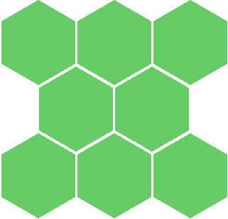
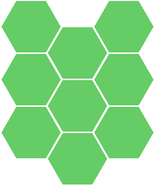
两种方向的六边形都可以很容易地拼贴在一起。第一种旋转方式的每个六边形上添加属性margin-left:
3px和margin-bottom: -26px,并且在偶数行还有margin-left: 53px。
| |
..hex {
float: left;
margin-left: 3px;
margin-bottom: -26px;
}
..hex .top {
width: 0;
border-bottom: 30px solid #6C6;
border-left: 52px solid transparent;
border-right: 52px solid transparent;
}
..hex .middle {
width: 104px;
height: 60px;
background: #6C6;
}
..hex .bottom {
width: 0;
border-top: 30px solid #6C6;
border-left: 52px solid transparent;
border-right: 52px solid transparent;
}
..hex-row {
clear: left;
}
..hex-row.even {
margin-left: 53px;
}
|
第二种旋转方式的每个六边形上添加 margin-right: -26px和margin-bottom:
-50px的属性在偶数列还有margin-top: 53px。
| |
..hex {
float: left;
margin-right: -26px;
margin-bottom: -50px;
}
..hex .left {
float: left;
width: 0;
border-right: 30px solid #6C6;
border-top: 52px solid transparent;
border-bottom: 52px solid transparent;
}
..hex .middle {
float: left;
width: 60px;
height: 104px;
background: #6C6;
}
..hex .right {
float: left;
width: 0;
border-left: 30px solid #6C6;
border-top: 52px solid transparent;
border-bottom: 52px solid transparent;
}
..hex-row {
clear: left;
}
..hex.even {
margin-top: 53px;
}
|
完成以上工作后还可以在.hex类添加以下代码再创造出3D透视效果。
| |
-webkit-transform: perspective(600px)
rotateX(60deg);
-moz-transform: perspective(600px) rotateX(60deg);
-ms-transform: perspective(600px) rotateX(60deg);
-o-transform: perspective(600px) rotateX(60deg);
transform: perspective(600px) rotateX(60deg);
Addendum
|
Will Hardy建议使用 :before和 :after来减少所需使用的div为1个。
| |
..hex:before {
content: " ";
width: 0; height: 0;
border-bottom: 30px solid #6C6;
border-left: 52px solid transparent;
border-right: 52px solid transparent;
position: absolute;
top: -30px;
}
..hex {
margin-top: 30px;
width: 104px;
height: 60px;
background-color: #6C6;
position: relative;
}
..hex:after {
content: "";
width: 0;
position: absolute;
bottom: -30px;
border-top: 30px solid #6C6;
border-left: 52px solid transparent;
border-right: 52px solid transparent;
}
|
|


